Topics Covered in This Web Development Tutorial:
Master advanced CSS Grid sizing techniques including Minmax, Auto-Fit vs. Auto-Fill, Max-Content & Min-Content for responsive, professional layouts
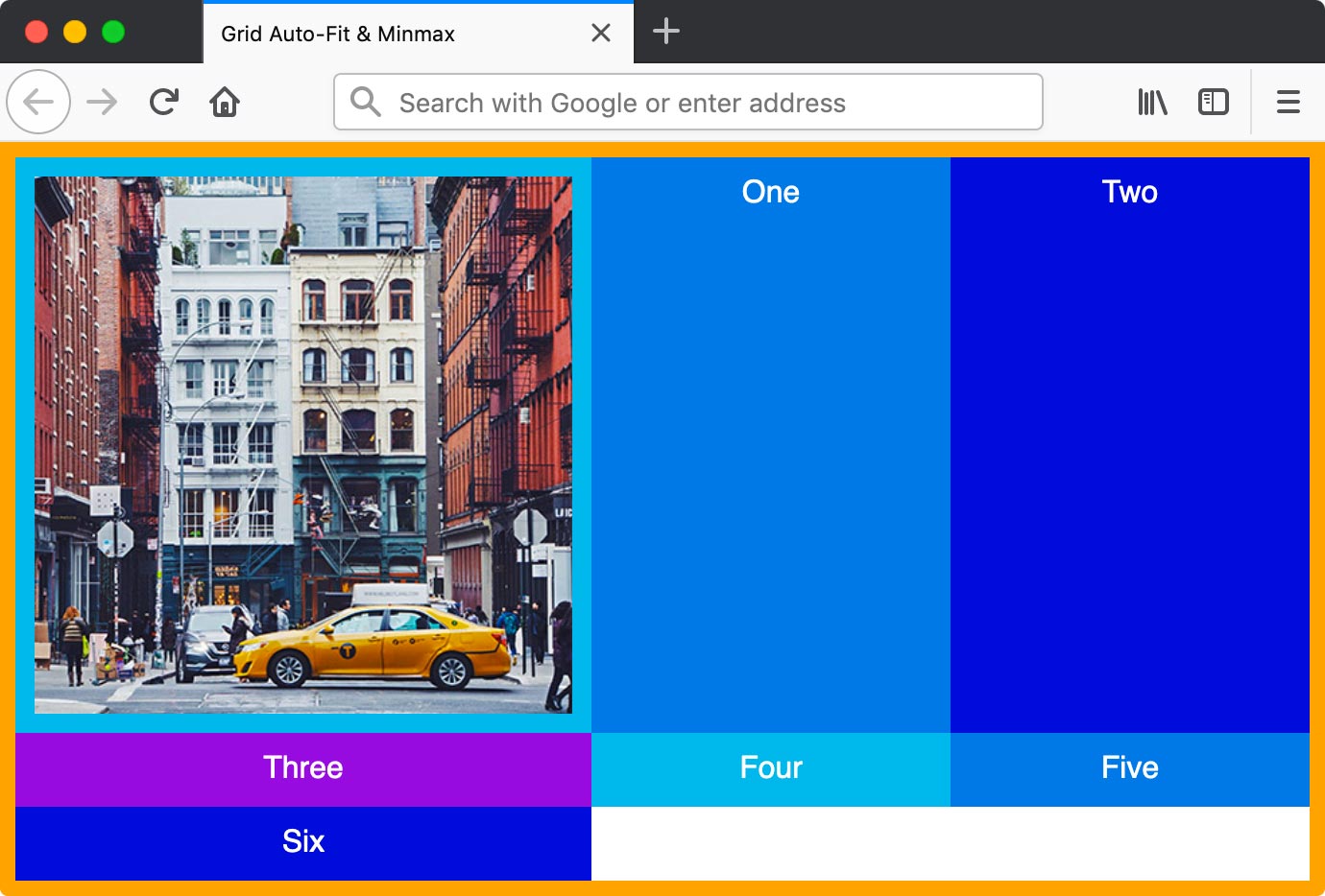
Exercise Preview
Exercise Overview
In this hands-on exercise, you'll master the sophisticated sizing capabilities of CSS Grid that separate professional developers from beginners. You'll learn to create truly responsive layouts using minmax, auto-fit, auto-fill, max-content, and min-content—techniques that ensure your grids adapt intelligently to any screen size while maintaining visual integrity. These advanced sizing methods are essential for modern web development, allowing you to build layouts that respond dynamically to content changes without media queries.
Getting Started
- In your code editor, close any files you may have open to start with a clean workspace.
- Navigate to the Grid Minmax folder located in Desktop > Class Files > yourname-Flexbox Grid Class. If you're using a modern editor like Visual Studio Code, Cursor, or WebStorm, open the entire folder to take advantage of intelligent autocomplete and file navigation.
Open index.html from the Grid Minmax folder.
- You'll notice the familiar structure: a .container div wrapping multiple numbered divs, with an image in the first div for realistic content testing.
- Several divs are commented out—we'll progressively uncomment these to demonstrate how grid layouts adapt to varying content volumes.
Preview index.html in Firefox (recommended for its superior CSS Grid debugging tools).
- The .container div displays with an orange border containing multi-colored grid items—this visual structure makes it easy to track layout changes as we modify the CSS.
Keep index.html open in Firefox throughout this exercise. Live reloading helps you immediately see the impact of each change, reinforcing the learning process.
Setup Process
Close Existing Files
Close any open files in your code editor to start with a clean workspace
Navigate to Project Folder
Open the Grid Minmax folder from Desktop > Class Files > yourname-Flexbox Grid Class
Open Project Files
Open index.html and preview it in Firefox, keeping both editor and browser open for live testing
Intro to Minmax
The minmax() function is arguably CSS Grid's most powerful sizing tool, allowing you to set flexible boundaries that respond intelligently to available space. Let's explore how it transforms rigid layouts into adaptive systems.
- Switch back to your code editor.
- Open main.css from the css folder (in the Grid Minmax folder).
In the .container rule add the following bold code:
.container {
   display: grid;
   grid-template-columns: repeat(5,1fr);
   border: 8px solid orange;
}
Save the file, and reload the page in Firefox.
- You now have 5 columns with flexible widths that automatically fill the container—this is the foundation of responsive design.
- Resize the window to its narrowest point. Notice how the columns become uncomfortably narrow, potentially breaking text layout or making images unusable.
- Switch back to your code editor.
In the .container rule, edit the column size as shown below in bold:
.container {
   display: grid;
   grid-template-columns: repeat(5, 100px);
   border: 8px solid orange;
}
Save the file, and reload the page in Firefox.
- The 5 columns now have fixed 100px widths, creating consistent sizing but sacrificing responsive behavior—they no longer adapt to the container width.
- Switch back to your code editor.
Now we'll implement the minmax() function to get the best of both worlds. In the .container rule, edit the column size as shown below in bold:
.container {
   display: grid;
   grid-template-columns: repeat(5, minmax(100px, 1fr));
   border: 8px solid orange;
}
Save the file, and reload the page in Firefox.
- Resize the window and observe the intelligent behavior: at wider screen sizes, columns flex to fill available space (1fr), but they maintain a minimum 100px width to preserve usability. This prevents the content collapse we saw earlier while maintaining responsiveness.
- CTRL–click (Mac) or Right–click (Windows) anywhere in the grid and choose Inspect Element.
- In the DevTools, to the right of
<div class="container">click the grid button to show a grid overlay—Firefox's grid debugging tools are industry-leading. - In the Grid area of the Firefox DevTools, under Grid Display Settings check on Display line numbers for precise layout analysis.
- Leave the DevTools open with the grid overlay on—this visual feedback is invaluable for understanding grid behavior.
- Switch back to your code editor.
- Switch to index.html.
- Uncomment
<div>Five</div> Save the file, and reload the page in Firefox.
- Our grid template specifies 5 columns, so the sixth item (including the image column) automatically wraps to a new row. This demonstrates CSS Grid's automatic placement algorithm—a key advantage over older layout methods.
Fixed vs Flexible vs Minmax Columns
| Feature | Fixed (100px) | Flexible (1fr) | Minmax (100px, 1fr) |
|---|---|---|---|
| Responsiveness | No resize | Full resize | Constrained resize |
| Minimum Width | Always 100px | Can shrink to 0 | Protected at 100px |
| Maximum Width | Always 100px | Unlimited | Fills available space |
| Use Case | Static layouts | Fully fluid | Responsive with limits |
Use Firefox DevTools grid overlay and display line numbers to visualize your grid structure and debug layout issues effectively.
Auto-Fit Vs. Auto-Fill
Here's where CSS Grid truly shines in modern web development. The auto-fit and auto-fill keywords create truly dynamic layouts that adapt not just to screen size, but to content quantity—essential for content management systems, e-commerce sites, and any application where item counts vary.
- Switch back to your code editor.
- Switch to main.css.
In the .container rule, edit the column size as shown below in bold:
.container {
   display: grid;
   grid-template-columns: repeat(auto-fit, minmax(100px, 1fr));
   border: 8px solid orange;
}
Save the file, and reload the page in Firefox.
- Resize the window from small to wide to see the intelligent adaptation in action.
- The columns maintain their 100px minimum width, wrapping to new rows when necessary, then scaling up to fill available width (1fr maximum).
- On wide screens, pay attention to the grid line numbers in DevTools: as the window expands, auto-fit collapses unused column tracks, allowing existing columns to stretch and fill the entire container width. This creates the most space-efficient layouts.
- Switch back to index.html in your code editor.
- Uncomment
<div>Six</div> Save the file, and reload the page in Firefox.
- Resize the window to see how the layout automatically accommodates the additional item.
- This technique eliminates the need for media queries in many responsive scenarios—the layout intelligently adjusts based on content quantity and available space.
- Switch back to main.css in your code editor.
Now let's contrast this with auto-fill behavior. In the .container rule, edit the column size as shown below in bold:
.container {
   display: grid;
   grid-template-columns: repeat(auto-fill, minmax(100px, 1fr));
   border: 8px solid orange;
}
Save the file, and reload the page in Firefox.
- Resize the window from small to wide and observe the key difference.
- On narrow screens, auto-fill behaves identically to auto-fit, but on wider screens the behavior diverges significantly. Auto-fill creates additional empty column tracks instead of expanding existing columns.
- auto-fill: Creates as many column tracks as will fit in the available space, even if they're empty. Use this when you want consistent column widths regardless of content quantity.
- auto-fit: Fits the actual number of items to the full width of the grid by collapsing empty tracks. Use this when you want content to fully utilize available space.
Auto-Fit vs Auto-Fill Behavior
| Feature | Auto-Fit | Auto-Fill |
|---|---|---|
| Empty Columns | Collapses unused columns | Maintains empty columns |
| Column Expansion | Existing columns fill space | Adds new empty columns |
| Wide Screen Behavior | Stretches content columns | Shows empty grid tracks |
| Best For | Content that should expand | Maintaining grid structure |
With auto-fit and auto-fill, you don't need to know the exact number of columns in advance - the layout automatically adjusts to accommodate your content.
More About Minmax
Beyond basic min and max values, minmax() works with content-aware keywords that create layouts that respond to actual content dimensions—a sophisticated approach that's particularly valuable for content-heavy applications.
- Switch back to your code editor.
Let's explore more complex minmax() scenarios. In the .container rule, edit the column size as shown below in bold:
.container {
   display: grid;
   grid-template-columns: minmax(200px, 300px) 1fr;
   border: 8px solid orange;
}
Save the file, and reload the page in Firefox.
- This creates a two-column layout where the first column has strict size boundaries: it prefers to be 300px wide but will compress down to 200px when space is constrained. The second column flexibly fills remaining space.
- Switch back to your code editor.
Now we'll introduce content-aware sizing. In the .container rule, edit the column size as shown below in bold:
.container {
   display: grid;
   grid-template-columns: minmax(200px, max-content) 1fr;
   border: 8px solid orange;
}
Save the file, and reload the page in Firefox.
- The first column's maximum width is now determined by its widest content—in this case, the photograph. This technique is invaluable for creating layouts that adapt to actual content dimensions rather than arbitrary pixel values.
- Switch back to your code editor.
Let's explore the opposite scenario with min-content. In the .container rule, edit the column size as shown below in bold:
.container {
   display: grid;
   grid-template-columns: minmax(min-content, 300px) 1fr;
   border: 8px solid orange;
}
NOTE: While minmax(min-content, max-content) works perfectly, it's functionally identical to minmax(auto, auto) or simply auto—always choose the most concise, readable option in production code!
Save the file, and reload the page in Firefox.
- Resize the window to see how the first column's minimum width is now determined by its narrowest content that doesn't cause overflow. In this case, that's the text "Three"—demonstrating how min-content prevents text wrapping when possible.
Minmax Value Options
Fixed Dimensions
Use pixel values like minmax(200px, 300px) to set specific minimum and maximum boundaries for precise control.
Max-Content Sizing
Using max-content as the maximum makes the column size based on the widest content element within it.
Min-Content Sizing
Min-content sets the minimum to the narrowest possible width without causing content overflow issues.
Remember that minmax(min-content, max-content) equals minmax(auto, auto) which can be simplified to just 'auto' - much cleaner code!
Fit-Content Vs. Minmax
Understanding the nuanced differences between fit-content and minmax is crucial for professional-level CSS Grid mastery. Both handle content-aware sizing, but their philosophies differ significantly. Consider a scenario where content doesn't fill the entire available column width:
fit-content(800px)
- If a column's content is less than 800px wide, the column shrinks to match the content width, even when there's sufficient space for 800px.
- If a column's content exceeds 800px, the column caps at 800px width, causing content to wrap or overflow.
- Philosophy: Content-first approach—shrink to fit content, but respect maximum boundaries.
minmax(auto, 800px)
- If there's sufficient space, the column expands to 800px regardless of content width, creating consistent column sizing.
- If space is constrained, the column compresses down to the minimum content width.
- Philosophy: Space-first approach—fill available space up to maximum, compress when necessary.
Professional Application: Use fit-content for content-heavy layouts like article cards or product listings where content should drive sizing. Use minmax for interface components like sidebars or navigation areas where consistent dimensions matter more than content-driven sizing. This distinction becomes critical in complex applications where layout predictability affects user experience.
Fit-Content vs Minmax Approach
| Feature | fit-content(800px) | minmax(auto, 800px) |
|---|---|---|
| Content Less Than 800px | Shrinks to content width | Expands to 800px if space allows |
| Content More Than 800px | Limited to 800px max | Scales down from 800px as needed |
| Primary Goal | Content-centric sizing | Space-filling behavior |
| Behavior Priority | Shrink to fit content | Expand to fill available space |
Fit-content is more content centric and wants to shrink down to the content when possible, whereas minmax wants to scale up to fill the space.