Topics Covered in This Web Development Tutorial:
Getting Started with CSS Grid (Columns, Rows, & Gaps), Understanding the Explicit vs. Implicit Grid, Leveraging Firefox DevTools for Grid Debugging
Exercise Preview
Exercise Overview
In this hands-on exercise, you'll master the fundamentals of CSS Grid—a powerful two-dimensional layout system that revolutionizes how we approach web design. Unlike traditional CSS layout methods that require complex workarounds and fragile positioning, Grid provides intuitive control over both columns and rows simultaneously. This exercise will transform your understanding of layout architecture, moving you from hack-based positioning to declarative, maintainable design patterns that scale beautifully across devices and content variations.
When to Use Flexbox & Grid
Flexbox and Grid serve complementary roles in modern CSS architecture, and mastering both is essential for professional front-end development. Grid excels at macro-layout—defining the overall page structure—while Flexbox handles micro-layout within individual components. As of 2026, both technologies enjoy universal browser support and are considered industry standards.
CSS-Tricks contributor Beverly @aszenitha perfectly captured their relationship: "Use Grid when you already have the layout structure in mind, and Flexbox when you just want everything to fit. Layout first vs. content first." This distinction becomes crucial when architecting complex interfaces. Read the full analysis at tinyurl.com/flex-grid-dif
Grid vs Flexbox: When to Use Which
| Feature | CSS Grid | Flexbox |
|---|---|---|
| Best Use Case | Layout structure in mind | Content needs to fit |
| Approach | Layout first | Content first |
| Dimension Control | Two-dimensional | One-dimensional |
| Planning Required | Structure predetermined | Flexible adaptation |
Use grid when you already have the layout structure in mind, and flex when you just want everything to fit. Layout first vs. content first.Getting Started
Let's establish our development environment and examine the foundational HTML structure we'll be transforming throughout this exercise.
- In your code editor, close any files you may have open to maintain focus.
- Navigate to the Grid Intro folder located in Desktop > Class Files > yourname-Flexbox Grid Class. If your editor supports project folders (like Visual Studio Code), open the entire directory for easier file navigation.
Open index.html from the Grid Intro folder and examine its structure.
- Notice the .container div that serves as our grid container, wrapping multiple child divs with numerical content—these will become our grid items.
Preview index.html in Firefox. We're using Firefox because its DevTools provide superior Grid inspection capabilities, including visual overlays and detailed grid line information.
- Observe the .container div's orange border, which helps visualize container boundaries throughout our exercises.
- Notice how the numbered divs currently behave as standard block elements, each taking the full width of their parent container.
Keep index.html open in Firefox as you work—you'll refresh frequently to see your Grid transformations in real-time.
Setup Requirements
Firefox has superior DevTools for inspecting CSS Grid at the time of writing
Locate in Desktop > Class Files > yourname-Flexbox Grid Class
You'll be reloading frequently to see changes as you code
Orange border container div wraps numbered divs with different background colors
Activating CSS Grid
Now we'll transform our ordinary block layout into a powerful CSS Grid container. This fundamental step unlocks Grid's layout capabilities and demonstrates how a single CSS property can completely restructure your page.
- Switch back to your code editor.
- Open main.css from the css folder within the Grid Intro directory.
Add the Grid display property to the .container rule:
.container {
   display: grid;
   border: 8px solid orange;
}
Save the file and reload the page in Firefox.
- Notice that visually nothing has changed yet. This is expected—Grid requires explicit column definitions to alter layout behavior.
- Return to your code editor to define our first Grid column structure.
Add a column template to the .container rule:
.container {
   display: grid;
   grid-template-columns: 200px;
   border: 8px solid orange;
}
NOTE: Grid accepts any CSS length unit (rem, em, %, vw, etc.). We'll soon explore the powerful fr unit, which often provides more flexible solutions than traditional percentage-based layouts.
Save the file and reload the page in Firefox.
- Your numbered divs should now form a single column, each 200px wide, stacked vertically.
- Notice the container's orange border still spans the full width, but the Grid items no longer fill their container, creating whitespace on the right.
- Let's add visual breathing room between Grid items by introducing gaps.
Add the gap property to create consistent spacing:
.container {
   display: grid;
   grid-template-columns: 200px;
   gap: 10px;
   border: 8px solid orange;
}
NOTE: Modern CSS uses the gap property, which replaced the legacy grid-gap property. The gap property serves as shorthand for both row-gap and column-gap.
- A single value applies to both row and column gaps equally.
- Two values target rows first, columns second:
gap: 10px 30px;creates 10px row gaps and 30px column gaps.
Save the file and reload the page in Firefox.
- Clean 10px spacing should now separate each Grid item, creating a professional, organized appearance.
- Now let's explore multi-column layouts by expanding our Grid template.
Modify the column template to create a three-column layout:
.container {
   display: grid;
   grid-template-columns: 200px auto 200px;
   gap: 10px;
   border: 8px solid orange;
}
Save the file and reload the page in Firefox.
- You now have three distinct columns with fixed outer columns (200px each) and a flexible center column that automatically fills the remaining space.
- This pattern—fixed sidebars with flexible content areas—is fundamental to responsive design.
- Let's add row control to demonstrate Grid's two-dimensional capabilities.
Add explicit row sizing to your Grid:
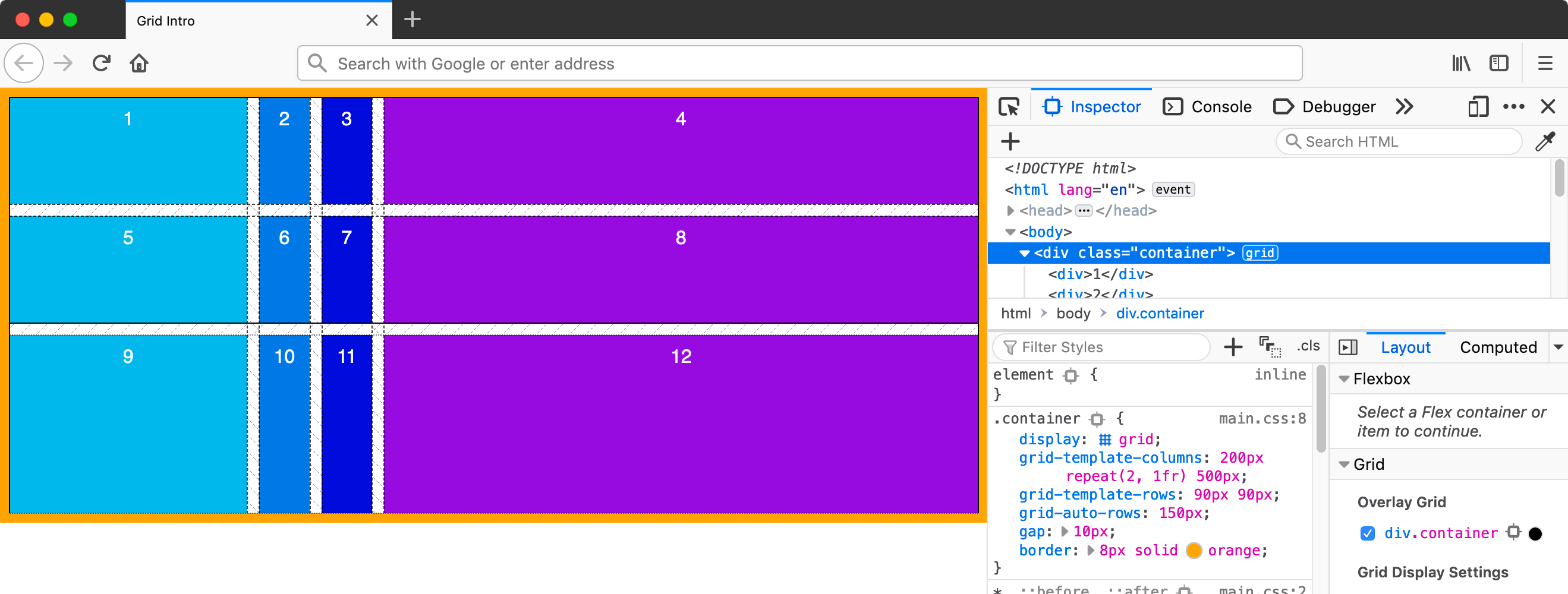
.container {
   display: grid;
   grid-template-columns: 200px auto 200px;
   grid-template-rows: 90px;
   gap: 10px;
   border: 8px solid orange;
}
Save the file and reload the page in Firefox.
- The first row should now have a fixed height of 90px, while subsequent rows maintain their natural content height.
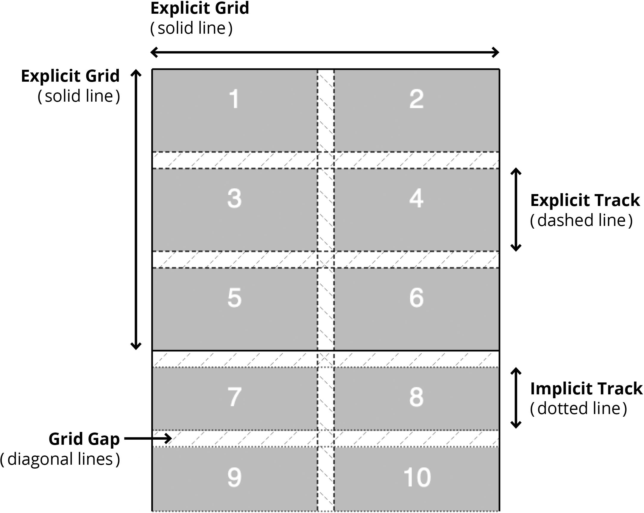
- This demonstrates the difference between explicit grid tracks (those you define) and implicit grid tracks (those automatically created by the browser).
- Your defined columns and first row comprise the explicit grid, while additional rows form the implicit grid.
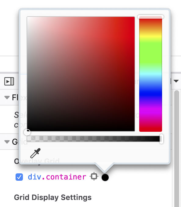
- Let's examine this Grid structure using Firefox's powerful debugging tools. Ctrl+click (Mac) or Right-click (Windows) anywhere within the Grid and select Inspect Element.
- In the DevTools, locate the grid button next to
<div class="container">and click it to activate the Grid overlay. - Toggle the grid button to see how the overlay helps visualize your Grid structure.
For enhanced Grid debugging, use the dedicated Grid panel in DevTools:
- Find the Grid section, which lists all Grid containers on the page.
- Check the box next to div.container to enable the overlay.
- Click the colored dot beside div.container to customize the overlay color for optimal visibility:
Understanding the Explicit vs. Implicit Grid
This fundamental concept distinguishes professional Grid implementations from amateur attempts. Firefox's visual overlay system makes these differences immediately apparent.
Firefox's Grid overlay uses distinct visual cues to differentiate between explicit and implicit Grid areas:
- Return to your code editor to gain control over implicit Grid behavior.
Add sizing control for automatically generated rows:
.container {
   display: grid;
   grid-template-columns: 200px auto 200px;
   grid-template-rows: 90px;
   grid-auto-rows: 150px;
   gap: 10px;
   border: 8px solid orange;
}
Save the file and reload the page in Firefox.
- The first row remains 90px (explicit), but all subsequent rows now follow the 150px pattern you've defined for implicit rows.
- Let's explore the powerful fractional unit (fr) that makes Grid layouts truly responsive.
Simplify your column structure using the fr unit:
.container {
   display: grid;
   grid-template-columns: 200px 1fr;
Code Omitted To Save Space
}NOTE: The fr unit represents fractional space—specifically, a fraction of available space after fixed-size elements are calculated. Think of fr as "free space distribution." The browser first allocates space for pixel-based elements, then distributes remaining space proportionally among fr-based tracks. This creates truly flexible layouts that adapt gracefully to any container size.
Save the file and reload the page in Firefox.
- You now have two columns: one fixed at 200px, another that fluidly fills all remaining horizontal space.
- Resize your browser window to see how the fr column adapts while the pixel column remains constant.
- Let's explore proportional space distribution with multiple fr units.
Create a three-column layout with proportional sizing:
.container {
   display: grid;
   grid-template-columns: 200px 1fr 1fr;
Code Omitted To Save Space
}Save the file and reload the page in Firefox.
- Three columns now exist: one fixed 200px column and two flexible columns that equally share the remaining space.
- Now let's demonstrate weighted space distribution—a key advantage over percentage-based layouts.
Adjust the fractional weights to create unequal column distribution:
.container {
   display: grid;
   grid-template-columns: 200px 2fr 1fr;
Code Omitted To Save Space
}NOTE: Fractional units distribute available space proportionally. With 2fr and 1fr, the available space is divided into 3 equal parts, with the 2fr column receiving 2/3 of the flexible space and the 1fr column receiving 1/3.
Save the file and reload the page in Firefox.
- The middle column should now be significantly larger than the right column, demonstrating precise proportional control.
- Let's examine how the auto keyword behaves differently in Grid contexts.
Replace the fixed-width column with auto sizing:
.container {
   display: grid;
   grid-template-columns: auto 1fr;
Code Omitted To Save Space
}NOTE: In Grid layouts, auto sizing creates columns that shrink to fit their content, providing automatic responsive behavior without media queries.
Save the file and reload the page in Firefox.
- The left column now precisely fits its content width, while the right column claims all remaining space.
- Let's create a perfectly balanced layout using equal fractional units.
Distribute space equally across two columns:
.container {
   display: grid;
   grid-template-columns: 1fr 1fr;
Code Omitted To Save Space
}Save the file and reload the page in Firefox.
- You should now see two perfectly equal columns that responsively fill the entire container width.
- CSS Grid provides the repeat() function to eliminate redundant code in complex layouts.
Refactor your equal columns using the repeat function:
.container {
   display: grid;
   grid-template-columns: repeat(3,1fr);
Code Omitted To Save Space
}Save the file and reload the page in Firefox.
- The layout should show three equal columns, demonstrating how repeat() simplifies Grid declarations for symmetric layouts.
- The repeat() function accepts complex patterns, not just single values.
Create an alternating column pattern:
.container {
   display: grid;
   grid-template-columns: repeat(3,1fr 50px);
Code Omitted To Save Space
}Save the file and reload the page in Firefox.
- You should now see six columns alternating between flexible 1fr columns and narrow 50px columns, creating a rhythmic layout pattern.
- For maximum layout flexibility, combine repeat() functions with explicit sizing.
Create a sophisticated layout mixing fixed, flexible, and repeated elements:
.container {
   display: grid;
   grid-template-columns: 100px repeat(2,1fr) 500px;
Code Omitted To Save Space
}Save the file and reload the page in Firefox.
- This creates four columns: a 100px left sidebar, two equal flexible content columns, and a 500px right sidebar—a pattern common in complex application layouts.
Understanding Grid Types
Explicit Grid
Columns and rows you deliberately define using grid-template-columns and grid-template-rows. These have predictable, controlled sizing.
Implicit Grid
Columns and rows automatically created when content doesn't fit in the explicit grid. Control their size with grid-auto-rows and grid-auto-columns.
Use Firefox DevTools grid overlay to visualize your grid structure. Different line styles indicate explicit vs implicit tracks, and you can customize overlay colors for better visibility.
Understanding Grid Auto Flow
Just as Flexbox has directional flow, CSS Grid controls how items automatically place themselves within the grid structure. The grid-auto-flow property defaults to row, meaning new items create additional rows as needed.
Setting grid-auto-flow: column; changes this behavior to create new columns instead of rows, fundamentally altering your layout's growth pattern. When using column flow, leverage grid-auto-columns to control the size of automatically generated columns, just as we used grid-auto-rows for implicit row sizing. This directional control becomes crucial when building dynamic interfaces that grow with content.
Grid Direction Control
| Feature | Row Direction (Default) | Column Direction |
|---|---|---|
| Property Value | grid-auto-flow: row | grid-auto-flow: column |
| Item Flow | Creates new rows | Creates new columns |
| Size Control | grid-auto-rows | grid-auto-columns |
| Use Case | Vertical content flow | Horizontal content flow |
Fractional Units (fr) Explained
1fr = Equal Distribution
When using 1fr 1fr, available space is divided equally between columns after fixed-width columns are calculated.
2fr 1fr = Proportional
The first column gets twice as much free space as the second. Think of it as distributing 3 units total: 2 to first, 1 to second.
repeat() Function
Use repeat(3, 1fr) instead of 1fr 1fr 1fr. Can repeat patterns like repeat(3, 1fr 50px) for alternating column types.