Topics Covered in This Web Development Tutorial:
Setting up Grid Template Areas, Creating Empty Grid Areas, Using Automatically Created Named Lines, Multiple Elements Occupying the Same Grid Area, Viewing Grid Template Area Names in Firefox's DevTools
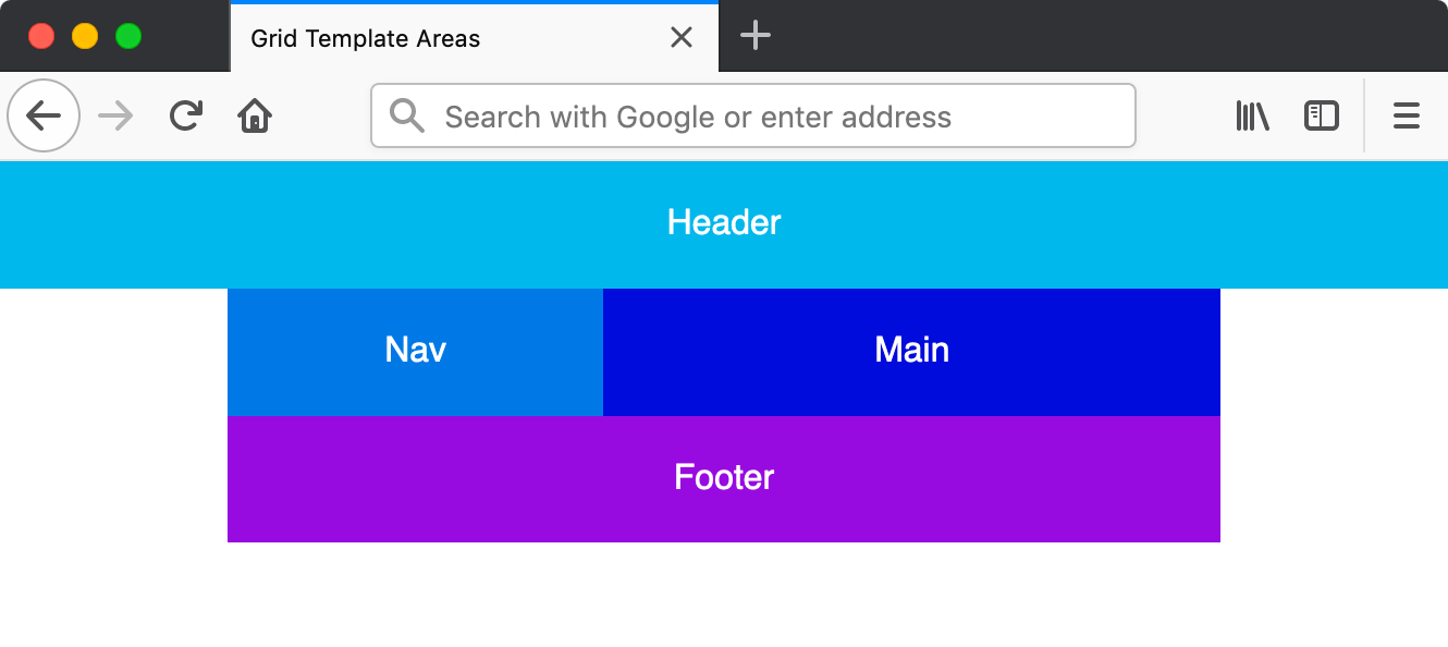
Exercise Preview
Firefox DevTools provide the best grid debugging experience with visual area name overlays and comprehensive grid inspection tools.
Exercise Overview
In this exercise, you'll master one of CSS Grid's most intuitive features: grid template areas. This powerful technique allows you to create complex layouts using named regions, making your CSS more readable and maintainable. Unlike traditional positioning methods, grid template areas let you visualize your layout directly in the code, dramatically simplifying responsive design workflows that modern web developers rely on daily.
Getting Started
Before diving into grid template areas, let's set up our development environment with the proper file structure.
- In your code editor, close any files you may have open to start with a clean workspace.
- For this exercise we'll be working with the Grid Template Areas folder located in Desktop > Class Files > yourname-Flexbox Grid Class. If you're using Visual Studio Code or a similar editor, open the entire folder to enable better IntelliSense and file navigation.
Open index.html from the Grid Template Areas folder.
- You'll notice the familiar structure: a .container div wrapping four semantic sections that form the foundation of our grid layout.
Preview index.html in Firefox (recommended for its superior grid debugging tools).
- We've intentionally omitted the orange .container border from previous exercises to focus on the clean, production-ready styling you'd implement in real projects.
- The current stacking layout works perfectly for mobile devices, but we'll transform this into a sophisticated multi-column grid layout for larger screens using modern responsive design principles.
Keep index.html open in Firefox throughout this exercise to see real-time changes as you implement each technique.
Project Setup Process
Open Project Files
Navigate to Grid Template Areas folder and open index.html in your code editor
Preview in Firefox
Open index.html in Firefox browser to view the initial stacking layout
Keep Files Open
Maintain both code editor and browser open for live preview of changes
Setting up Grid Template Areas
Now we'll implement the core concept: using named template areas to create an intuitive, visual representation of our layout directly in CSS.
- Switch back to your code editor.
- Open main.css from the css folder (in the Grid Template Areas folder).
We'll implement a mobile-first approach, adding our grid only for larger screens. Below all existing rules, create the following media query:
@media (min-width: 600px) {

}
In the min-width: 600px media query add the following code:
@media (min-width: 600px) {
   .container {
      display: grid;
      grid-template-areas:
         "nav header"
         "nav main"
         "nav footer";
   }
}
This is where the magic happens! The grid-template-areas property lets you define named regions using an ASCII-art-like syntax. Each quoted string represents a row, and each name represents a column within that row. Notice how you can immediately visualize the layout:
- The navigation column spans three rows on the left side
- The right column contains header, main, and footer sections stacked vertically
Now we'll assign our HTML elements to these named areas. Add the following code to your existing element rules:
header {
   grid-area: header;
   background: #0db8e8;
}
nav {
   grid-area: nav;
   background: #0978e2;
}
main {
   grid-area: main;
   background: #0000d5;
}
footer {
   grid-area: footer;
   background: #9700da;
}
Save the file and reload the page in Firefox.
- Expand the window beyond 600px width to see the transformation
- You should see a clean two-column layout with navigation in the left column and content sections perfectly aligned in the right column
- Switch back to your code editor to explore grid template areas' flexibility.
In the .container rule, modify the areas to create a different layout structure:
.container {
   display: grid;
   grid-template-areas:
      "header header"
      "nav main"
      "footer footer";
}
Important: Grid template areas must form rectangular regions. You cannot create L-shaped or other irregular areas—this constraint ensures consistent, predictable layouts.
Save the file and reload the page in Firefox.
- Notice how effortlessly we've restructured the entire layout with just a few character changes
- The header now spans the full width at the top, while the footer extends across both columns at the bottom—a common pattern in professional web layouts
Starting with a min-width: 600px media query ensures the grid layout only applies to larger screens, maintaining mobile-friendly stacking.
The cool thing is you can visualize the grid simply by looking at these labels!Creating Empty Grid Areas
Professional layouts often require strategic white space. Grid template areas handle this elegantly with empty grid cells, giving you precise control over negative space.
- Switch back to your code editor.
In the .container rule, modify the areas to include empty spaces using periods:
.container {
   display: grid;
   grid-template-areas:
      "header header header"
      ". nav main ."
      ". footer footer .";
}
Pro tip: You can use additional spaces for visual alignment in your CSS, and multiple consecutive periods (...) work the same as a single period, as long as they're not separated by spaces within the same grid area.
Save the file and reload the page in Firefox.
- If your layout breaks, verify that each row has the same number of columns—we now have three columns total
- The header maintains full width, while the content rows now feature symmetrical margins created by the empty grid cells
Grid Area Notation Options
| Feature | Single Period | Multiple Periods |
|---|---|---|
| Syntax | . | ... |
| Spacing Flexibility | Basic | Enhanced |
| Readability | Standard | Improved |
All grid template area rows must have the same number of columns. Mismatched column counts will break the layout.
Viewing Grid Template Area Names in Firefox's DevTools
Firefox offers industry-leading grid debugging tools that visualize your template areas directly in the browser—an invaluable asset for debugging complex layouts.
- Ctrl–click (Mac) or Right–click (Windows) anywhere in the grid and choose Inspect Element.
- In the DevTools, locate
<div class="container">and click the grid button to activate the grid overlay. - In the Grid panel, under Grid Display Settings, check Display area names.
- Ensure your window is wide enough to trigger the grid layout, and you'll see your named template areas overlaid directly on the page—exactly matching your CSS definitions!
- Close the DevTools when you're finished exploring.
DevTools Grid Inspection
Inspect Grid Element
Right-click the grid container and select Inspect Element
Enable Grid Overlay
Click the grid button next to the container div element
Display Area Names
Check 'Display area names' in Grid Display Settings to visualize named areas
Sizing the Columns
While template areas define the layout structure, you'll often need precise control over column dimensions. Let's combine template areas with explicit sizing.
- Switch back to your code editor.
In the .container rule, add explicit column sizing:
.container {
   display: grid;
   grid-template-columns: 75px 200px 1fr 75px;
   grid-template-areas:
Code Omitted To Save Space
}Key principle: The number of values in grid-template-columns must match the number of columns defined in your template areas. Here, our three-column template areas require three corresponding width values.
Save the file and reload the page in Firefox.
- The outer empty columns now measure exactly 75px—perfect for consistent page margins
- The navigation column maintains a fixed 200px width for reliable sidebar dimensions
- The main content area flexibly fills the remaining space using the 1fr unit
Column Width Distribution
Using Automatically Created Named Lines
Here's where CSS Grid's intelligence shines: when you define template areas, the browser automatically creates corresponding named grid lines. This feature enables precise positioning without manual line naming.
Let's demonstrate this by adding an overlay that spans multiple areas using these auto-generated line names. First, we'll establish a base grid for all screen sizes.
- Switch back to your code editor.
Below the body rule (outside any media query), add a mobile-first grid layout:
.container {
   display: grid;
   grid-template-areas:
      "header"
      "nav"
      "main"
      "footer";
}
In the min-width: 600px media query's .container rule, remove the redundant
display: grid;declaration:@media (min-width: 600px) { .container { grid-template-columns: 75px 200px 1fr 75px; grid-template-areas: "header header header" ". nav main ." ". footer footer ."; } }Save the file and reload the page in Firefox.
- Verify that narrow screens display a single-column stack while wider screens maintain the multi-column layout
- Switch back to your code editor and open index.html.
Add an overlay element after the footer:
<footer>Footer</footer> <div class="overlay">Overlay</div> </div>- Save the file and switch to main.css.
Below the footer rule (outside the media query), add the overlay styling:
.overlay {
   background: rgba(0,0,0,.6);
   grid-column: nav-start / main-end;
   grid-row: nav-start / footer-end;
}
The magic explained: CSS Grid automatically creates line names by adding -start and -end to your template area names. This allows precise positioning across multiple areas without calculating line numbers.
Save the file and reload the page in Firefox.
- You'll see a semi-transparent overlay covering the navigation, main content, and footer areas while leaving the header clear
- This demonstrates CSS Grid's powerful capability to layer multiple elements within the same grid space
Professional tip: The overlay appears on top because it comes last in the HTML document flow. You can control stacking order with
z-index: -1;to position elements behind others—particularly useful for background effects or decorative elements.
Automatic Named Lines Benefits
Grid allows multiple elements to occupy the same space. Stacking order follows HTML document order, with later elements appearing on top.
Overlay Implementation Steps
Ensures overlay appears on top due to document order
nav-start to main-end creates precise area coverage
rgba notation allows content visibility beneath overlay
Verify overlay works correctly across different screen sizes