Creating Dual-axis Charts in Tableau

What is a Dual-axis Chart?
A dual-axis chart is a sophisticated visualization technique that overlays two distinct datasets on a single chart, each with its own dedicated axis. This powerful approach enables you to compare disparate but related metrics within the same visual context. For instance, you might plot monthly sales data against profit margins over time, where the X-axis represents time periods while two separate Y-axes display the different value scales for each measure.
The true strength of dual-axis charts lies in their flexibility—each axis maintains independent formatting options through separate marks cards. This means you can represent one measure as a bar chart while simultaneously displaying the second measure as a line chart, creating rich, multi-layered visualizations that reveal relationships between different business metrics. In our example, we're visualizing sales performance using bars while tracking profit trends with a line overlay, providing immediate insight into both volume and profitability patterns.
Common Dual-Axis Use Cases
Sales vs Profit Analysis
Compare revenue trends with profitability over time. Use bar charts for sales volume and line charts for profit margins.
Performance Metrics
Overlay different KPIs with varying scales. Essential for dashboard creation and executive reporting.
Geographic Layering
Combine polygon fills with data points on maps. Perfect for demographic and regional analysis.
Blend Measures Vs. Dual-axis
Understanding when to use dual-axis charts versus blended measures is crucial for effective data visualization. Dual-axis charts excel when analyzing measures with significantly different scales—think revenue in millions alongside conversion rates in percentages. The separate axes prevent one measure from overwhelming the other visually.
Conversely, blended measures work best when your data shares similar scales and units. The blending approach in Tableau involves dragging one measure directly onto an existing axis, consolidating both metrics onto a shared continuous scale. This method maintains chart simplicity while enabling direct comparison of similarly scaled values. The key decision factor: are your measures naturally comparable on the same scale, or do they require independent scaling to reveal meaningful patterns?

Blend Measures vs Dual-Axis Decision Matrix
| Feature | Blend Measures | Dual-Axis Charts |
|---|---|---|
| Data Scale Requirements | Same scale measures | Different scale measures |
| Axis Configuration | Single shared axis | Two separate axes |
| Customization Level | Limited formatting | Separate marks cards |
| Visual Complexity | Simpler interpretation | More detailed analysis |
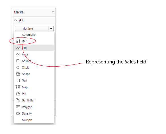
How to Create Your Dual-axis Chart in Tableau
Building a dual-axis chart in Tableau follows a straightforward workflow that transforms simple charts into powerful analytical tools. Begin by creating a standard visualization using your primary measure—this establishes your foundation chart with its initial axis and formatting.
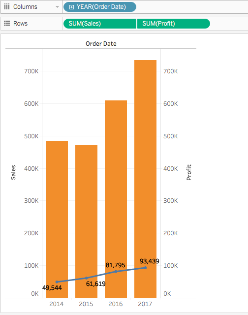
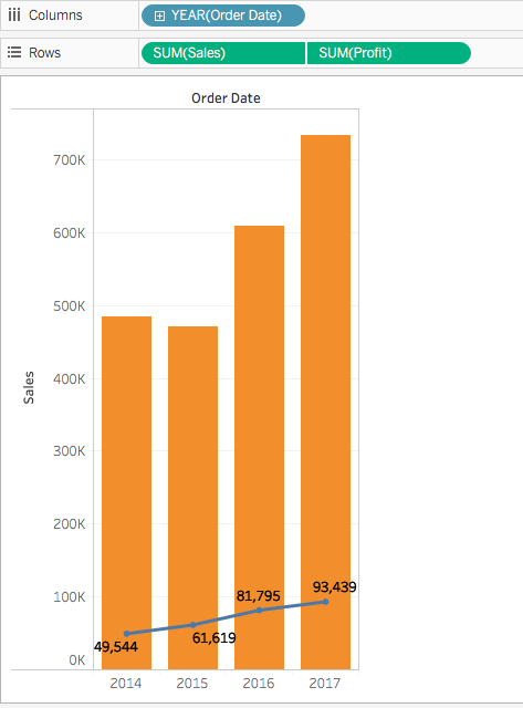
Next, drag your second measure onto the Rows shelf. Tableau automatically generates a second chart beneath the first, creating what's technically a dual-axis configuration. However, at this stage, you have two separate charts rather than the integrated dual-axis combination chart that maximizes analytical value. The real power emerges when you combine these axes to create overlapping visualizations that share the same plotting area.

Note: Tableau supports up to four layered axes in a single visualization: two positioned on the Columns shelf and two on the Rows shelf, enabling complex multi-dimensional analysis when needed.
Creating Your First Dual-Axis Chart
Create Initial Graph
Start by creating a standard chart for your first measure. This establishes your primary visualization foundation.
Add Second Measure
Drag your second measure onto the Rows shelf. Tableau automatically generates a second graph alongside the first.
Enable Dual-Axis Mode
Right-click on the second measure axis and select 'Dual Axis' to overlay the charts and create the combination view.
Customize Mark Types
Use separate marks cards to format each measure differently - bars for one measure, lines for another.
Synchronizing Axis
Axis synchronization represents a critical decision point that significantly impacts your chart's interpretability. When both measures share compatible units—such as two revenue streams or multiple cost categories—synchronizing the axes ensures accurate visual comparison by aligning their scales proportionally.
To synchronize, right-click the secondary axis (typically positioned on the right side) and select "Synchronize Axis." This action aligns the secondary axis scale to match the primary axis range, enabling viewers to make direct visual comparisons between the measures. In our example, the Profit axis serves as the secondary axis while Sales functions as the primary reference point.

Advanced formatting options provide additional control over your chart's appearance and functionality. You can hide redundant axes to reduce visual clutter while maintaining data accuracy, or reorder fields within the Rows shelf to designate which measure takes precedence as the primary axis. These adjustments help focus viewer attention on the most critical insights while preserving analytical depth.
To streamline your visualization, right-click the right-side axis and deselect Show Header to remove secondary axis labels. You can also drag measures between positions in the Rows shelf to adjust which data takes visual prominence in your final chart.
Note: Tableau's synchronization capabilities extend across different numeric data types, allowing you to align integer-based measures with decimal measures seamlessly. This flexibility supports diverse analytical scenarios without requiring data preprocessing.
Extending the Possibilities of Dual-axis
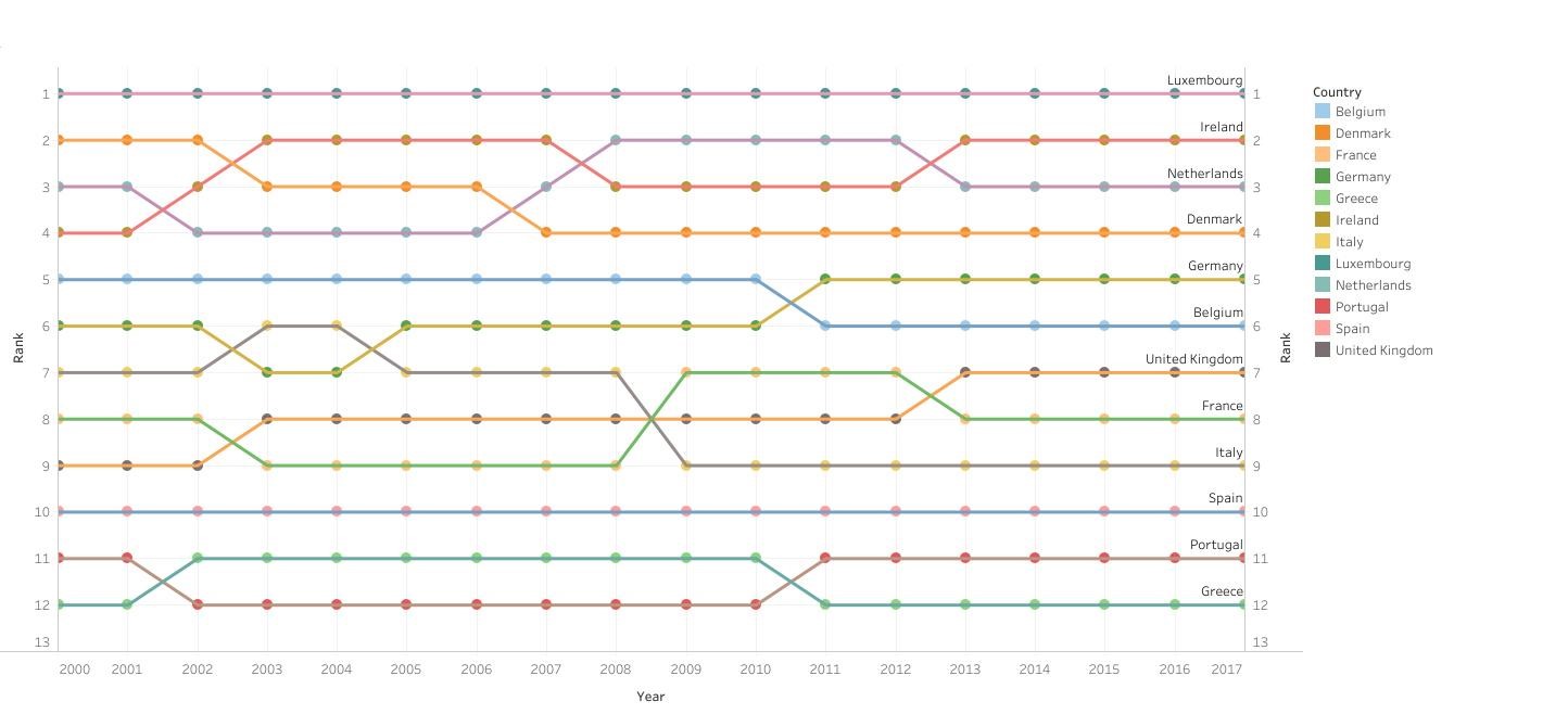
Mastering dual-axis fundamentals opens doors to sophisticated custom visualizations that go far beyond standard chart types. Advanced practitioners leverage dual-axis principles to create specialized charts like dynamic ranking visualizations, performance scorecards, and complex analytical dashboards that would be impossible with single-axis approaches.
The ranking chart example below demonstrates how dual-axis techniques can transform simple data into compelling visual narratives, combining positional data with performance metrics to create insights that drive strategic decision-making.
Axis Synchronization Considerations
Axis Management Best Practices
Ensure both measures use comparable units for meaningful synchronization
Right-click and toggle 'Show Header' to reduce visual clutter
Switch measure positions in Rows shelf to change axis hierarchy
Verify synchronization works across your entire dataset
Dual-Axis (Layered) Maps
Geographic analysis reaches new heights when dual-axis principles extend into mapping applications. Dual-axis layered maps combine multiple geographic datasets into unified visualizations that reveal spatial relationships and regional patterns impossible to detect through separate maps.
Consider a comprehensive urban analysis where polygon-filled regions display one metric (such as demographic data) while overlaid point data reveals complementary information (like infrastructure or economic indicators). The example below illustrates this approach by mapping CO2 emissions across London boroughs using color-filled polygons, while simultaneously displaying population density through proportional circle sizes on a second map layer.
-Maps.png)
Creating effective dual-axis maps requires understanding your data structure and choosing appropriate techniques based on whether you're working with generated coordinates, polygon boundaries, or hybrid geographic datasets. Each approach offers distinct advantages for specific analytical objectives, and we'll explore these methodologies in detail in upcoming advanced mapping tutorials.
Dual-axis maps combine polygon fills with point data, such as mapping CO2 emissions by borough area while showing population data through circle sizes on the same visualization.
Map Layer Combinations
Polygon + Points
Fill geographic areas with one measure while overlaying cities or locations with another measure using symbols.
Density + Categorical
Show data density through heat maps while marking specific categories or events with distinct markers.
Conclusion
Dual-axis charts represent an essential skill for any serious Tableau practitioner, bridging the gap between basic visualization and sophisticated analytical storytelling. Whether you're analyzing business performance metrics with different scales, creating custom ranking systems, or building complex geographic analyses, dual-axis techniques provide the flexibility and power needed for professional-grade data visualization.
The strategic advantage of dual-axis charts lies not just in their ability to display multiple measures simultaneously, but in their preservation of full customization capabilities for each component. This means you can fine-tune colors, shapes, sizes, and levels of detail independently for each measure, creating nuanced visualizations that communicate complex insights with clarity and impact. As organizations increasingly rely on sophisticated analytics for strategic decision-making, mastering dual-axis charts positions you to deliver the multi-dimensional insights that drive business success.
The ability to add a second axis to your chart unlocks many more possibilities in Tableau, making dual-axis charts some of the most useful charts.