Getting Started with Maps in Tableau
In today's data-driven world, understanding the "where" behind your data has become critical for strategic decision-making. Tableau stands out as the premier platform for geographic data visualization, offering unmatched flexibility and seamless integration with your datasets. This comprehensive three-part guide explores Tableau's robust mapping capabilities, empowering you to transform location-based data into actionable insights that drive business value.
Why Maps Are Essential for Data Analysis
Geographic visualization reveals patterns and relationships that traditional charts simply cannot capture. Maps enable you to perform sophisticated location-based analysis—comparing regional performance, identifying distribution patterns, tracking geographic trends over time, and uncovering spatial correlations that might otherwise remain hidden. When strategically combined with complementary visualizations in a dashboard environment, maps become powerful engines for comprehensive data storytelling that can influence critical business decisions.
The spatial context that maps provide is particularly valuable for industries like retail, logistics, healthcare, and urban planning, where location intelligence directly impacts operational efficiency and strategic planning.
Tableau's Comprehensive Mapping Arsenal
Tableau's mapping capabilities extend far beyond basic geographic plotting. The platform supports an extensive range of visualization types, including choropleth maps for regional comparisons, proportional symbol maps for quantitative analysis, heat maps for density visualization, dot density maps for distribution patterns, flow maps for movement tracking, spider maps for network analysis, and numerous specialized variants tailored to specific analytical needs.
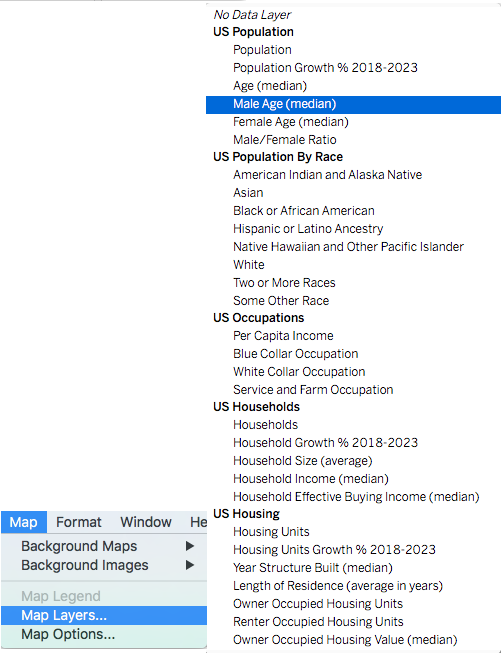
What sets Tableau apart is its integration with rich demographic and census data layers. The platform includes built-in access to population statistics, income distributions, age demographics, and other standardized datasets that can be seamlessly overlayed onto your custom data, providing instant context without requiring external data sourcing.
You can access these powerful features through Tableau's intuitive interface under Map > Map Layers
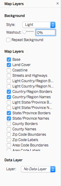
Beyond demographic overlays, Tableau provides granular geographic detail controls, allowing you to enhance your maps with county boundaries, ZIP code areas, street-level detail, and administrative regions. This flexibility ensures your visualizations can scale from high-level strategic overviews to detailed operational analysis.
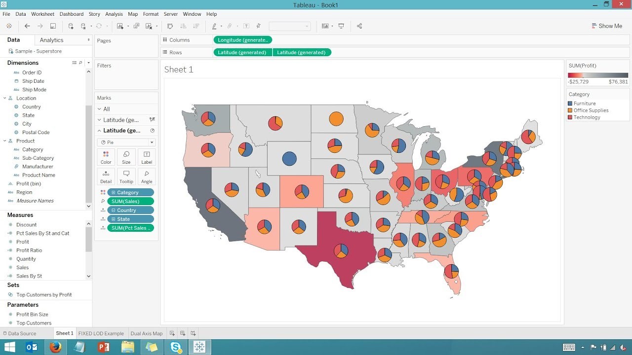
Advanced Multi-Layer Mapping with Dual-Axis Functionality
Tableau's dual-axis capabilities unlock sophisticated multi-dimensional mapping possibilities that elevate your analysis beyond simple geographic plotting. This advanced feature allows you to layer multiple visualization types on a single map, creating rich, information-dense displays that communicate complex relationships effectively.
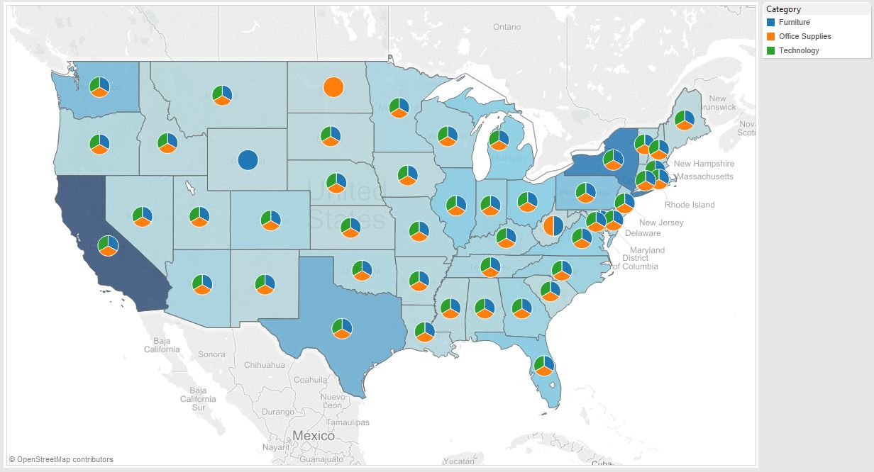
Consider combining choropleth regions with proportional circles to simultaneously show categorical distributions and quantitative metrics, or overlay pie charts on filled maps to display percentage breakdowns across geographic areas. You can use color gradients to represent one variable while employing symbol sizes for another, creating nuanced visualizations that capture multiple data dimensions in a single, coherent view.
-> Read our previous article to familiarize yourself with using Dual-axis charts.
Streamlined Map Creation Process
Tableau's intelligent geographic recognition engine dramatically simplifies map creation by automatically identifying and processing location data in your datasets. Whether your data contains precise coordinates, recognizable location names, postal codes, or administrative regions, Tableau seamlessly converts this information into mappable elements.
The process is remarkably straightforward: simply double-click on any geographic field (identified by the distinctive ![]() icon), and Tableau instantly generates an interactive map. From there, you can layer additional data dimensions, apply filters, and customize the visualization to meet your specific analytical requirements. The resulting maps integrate seamlessly with Tableau's sharing and collaboration features, enabling instant distribution to stakeholders.
icon), and Tableau instantly generates an interactive map. From there, you can layer additional data dimensions, apply filters, and customize the visualization to meet your specific analytical requirements. The resulting maps integrate seamlessly with Tableau's sharing and collaboration features, enabling instant distribution to stakeholders.
Custom Image-Based Mapping Solutions
For specialized use cases requiring non-traditional geographic contexts, Tableau supports custom image-based mapping—a powerful feature for analyzing data within unique spatial frameworks such as building layouts, facility maps, custom territories, or proprietary geographic regions.
This approach treats uploaded images as coordinate systems based on pixel dimensions, allowing you to plot data points anywhere within the image boundaries. Access this functionality through Maps > Background Images to begin creating your custom mapping solution.
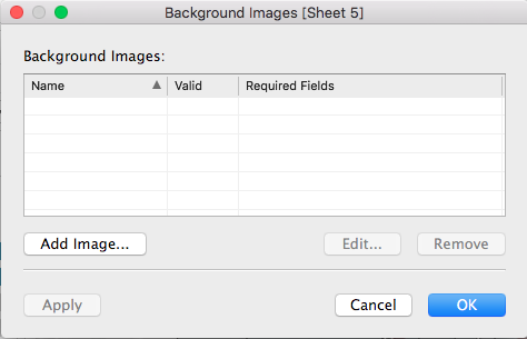
Note: While image-based mapping offers complete control over spatial representation—ideal for floor plans, campus maps, or specialized geographic contexts—it requires manual coordinate specification for each data point. This approach is most efficient when working with a limited number of precisely positioned elements or when standard geographic mapping doesn't meet your visualization requirements.
Once your image map is configured and coordinate data is properly structured, removing the traditional axes creates a clean, professional visualization that focuses attention on your annotated data points within the custom geographic context.
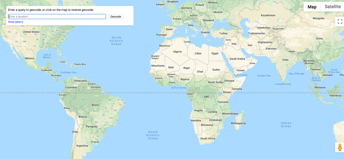
Geocoding Strategies for Address-Based Data
When working with street addresses rather than structured geographic identifiers, geocoding becomes essential for accurate spatial visualization. Geocoding translates physical addresses into precise latitude and longitude coordinates, enabling accurate map placement and spatial analysis.
Numerous online geocoding services offer this functionality, ranging from free tools suitable for small datasets to enterprise-grade solutions designed for high-volume processing. When selecting a geocoding service, consider factors such as processing limits, accuracy requirements, data privacy policies, and integration capabilities with your existing workflow.
Leveraging Spatial Files and GIS Integration
For advanced geographic analysis, Tableau's support for spatial file formats opens up sophisticated mapping possibilities. The platform seamlessly integrates with data from GIS systems, R spatial packages, and various custom geographic data sources, enabling you to incorporate specialized boundary definitions, custom territories, and proprietary geographic datasets.
This capability is particularly valuable for organizations requiring precise geographic boundaries that differ from standard administrative regions, such as sales territories, service areas, or custom market definitions. Spatial files also enable analysis of complex geographic features like watersheds, transportation networks, or specialized administrative boundaries.
 (Image Source)
Our upcoming second installment will provide detailed guidance on implementing GIS file integration within Tableau, including best practices for data preparation, performance optimization, and advanced spatial analysis techniques.
Map Types Available in Tableau
Choropleth Maps
Fill geographic regions with colors based on data values. Perfect for showing data density across territories and comparing regional performance metrics.
Proportional Symbol Maps
Use varying circle sizes to represent data magnitude. Ideal for displaying quantities like sales volume or population across different locations.
Heat Maps
Show data intensity through color gradients. Excellent for identifying hotspots and patterns in geographic distribution of your metrics.
Flow Maps
Visualize movement and connections between locations. Perfect for tracking shipments, migration patterns, or network relationships.
Creating Your First Map in Tableau
Identify Geographic Fields
Look for fields with geographic icons next to them, such as country names, zip codes, or coordinates that Tableau automatically recognizes.
Double-Click to Generate
Simply double-click on the geographic field to automatically generate a map visualization with your data plotted on appropriate locations.
Customize and Layer
Add additional data dimensions, apply color coding, adjust sizing, and layer multiple data sets using dual-axis functionality.
Share and Integrate
Share your completed map with a single click or integrate it into dashboards where it can filter and interact with other visualizations.
Tableau includes census-based population, income, and demographic datasets that can be overlayed on your data. Access these through Map > Map Layers to add context without additional data preparation.
Standard Maps vs Custom Image Maps
| Feature | Geographic Data Maps | Custom Image Maps |
|---|---|---|
| Setup Time | Instant recognition | Manual coordinate entry |
| Data Requirements | Standard locations | Custom coordinates |
| Flexibility | Global coverage | Any custom space |
| Use Cases | Regional analysis | Floor plans, custom areas |
Geocoding Addresses vs Using Zip Codes
Advanced Mapping Preparation Checklist
Ensure Tableau displays geographic icons next to location fields
Plan combination of choropleth maps with symbol overlays for multi-dimensional analysis
Use external tools to convert addresses to coordinates if needed
Prepare GIS or R-generated spatial data files for advanced geographic analysis
Select appropriate demographic overlays and boundary details like counties or zip codes
Conclusion
Geographic visualization represents a transformative approach to data analysis, revealing insights that remain invisible in traditional chart formats. Tableau's comprehensive mapping platform democratizes sophisticated spatial analysis by treating maps as integral components of your analytical toolkit rather than specialized add-ons.
The platform's advanced features—including dual-axis layering, extensive customization options, and rich demographic integration—create mapping possibilities that extend far beyond the capabilities of conventional tools like Excel. This spatial intelligence becomes even more powerful when maps function as interactive filters within dashboard environments, creating dynamic analytical experiences that enable stakeholders to explore data relationships intuitively.
As organizations increasingly recognize location as a critical data dimension, mastering Tableau's mapping capabilities positions you to deliver insights that drive strategic decision-making and competitive advantage. The investment in geographic visualization skills pays dividends across industries, from optimizing supply chains to identifying market opportunities to improving customer experience through location-aware strategies.
Tableau simplifies mapping by treating maps like any other graph, enabling rich data visualization through tools like dual-axis combinations.Maps in Tableau dashboards can filter data from other charts, creating interactive analysis environments where geographic insights drive exploration across all visualizations.