Building on our previous exploration of GIS spatial files for map visualizations, this article delves into advanced choropleth mapping techniques that will elevate your data storytelling capabilities. Master these approaches to create compelling, multi-layered visualizations that reveal complex geographical patterns and relationships.
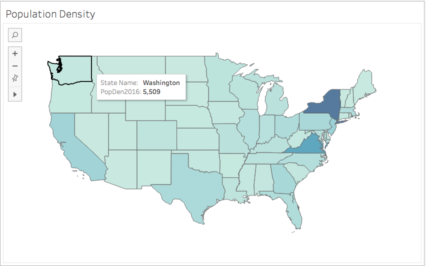
Fig 1.
Displaying Multiple Fields on Your Map
Modern data analysis often requires displaying multiple variables simultaneously to uncover correlations and patterns that single-field maps miss. The dual-axis function in mapping tools provides an elegant solution by allowing you to layer multiple datasets, creating rich, multi-dimensional visualizations that tell more complete stories.
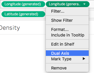
The process begins with establishing your base layer. In this example, we create a map with the population field mapped using color encoding (fig 1.). To add a second layer, drag the Longitude (generated) field to the column mark. This action generates a duplicate map, and both visualizations will appear side by side in your Tableau workspace—setting the stage for combination.
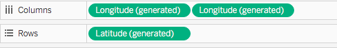
The magic happens when you right-click the second longitude pill and select "Dual Axis" from the dropdown menu. This combines both charts into a single, layered visualization that can display multiple data dimensions without overwhelming your audience.
Once combined, your marks card will show two longitude entries, each controlling a separate layer. Remove the population field from the top longitude entry, then drag your secondary field to this layer. Select the circle symbol from the mark type dropdown to differentiate this layer visually. For enhanced clarity and immediate data comprehension, drag the secondary field to the label marks to display actual values directly on the map.
This layered approach proves invaluable when analyzing relationships between demographic, economic, or environmental factors across geographical regions, enabling stakeholders to identify correlations that drive strategic decision-making.
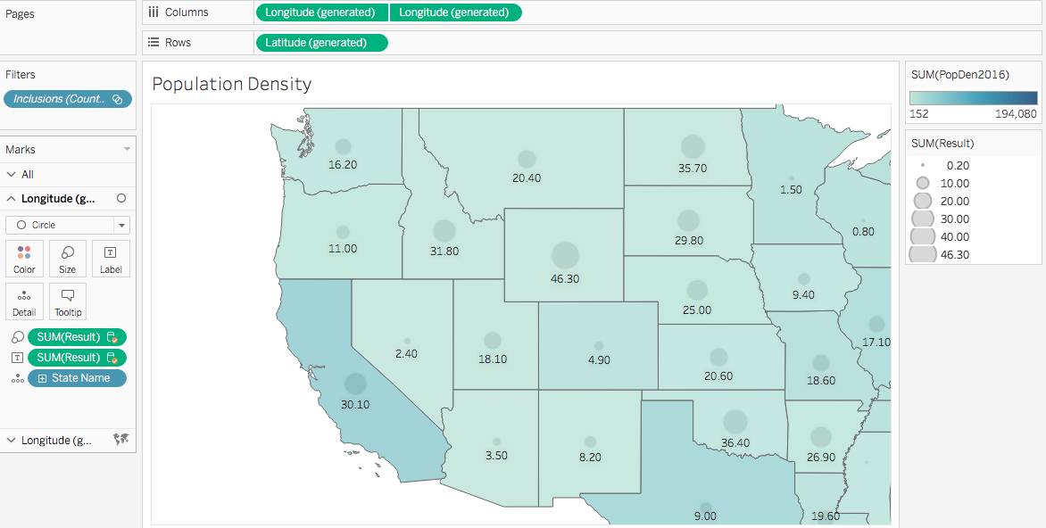
Fig. 2
Bivariate Maps to Compare Similar Fields
When analyzing two related variables of similar magnitude and importance, traditional dual-axis mapping often falls short. Consider the challenge of comparing obesity rates and physical inactivity levels across counties—both critical public health indicators that likely influence each other.
In fig 3., we've represented obesity rates in orange and physical inactivity in red for each county. While visually appealing, this approach creates analytical friction: overlapping colors obscure patterns, making it nearly impossible to identify counties where both variables are high, low, or inversely related. The human eye struggles to process these competing visual signals effectively.
This limitation highlights why bivariate mapping has become the gold standard for comparing related variables. Rather than forcing viewers to mentally overlay separate datasets, bivariate techniques encode both variables into unified visual elements that reveal relationships at a glance.
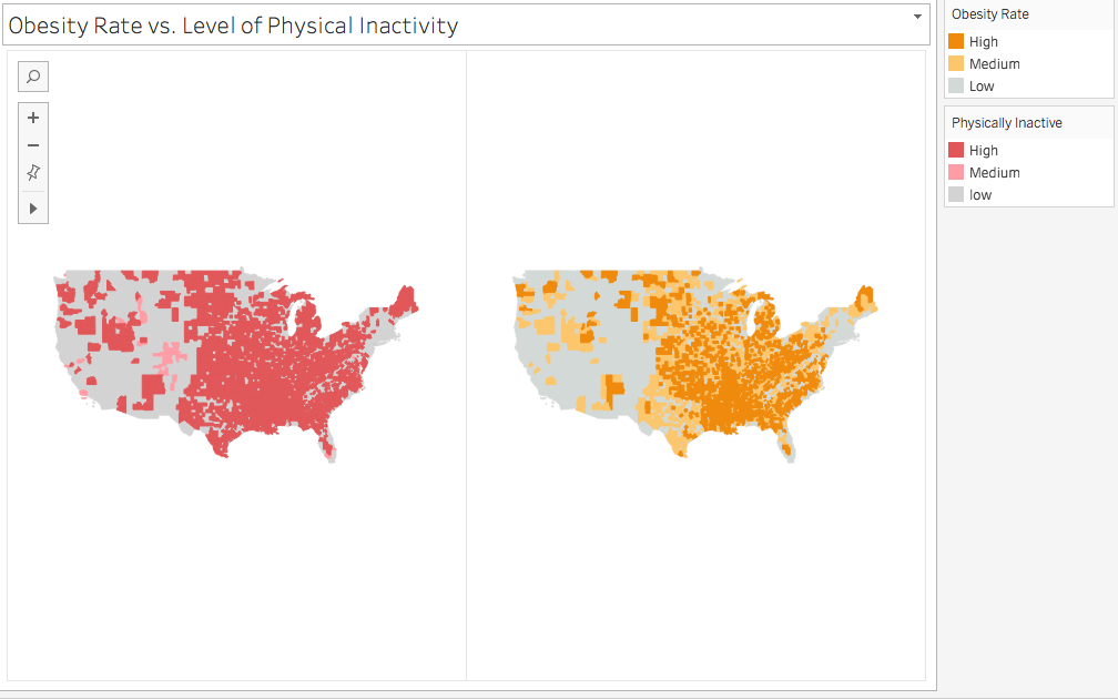
Fig. 3
What is a Bivariate Map?
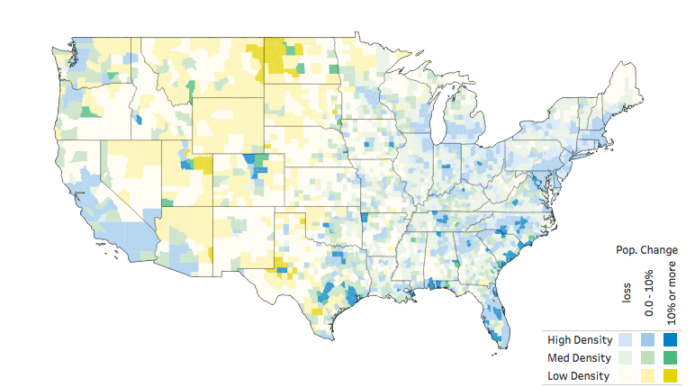
Fig. 4 -source: Sarah Battersby
https://public.tableau.com/profile/sarah.battersby#!/
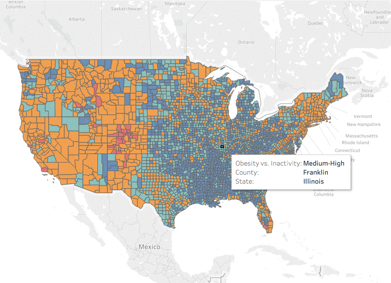
A bivariate map transforms the challenge of comparing two variables into an elegant visual solution. As demonstrated in fig. 4, this technique allows you to simultaneously explore the influence of both variables within each geographical unit, revealing patterns that would remain hidden in separate visualizations.
The genius lies in the color encoding: each polygon receives a composite color that reflects both variables' values. Think of it as digitally mixing paint—each county is "painted" with a blend that represents its position along both data dimensions simultaneously. Areas with high values for both variables might appear in deep purple (combining red and blue), while regions with mixed values show intermediate hues.
This approach has gained significant traction in fields ranging from epidemiology to market analysis, where understanding variable interactions drives critical insights. By 2026, bivariate mapping has become essential for analysts working with socioeconomic data, environmental monitoring, and business intelligence applications.
How to Create a Bivariate Choropleth Map?
Creating effective bivariate maps requires strategic data classification to ensure readability and analytical value. The key is grouping your continuous data into discrete classes—typically three levels (low, medium, high) per variable to avoid overwhelming complexity. This creates nine possible combinations that viewers can easily distinguish and interpret.
Using our health data example from fig. 3, we establish clear classifications for both variables:
The technical implementation begins with calculating quantile breaks for each attribute using calculated fields. For obesity rates, we employ the following formula that automatically determines data-driven breakpoints:
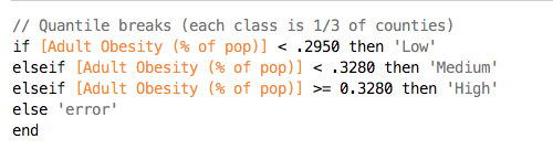
This calculation converts continuous data into a categorical dimension, which you can then drag to the color marks to apply the classification legend shown above. The quantile approach ensures balanced distribution across categories, preventing outliers from skewing your classification scheme.
The final step involves combining both classified attributes into a single dimension using a concatenated formula that creates unique combinations:
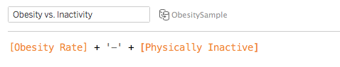
This combined field becomes the foundation for your bivariate color scheme, where each unique combination receives its own color that reflects both variables' contributions. The result is a sophisticated visualization that enables immediate pattern recognition across complex geographical datasets.
Conclusion
While data classification introduces an element of analytical judgment, bivariate mapping represents one of the most powerful techniques for revealing geographical patterns in complex datasets. The approach we've explored transforms overwhelming multi-variable data into accessible, actionable insights that support evidence-based decision-making.
The strategic value extends beyond technical visualization—these maps become communication tools that help stakeholders quickly identify priority areas, resource allocation opportunities, and intervention targets. As we continue building your mapping expertise, our next article will dive deep into color theory and custom legend creation for bivariate visualizations, ensuring your maps not only reveal insights but communicate them with maximum impact.
Creating Multi-layered Maps: Step-by-Step Process
Create Initial Map Layer
Start with your base map and apply the first data field using color marks. This establishes your primary visualization layer with population or your chosen metric.
Generate Dual Axis
Drag Longitude (generated) to columns to create a duplicate map. Select Dual Axis from the dropdown menu to combine both charts into layered visualization.
Configure Second Layer
Remove the population field from the top longitude marks card. Add your second data field and select circle symbols for clear differentiation between layers.
Enhance with Labels
Drag the second field to label marks to display values directly on the map, providing immediate context and improving data accessibility.
Bivariate Maps vs Traditional Layered Approach
When creating bivariate maps, limit each variable to maximum 3 groups (low, medium, high) to maintain readability and avoid overwhelming your audience with too many color combinations.
Bivariate Map Data Groups Structure
Pre-Implementation Checklist
Ensures accurate polygon rendering and prevents visualization errors
Creates meaningful classification groups for bivariate analysis
Ensures your visualization is readable by users with color vision differences
Helps users interpret bivariate color combinations correctly
Confirms that comparing your chosen fields will provide meaningful insights
Although classifying our data fields into groups introduces some level of subjectivity, it is nonetheless a reliable way to represent our data to see the pattern on our map.