Building sophisticated distribution charts is only half the battle—if you can't extract meaningful insights from them, you're leaving analytical power on the table. While terms like modality, skewness, and kurtosis may sound intimidating, these concepts are surprisingly intuitive and form the foundation of effective data analysis. Consider the graph below: what immediately catches your eye? Most analysts notice that the distribution peaks sharply at 50, with no other significant peaks—just minor fluctuations across the range.
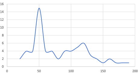
In statistical terms, this distribution is unimodal—it contains exactly one peak. If another point in this graph reached the same frequency level as our peak at 50, we'd classify it as bimodal. When multiple points share the maximum frequency value, the distribution becomes multimodal. While these concepts may seem elementary, they're critical for data scientists and machine learning engineers who need to model real-world phenomena accurately. Understanding modality helps you identify whether your data represents a single underlying process or multiple competing forces—knowledge that directly impacts model selection and performance.
Skewness
Skewness reveals the asymmetry in your data distribution, and it comes in three flavors: positive, negative, and symmetric. Positive skewness occurs when the distribution's long tail extends toward higher values, often indicating rare but significant high-end outliers—think income distributions or website traffic spikes. Negative skewness shows the opposite pattern, with the tail stretching toward lower values. Symmetric distributions exhibit no skew and mirror the classic bell curve we covered in our previous discussion of standard deviation and variance.
Looking at the graph above, can you determine whether it displays positive, negative, or symmetric skewness? The practical importance of skewness extends far beyond academic curiosity. In 2026's data-driven landscape, virtually no real-world dataset follows a perfect normal distribution. Customer behavior, financial markets, user engagement metrics—all exhibit some degree of skewness. Recognizing and accounting for this asymmetry is essential for building predictive models that perform reliably in production environments.
Types of Skewness in Data Distribution
| Feature | Positive Skew | Negative Skew | Symmetric |
|---|---|---|---|
| Tail Direction | Long tail on positive side | Long tail on negative side | No tail bias |
| Peak Position | Left of center | Right of center | Center |
| Data Concentration | Lower values | Higher values | Even distribution |
| Real-world Impact | Affects model predictions | Requires adjustment | Ideal for modeling |
Almost all real-world data is not perfectly distributed, making skewness analysis crucial for accurate model predictions. You must understand what skewness tells you and incorporate that knowledge into your model design.
Kurtosis
While skewness measures asymmetry, kurtosis examines the "tailedness" of your distribution—essentially quantifying how prone your data is to extreme values compared to a normal distribution. Think of kurtosis as your early warning system for outliers. High kurtosis signals heavy tails packed with extreme values, which can wreak havoc on regression models and prediction algorithms. When data scientists encounter high kurtosis, it's often a signal to reconsider model assumptions, apply robust statistical methods, or investigate data quality issues.
Conversely, low kurtosis might initially seem reassuring, suggesting well-behaved data with few outliers. However, experienced analysts know that extremely low kurtosis can indicate data quality problems—perhaps duplicate records, artificial truncation, or overly aggressive preprocessing. The key is finding the sweet spot that reflects genuine patterns rather than data artifacts.
While mathematical formulas exist to calculate precise skewness and kurtosis values, the computational complexity isn't your concern—modern Python libraries handle these calculations seamlessly. What matters is your ability to interpret these metrics and translate them into actionable modeling decisions.
This foundation in statistical distribution analysis transcends any single programming language or tool. Whether you're working in Python, R, or emerging platforms, understanding how your data behaves is fundamental to extracting reliable insights. Python's rich ecosystem of statistical libraries makes implementing these analyses straightforward, but the conceptual framework we've discussed here applies universally across data science workflows.
Kurtosis Levels in Model Analysis
High kurtosis in regression analysis should cause data scientists to rethink their model, while extremely low kurtosis might indicate duplicate data in your initial model.
Analyzing Distribution Characteristics
Identify Modality
Determine if your data has one peak (unimodal), two peaks (bimodal), or multiple peaks (multimodal) at the same frequency level
Measure Skewness
Analyze whether the long tail extends in positive direction, negative direction, or if the distribution is symmetric
Evaluate Kurtosis
Compare your data tails to normal distribution tails to measure outliers and assess model confidence
Apply to Machine Learning
Use skewness and kurtosis together to judge probability of events and adjust your predictive models accordingly
See Our Python and Related Programs:
Learning Path Recommendations
Python Classes and Certificates
Build foundational programming skills essential for implementing statistical analysis. Master the core language before diving into specialized libraries.
Data Science Classes
Advance your understanding of statistical concepts like skewness and kurtosis. Learn to apply these concepts in real-world machine learning scenarios.
While the mathematical formulas for skewness and kurtosis are complex, Python libraries provide built-in attributes for these calculations. Focus on understanding the concepts now and implementation techniques later.