Strategic color choices can transform your data visualization from confusing charts into compelling, actionable insights. When your audience can instantly distinguish patterns, trends, and outliers through thoughtful color application, they're far more likely to grasp your key findings and make informed decisions based on your analysis.
Using Tableau Color Tools
Qualitative value fields
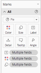
figure 1
When you drag a discrete field (typically a dimension) into the Color Marks card, Tableau automatically assigns a unique color to each value within that field (fig 1). This creates an immediate visual distinction between categories—whether you're comparing sales regions, product lines, or customer segments. To refine these colors for maximum impact, click the "More colors" button to access Tableau's extensive categorical palettes, each designed for specific data storytelling scenarios (fig 2).
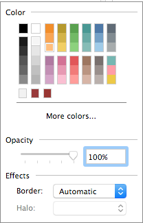 figure 2
Quantitative value fields
Continuous data tells a different visual story and requires a graduated color approach. When you assign a continuous field (typically a measure) to the Color Marks card, Tableau creates a color gradient that represents the full range of your data values. This technique is particularly powerful for revealing performance hotspots, geographic concentration patterns, or temporal trends—as shown in this sales performance example (fig 3).
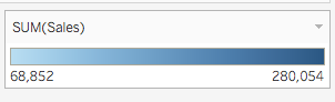 figure 3
Fine-tuning these color ranges ensures your data story remains clear and compelling. To customize the gradient, click the dropdown arrow in the upper right of the color legend and select "Edit Colors" (fig 4). This opens advanced controls that let you align colors with your audience's expectations and your organization's visual standards.
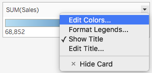 figure 4
Diverging Color Scales
Diverging color scales excel when your data has a meaningful center point—such as profit/loss scenarios, variance from targets, or performance above and below benchmarks. Think of diverging scales as two complementary gradients that meet at a neutral midpoint, allowing viewers to instantly identify positive and negative deviations (fig 5). You can modify the color distribution and enable options like "Stepped Color" for discrete intervals or "Reversed" to flip the scale orientation based on your analytical narrative.
For precise control over your diverging scale, select the "Advanced" button to define specific Start, End, and Center values (fig 6). The Start represents your data's lower boundary, the End marks the upper limit, and the Center establishes where your neutral point sits on the scale—critical for ensuring accurate visual interpretation of your data's true distribution.
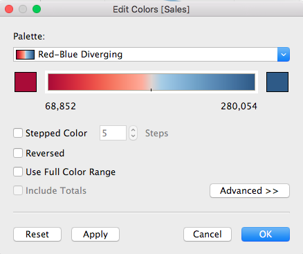 figure 5
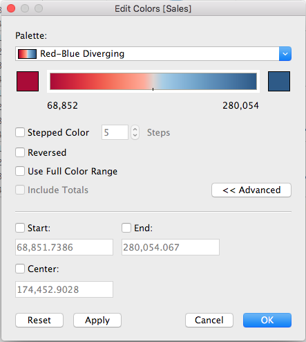 figure 6
What to consider when choosing colors? 
Effective color strategy goes far beyond aesthetic appeal—it's about creating immediate comprehension and driving action. While color coding your dimensions and measures enhances differentiation and reveals hidden patterns within your data, successful implementation requires balancing visual impact with cognitive accessibility. The following principles will help you make color choices that strengthen rather than distract from your analytical insights.
-
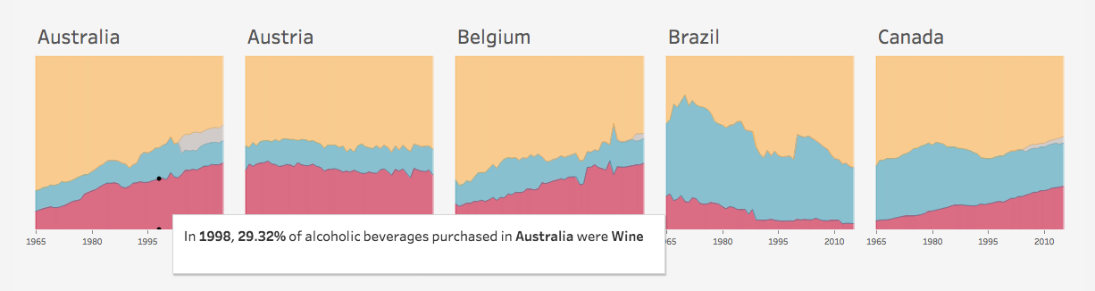
Align with industry and cultural context: Your visualization doesn't exist in a vacuum. Industry conventions and cultural associations significantly impact how your audience interprets color choices. In highly regulated sectors like banking and finance, conservative palettes featuring blues, grays, and muted tones communicate credibility and stability. Conversely, technology and creative industries often embrace bolder, more dynamic color schemes that signal innovation and forward-thinking.
 Credit Suisse Global Wealth Report 2019
-
Honor organizational brand guidelines: Your data visualizations are extensions of your company's brand identity. Most established organizations have detailed style guides that specify approved color palettes, usage hierarchies, and combination rules. Following these guidelines not only ensures visual consistency across all communications but also reinforces brand recognition and professional credibility with your stakeholders.
-
Maintain consistency across related visualizations: When presenting multiple charts that share common variables, use identical colors for the same data elements throughout your presentation. This consistency eliminates cognitive load and allows your audience to effortlessly compare insights across different views. Inconsistent color coding forces viewers to constantly relearn your visual language, undermining the clarity you're trying to achieve.
 Source: Tableau
 -
Deploy strategic accent colors: The most compelling data stories use color selectively to guide attention toward critical insights. Reserve one or two vibrant accent colors for highlighting key findings, outliers, or call-to-action elements. This restraint creates visual hierarchy and ensures your most important messages don't get lost in a rainbow of competing colors. The strategic use of accent colors transforms passive charts into persuasive analytical narratives.
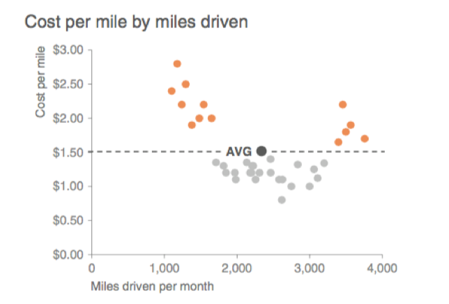
Source: Storytelling with data
-
Apply intuitive intensity mapping for continuous data: Human perception naturally associates lighter colors with smaller quantities and darker colors with larger values. Honor this cognitive convention by mapping light tints to lower values and rich, saturated tones to higher values in your range. This intuitive approach allows viewers to instantly gauge relative magnitude without consulting legends or scales, making your visualizations more accessible and actionable.

-
Optimize contrast for clarity: Insufficient contrast renders even the most insightful data virtually unusable. Achieve optimal contrast through two proven approaches:
-
The spotlight method: Use neutral grays for background data and reserve a single, vibrant accent color for your key narrative elements. This approach immediately draws attention to your most important findings while maintaining visual context.
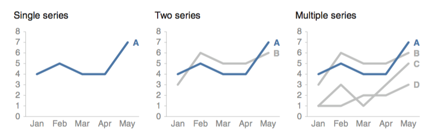
Source: Storytelling with data
-
High-contrast pairing: When displaying multiple data series simultaneously, position the most contrasting colors adjacent to each other. This technique is particularly crucial for text overlays and label readability. Poor contrast choices can render your insights completely inaccessible, regardless of the quality of your underlying analysis.
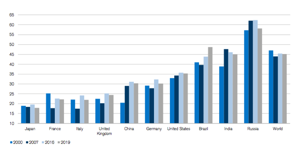 Credit Suisse Global Wealth Report 2019
-
Design for color vision accessibility: Approximately 8% of men and 0.5% of women experience some form of color vision deficiency. Designing exclusively for typical color vision excludes a significant portion of your potential audience and may violate accessibility standards increasingly required in corporate and government settings. Test your visualizations using tools like the Color Blindness Simulator to ensure your insights remain clear across all types of color perception. Consider supplementing color coding with patterns, shapes, or direct labeling for critical information.
Qualitative vs Quantitative Color Applications
| Feature | Qualitative Fields | Quantitative Fields |
|---|---|---|
| Data Type | Discrete values (dimensions) | Continuous values (measures) |
| Color Display | Distinct color per value | Continuous color range |
| Palette Type | Categorical palettes | Sequential/diverging scales |
| Best Use Case | Category differentiation | Value magnitude representation |
Setting Up Diverging Color Scales
Conceptualize the Scale
Think of diverging colors as two sequential scales sharing a low value with customizable distribution and properties.
Access Advanced Options
Click the Advanced button to set Start, End, and Center values for precise control over your color range.
Configure Range Values
Set Start as lower limit, End as upper limit, and Center as the mid-point position on your scale.
More Resources:
-
The Power of The Palette: Why Color is Key in Data Visualization and How to Use It
-
Adobe Color Wheel
-
Coblis: Color Blindness – learn all about it
Author Bio:
This post was written by Faycal Bouguir, a UX & Data Visualization specialist based in NYC. He teaches Data Visualization using Tableau at leading career development centers, helping professionals transform complex data into compelling visual narratives that drive business decisions.