Topics Covered in This JavaScript & jQuery Tutorial:
Grouping the Photos into a Gallery, Adding Captions, Removing the Counter, Customizing the Appearance
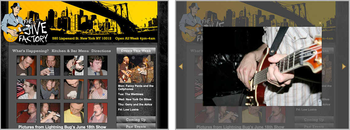
Exercise Preview
Exercise Overview
When users click thumbnail images to view larger versions, the implementation strategy significantly impacts user experience and site performance. Traditional approaches like linking to separate pages force users through disruptive navigation cycles, while pop-up windows—once popular but now largely deprecated—fail on mobile devices and trigger browser blockers due to their association with intrusive advertising.
The modern solution leverages JavaScript to create elegant "lightbox" overlays that display images within the current page context. This approach delivers seamless user interactions: visitors can navigate between photos using intuitive controls, close galleries with keyboard shortcuts, and maintain their browsing flow without page refreshes. In this comprehensive exercise, you'll master the implementation of Magnific Popup, a robust and lightweight jQuery lightbox plugin that has powered millions of professional websites since its introduction.
This tutorial uses Magnific Popup, a free responsive jQuery lightbox plugin that creates elegant image galleries with keyboard navigation and customizable styling options.
Getting Started
Launch your preferred code editor and ensure all previously opened files are closed to maintain a clean workspace.
Navigate to the Lightbox-Gallery project folder located at Desktop > Class Files > yourname-JavaScript jQuery Class. If your editor supports project folders (like Visual Studio Code, Sublime Text, or Atom), open the entire directory for enhanced file navigation.
Open photo-gallery.html from the Lightbox-Gallery folder to examine the base markup structure.
Preview photo-gallery.html in Chrome (we'll leverage Chrome DevTools extensively for debugging and customization).
Test the current functionality by clicking several gallery thumbnails. Notice how they behave as standard links, redirecting to full-size images on separate pages—exactly the user experience we'll be improving.
Keep the browser tab open for easy switching as we implement the lightbox functionality.
Now that we've established our baseline, let's transform this basic photo gallery into a professional-grade lightbox experience.
Setup Requirements
Start with a clean workspace for better focus
Located in Desktop > Class Files > yourname-JavaScript jQuery Class
This contains the base gallery markup we'll enhance
We'll use Chrome DevTools for debugging and inspection
Linking to the Plugin Files
We've included the complete Magnific Popup library in your class files, though you can always download the latest version, documentation, and examples from dimsemenov.com/plugins/magnific-popup. This plugin remains actively maintained and trusted by developers worldwide for its performance and flexibility.
Magnific Popup follows standard jQuery plugin architecture, requiring three core dependencies: jQuery (already linked in your project), the Magnific Popup JavaScript file, and the Magnific Popup CSS file. The loading order matters significantly—CSS should load before your custom styles to enable proper cascading, while JavaScript must load after jQuery but before your initialization code.
Return to photo-gallery.html in your code editor.
Locate the CSS link section around line 6. Add the Magnific Popup stylesheet before your custom CSS to ensure your styles can override plugin defaults when needed:
<title>The Jive Factory</title>
   <link rel="stylesheet" href="js/vendor/magnific/magnific-popup.css">
   <link rel="stylesheet" href="css/main.css">
</head>
Navigate to the JavaScript section around line 109. Add the Magnific Popup script after jQuery but before your main JavaScript file:
<script src="js/vendor/jquery-2.1.0.min.js"></script>
<script src="js/vendor/magnific/jquery.magnific-popup.min.js"></script>
<script src="js/main.js"></script>
Save the file and verify your syntax is clean—missing quotes or incorrect paths will prevent the plugin from loading.
With our dependencies properly linked, we're ready to initialize the lightbox functionality.
Required Plugin Files
jQuery Library
Already included in the project as the foundation for the plugin
Magnific Popup CSS
Link before custom CSS so your styles can override plugin defaults
Magnific Popup JavaScript
Add after jQuery but before your custom scripts for proper initialization
Initializing the Pop-up
Our dependencies are now linked, so we can initialize Magnific Popup using a configuration snippet from the official documentation. Open magnific-example.js from the snippets folder to examine the basic implementation pattern.
This code demonstrates the core magnificPopup() method. The current selector targets all anchor tags (a), automatically converting any link into an image lightbox trigger. Copy all the code for integration into your main script.
Open main.js from the js folder.
Navigate to line 34, position your cursor after the // Lightbox comment, and paste the initialization code:
// Lightbox
   $('a').magnificPopup({
      type: 'image'
   });

});
Save main.js.
Switch to Chrome and reload photo-gallery.html.
Test any of the 12 gallery thumbnails. The lightbox should now display enlarged images with a darkened page overlay. Close the popup using the X button or by clicking outside the image.
Now click the The Jive Factory logo in the top-left corner. This triggers an error because the logo links to index.html, not an image file. Our overly broad selector is targeting every link on the page—clearly problematic for navigation elements.
Return to main.js in your code editor.
Refine the selector to target only gallery links by leveraging the #gallery container div around line 34:
$('#gallery a').magnificPopup({
   type: 'image'
});
Save main.js.
Switch to Chrome and reload photo-gallery.html.
Verify the fix by testing both gallery thumbnails (should work) and the logo link (should behave normally). This targeted approach prevents conflicts with site navigation while enabling lightbox functionality exactly where needed.
Excellent! Our lightbox is now functional and properly scoped. Next, we'll enhance it with gallery navigation capabilities.
Initially targeting all 'a' tags causes errors with non-image links. Always scope your selectors to specific gallery containers like '#gallery a' to avoid conflicts.
Grouping the Photos into a Gallery
Individual image lightboxes work well, but users expect gallery functionality—the ability to navigate between related images without closing and reopening the overlay. Magnific Popup's gallery feature transforms isolated images into a cohesive browsing experience with intuitive navigation controls.
Switch back to main.js in your code editor.
Enable gallery functionality by adding the gallery configuration object:
$('#gallery a').magnificPopup({
   gallery: {
      enabled: true
   },
   type: 'image'
});
Save main.js.
Switch to Chrome and reload photo-gallery.html.
Open any gallery image and observe the new navigation elements: arrow controls on the left and right sides of the viewport.
Test multiple navigation methods:
- Click the arrow buttons to move between images
- Use your keyboard's Left and Right Arrow keys for hands-free navigation
- Click directly on the enlarged image to advance to the next photo
Practice the various closing methods to familiarize yourself with the user experience:
- Click the X button in the top-right corner
- Press the Escape key
- Click anywhere outside the enlarged image
This multi-modal navigation approach accommodates different user preferences and device capabilities, creating an accessible and intuitive gallery experience.
Navigation Methods
Arrow Buttons
Visual left and right arrows appear on hover for intuitive clicking navigation.
Keyboard Controls
Left and Right arrow keys allow quick navigation without moving mouse cursor.
Image Clicking
Click directly on enlarged image to advance to next photo in sequence.
Adding Captions
Professional galleries benefit from descriptive captions that provide context, attribution, or artistic details. Magnific Popup automatically generates captions from the title attribute of your anchor tags—a semantic approach that also improves accessibility for screen readers and SEO crawlers.
Switch back to your code editor and open photo-gallery.html.
Locate the #gallery div around line 68.
Add a descriptive title attribute to the first gallery link:
<div id="gallery">
   <a href="img/gallery/bugs1.jpg" title="Working Double-Time"><img src="img/gallery/thumbs/t-bugs1.jpg"></a>
Save the file.
Switch to Chrome, reload photo-gallery.html, and click the top-left thumbnail image. The caption Working Double-Time should appear below the enlarged image.
Add a second caption to demonstrate the dynamic behavior:
<div id="gallery">
   <a href="img/gallery/bugs1.jpg" title="Working Double-Time"><img src="img/gallery/thumbs/t-bugs1.jpg"></a>
   <a href="img/gallery/bugs2.jpg" title="Melodica Solo"><img src="img/gallery/thumbs/t-bugs2.jpg"></a>
Save the file.
- Switch to Chrome, reload photo-gallery.html, and test the caption functionality:
- Click the top-left thumbnail to see the first caption
- Press the Right Arrow key to advance and see the second caption
- Continue to the next image—notice the caption disappears for images without titles
- Observe the image counter in the bottom-right corner (we'll customize this next)
NOTE: While you could add titles to all remaining images, the implementation pattern is clear. Focus on understanding the mechanics rather than repetitive data entry.
Captions add professional polish and context to your galleries. Next, we'll customize the display elements to match your design requirements.
Caption Implementation
Add Title Attributes
Include title attribute in anchor tags - this text becomes the caption
Automatic Display
Magnific Popup automatically displays title text below enlarged images
Optional Implementation
Links without title attributes simply won't show captions - no errors occur
Removing the Counter
Switch back to your code editor and open main.js.
Many designs benefit from cleaner aesthetics without the "1 of 12" counter display. Remove it by setting the counter text to an empty string, but pay careful attention to the comma syntax:
$('#gallery a').magnificPopup({
   gallery: {
      enabled: true,
      tCounter: '' // those are two single quotes!
   },
   type: 'image'
});
NOTE: JavaScript objects require commas between properties, but not after the final property. Syntax errors here will break the entire lightbox functionality, so double-check your punctuation.
Save main.js.
Switch to Chrome and reload photo-gallery.html.
Open the top-left thumbnail image. The counter should no longer appear in the bottom-right corner. Keep the lightbox open as we continue with caption styling.
With the counter removed, we have a cleaner interface. Now let's enhance the caption styling to match our design aesthetic.
Remember to add commas after each option except the last one. The tCounter option uses two single quotes ('') to set empty text and remove the counter display.
Customizing the Look of the Captions
Default plugin styling rarely matches your site's design perfectly. We'll use Chrome DevTools to identify the generated markup structure, then write targeted CSS to achieve our desired appearance.
With the caption visible in the bottom-left area, CTRL–click (Mac) or Right–click (Windows) directly on the caption text and choose Inspect.
In the DevTools Elements panel, observe that Magnific Popup wraps captions in
<div class="mfp-title">. This class provides our CSS targeting hook.With the .mfp-title div selected, examine the Styles panel on the right. Note the padding-right: 36px; property—this space was reserved for the counter we just removed. We'll need to eliminate this padding for proper text centering.
Switch back to your code editor and open main.css from the css folder.
Locate the #contentPanel #gallery a style around line 99 and add our custom caption styling below it:
.mfp-title {
   padding-right: 0;
   text-align: center;
   color: #f6cf70;
   font-weight: bold;
   text-transform: uppercase;
   font-size: 14px;
}
Save main.css.
Switch back to Chrome and reload photo-gallery.html.
Open the top-left thumbnail image. The caption should now display centered, in golden yellow, bold, uppercase, and slightly larger than before. Keep the lightbox open for the next customization step.
Professional caption styling significantly enhances the visual hierarchy and brand consistency of your gallery. Now let's refine the overall lightbox appearance.
CSS Customization Process
Inspect Elements
Use browser DevTools to identify CSS classes like .mfp-title for styling
Override Styles
Create custom CSS rules to modify appearance, colors, and positioning
Adjust Layout
Remove default padding-right since counter is removed, enabling proper centering
Customizing the Overlay's Background Color
The dark overlay behind enlarged images serves both aesthetic and functional purposes—it focuses attention on the content while obscuring page distractions. However, the default color may not complement your site's color palette.
With the lightbox still open, CTRL–click (Mac) or Right–click (Windows) on the dark background area (not on the image itself) and choose Inspect.
In the DevTools Elements panel, locate
<div class="mfp-bg mfp-ready"></div>near the top of the body section.Select that element and examine the .mfp-bg rule in the Styles panel. The current background value of #0b0b0b creates a very dark overlay.
Switch back to main.css in your code editor.
Add the background override below your .mfp-title styles (around line 105):
.mfp-bg {
   background: #333;
}
Save main.css.
Switch back to Chrome and reload photo-gallery.html.
Open any gallery image and notice the subtly lighter background. This softer contrast maintains focus while feeling less harsh. Keep the lightbox open for navigation arrow customization.
Background color adjustments are subtle but important for overall user experience. Next, we'll tackle the more complex styling of navigation arrows.
Customizing the Look of the Arrows
With the lightbox still open, examine the navigation arrows. They have subtle outlines that may be barely visible depending on your monitor settings. These arrows are created using CSS borders rather than image files, making them infinitely scalable and customizable.
CTRL–click (Mac) or Right–click (Windows) on the lightbox's right arrow (next) and choose Inspect.
In the DevTools Elements panel, expand the button element to reveal the ::before and ::after pseudo-elements that create the arrow shape:

NOTE: The ::before pseudo-element creates the arrow outline, while ::after creates the filled interior.
Select the ::before element and locate the .mfp-arrow-right:before rule in the Styles panel. The border-left: 27px solid #3f3f3f; property defines the outline color and size.
Select the ::after element and find the .mfp-arrow-right:after rule with border-left: 17px solid white; for the interior fill.
Creating custom styles for both left and right arrows, with their different orientations and hover states, involves considerable CSS complexity. We've prepared a complete snippet to save development time.
Switch back to your code editor and open magnific-arrow-colors.css from the snippets folder.
Select and copy all the provided CSS code.
Switch back to main.css.
Paste the arrow styling code below your .mfp-bg rule (around line 113).
NOTE: This snippet provides a professional starting point—customize the hex color values to match your specific design requirements in real projects.
Save main.css.
Switch to Chrome and reload photo-gallery.html.
Open any gallery image and test the updated arrow styling. Hover over the arrows to see the opacity transitions that provide visual feedback.
Finally, let's address the close X button styling. CTRL–click (Mac) or Right–click (Windows) on the X button and choose Inspect.
In DevTools, identify the button element with class mfp-close—this provides our styling target.
Arrow customization requires attention to detail, but the results significantly enhance the professional appearance of your lightbox. Let's complete the styling with the close button.
Magnific Popup arrows use ::before pseudo-elements for outlines and ::after pseudo-elements for fills. Both can be styled independently with border properties and colors.
Customizing the Look of the X Close Button
Switch back to main.css in your code editor.
Add a close button style below your .mfp-bg rule (around line 113):
.mfp-close {
   color: #f6cf70;
}
Save the file.
Switch back to Chrome and reload photo-gallery.html.
Open any gallery image and notice the close X remains white instead of the intended golden yellow. This indicates a CSS specificity issue—a more specific rule is overriding our styles.
CTRL–click (Mac) or Right–click (Windows) on the close X button and choose Inspect.
With the mfp-close button selected, examine the Styles panel. Find the rule containing color: white—it should be .mfp-image-holder .mfp-close.
This rule has higher specificity because it includes the container class .mfp-image-holder. CSS specificity follows strict hierarchical rules—we need to match or exceed the original selector's specificity to override it.
Switch back to your code editor.
Update your close button rule around line 116 to match the plugin's specificity:
.mfp-image-holder.mfp-close {
   color: #f6cf70;
}
Save the file.
Switch to Chrome and reload photo-gallery.html.
Open any gallery image and confirm the close X now displays in golden yellow, perfectly complementing your design theme.
NOTE: For reference implementation, examine the completed files in Desktop > Class Files > yourname-JavaScript jQuery Class > Done-Files > Lightbox-Gallery.
Congratulations! You've successfully implemented and customized a professional-grade lightbox gallery that enhances user experience while maintaining design consistency.
The close button requires more specific selectors like '.mfp-image-holder .mfp-close' because the plugin's default styles have higher specificity than simple class selectors.
FancyBox: Another Professional Lightbox Solution
The JavaScript lightbox ecosystem offers numerous high-quality options, though performance and user experience vary significantly between libraries. While many plugins suffer from sluggish animations or outdated aesthetics, fancyBox stands out as a particularly compelling alternative worth considering for your projects.
Available at fancyapps.com, fancyBox offers a generous licensing model: completely free for personal use and non-profit websites, with affordable commercial licenses available for single sites or unlimited deployments. This makes it accessible for agencies and freelancers working across multiple client projects.
Two key features distinguish fancyBox from Magnific Popup: First, its sophisticated animation system smoothly transitions images both opening and closing, creating more polished interactions than Magnific's zoom option (which requires preloading for smooth animations). Second, fancyBox includes built-in thumbnail navigation—a feature completely absent from Magnific Popup that proves invaluable for large galleries.
Both libraries excel in different scenarios: Magnific Popup loads faster and works excellently for straightforward image galleries, while fancyBox provides enhanced animation and advanced navigation features for more complex implementations. Choose based on your specific project requirements, performance priorities, and desired user experience.