Topics Covered in This iOS Development Tutorial:
Creating files for a dual view controller app, adding a navigation controller to manage multiple views, implementing UI elements on the first view controller, constraining UI objects for responsive design, and duplicating the first view controller to create the second screen
Core Development Components
Dual View Controller Setup
Learn to create and manage multiple view controllers within a single application architecture.
Navigation Controller Integration
Implement navigation flow management between different screens and user interfaces.
UI Element Positioning
Master constraint-based layout design for responsive and professional interfaces.
Exercise Preview
Exercise Overview
The next application we'll build is a versatile list management system that adapts to multiple use cases—from grocery shopping and task management to tracking professional development goals like iOS skills acquisition. This exercise establishes the foundational architecture by creating all necessary Swift files and constructing a dual-screen interface managed by a Navigation Controller. You'll learn to implement the Model-View-Controller pattern that remains central to iOS development, even as SwiftUI gains popularity in 2026.
App Development Timeline
Project Setup
Create new Xcode project with proper configuration settings
File Structure Creation
Generate Swift files for dual view controller architecture
Navigation Implementation
Add navigation controller to manage view transitions
UI Design & Constraints
Build interface elements with proper positioning
Getting Started
Before diving into the interface design, we need to establish our project structure and configure the basic settings that will support our multi-screen application.
Launch Xcode if it isn't already open.
Go to File > New > Project or use the shortcut Cmd–Shift–N.
Under Application, double–click on the App to choose this foundational template that provides the essential components for any iOS application.
- Configure your project with the following settings:
- Product Name: Lists
- Team: Choose your development team if you have one registered
- Organization Name: Your Name
- Organization Identifier: com.YourName (this creates a unique bundle identifier for App Store distribution)
- Interface: Storyboard (we're using UIKit's visual interface builder rather than SwiftUI for this tutorial)
- Language: Swift
- Ensure both options at the bottom (Use Core Data and Include Tests) remain unchecked—we'll implement simpler data persistence for this learning exercise
Click Next.
Select your save location. Navigate to Desktop > Class Files > yourname-iOS App Dev 2 Class folder, or create a dedicated development directory if you prefer organized project management.
Ensure Create Git repository on My Mac is checked—version control is essential for professional development, even in learning projects.
Click Create.
In the Deployment Info section under Device Orientation, uncheck both Landscape Left and Landscape Right. This constraint focuses user interaction on portrait mode, which is optimal for list-based interfaces and reduces complexity during development.
Project Configuration Checklist
Ensures proper project identification and organization
Provides visual interface design capabilities
Simplifies project structure for this tutorial
Essential for version control and code management
Focuses on single orientation for cleaner design
Creating Files for a Dual View Controller App
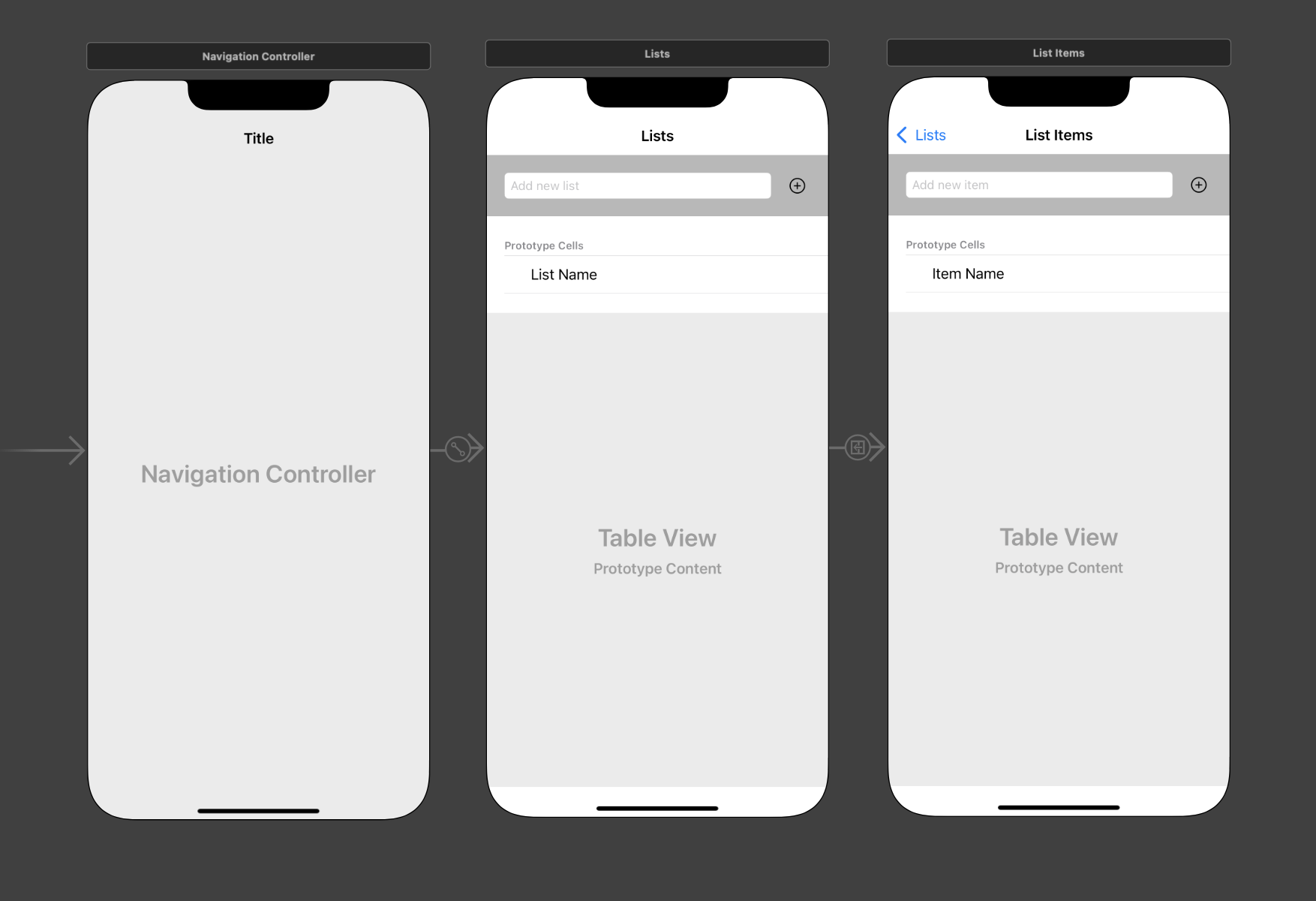
Professional iOS applications require thoughtful architecture from the start. Our app implements a master-detail pattern: one screen displays all user lists (master), while the second shows individual list items (detail). This pattern appears throughout iOS—from Mail to Settings—making it essential knowledge for any iOS developer. Let's establish the file structure that will support this navigation flow.
Remove the default View Controller that Xcode provides. In the Project navigator, click on ViewController and press the Delete key.
In the confirmation dialog, click Move to Trash to permanently delete the file.
For proper project organization, select the target folder before creating new files. In the Project navigator
 , click on the Lists folder (the yellow folder icon, not the blue project name).
Begin with our data model—the foundation that defines how our app stores and manages information. Go to File > New > File or use the shortcut Cmd–N.
Under iOS and Source, double–click on the Swift File template.
Name the file Data Model.swift in the Save As field.
Verify you're saving in Desktop > Class Files > yourname-iOS App Dev 2 Class > Lists > Lists, then click Create.
Now create our first view controller class. Press Cmd–N to create a new file.
Under iOS and Source, double–click on the Cocoa Touch Class template—this provides the essential structure for custom view controllers.
Configure the class options in this specific order to avoid unnecessary retyping:
- First, click the Subclass of menu and type UIViewController. Accept Xcode's autocompletion suggestion.
- Notice that Class automatically updates to "ViewController." Replace this with the more descriptive name: ListsVC (the VC suffix clearly indicates View Controller)
- Verify that Also create XIB file remains unchecked and Language is set to Swift
Professional Tip: Always set the subclass before naming your custom class. This prevents Xcode from appending default suggestions to your chosen class name, maintaining clean, readable code.
Click Next.
Confirm you're in the correct directory (Desktop > Class Files > yourname-iOS App Dev 2 Class > Lists > Lists) and click Create.
Create the second view controller using Cmd–N.
Select the Cocoa Touch Class template under iOS and Source.
Xcode remembers your previous settings, so verify the subclass is UIViewController with Swift language selected.
Name this class ListItemsVC and click Next, then Create.
Table views require custom cells to display data effectively. Create the first cell class with Cmd–N.
Choose the Cocoa Touch Class template again.
Configure these options precisely:
Subclass of: UITableViewCell (Set this first to avoid naming conflicts) Class: ListTitleTVCell (TV denotes Table View for clear identification) Click Next, then Create in the following screen.
Generate the final table cell class using Cmd–N. Create another Cocoa Touch Class subclassing UITableViewCell, named ListItemTVCell. Click Create when configured.
File Creation Process
Remove Default Controller
Delete the default ViewController file to start with clean architecture
Create Data Model
Generate Data Model.swift file using Swift File template for data structure
Build View Controllers
Create ListsVC and ListItemsVC using Cocoa Touch Class template with UIViewController subclass
Add Table View Cells
Generate ListTitleTVCell and ListItemTVCell using UITableViewCell subclass for data display
Always set the subclass first before naming your class to avoid having to clean up auto-generated naming suggestions that Xcode appends.
Adding a Navigation Controller to Manage Our Two Views
Navigation Controllers serve as the invisible traffic directors of iOS apps, managing the flow between screens and providing the familiar back-button navigation that users expect. In professional iOS development, proper navigation architecture prevents user confusion and creates intuitive app experiences. Let's implement this foundational component.
Access the visual interface by clicking Main.storyboard in the Project navigator.
Optimize your workspace for multiple controllers. Click the Hide or show the Navigator button
 in the top right to maximize your Storyboard canvas.
Observe the gray arrow pointing to the View Controller—this indicates the initial view controller, the first screen users see when launching your app.
Remove the default View Controller from the Storyboard to match our custom file structure. Click anywhere on the View Controller in the Editor and press Delete (you may need to press it multiple times to fully remove all components).
The gray arrow disappears along with the controller—we'll restore this crucial entry point shortly.
Locate the Navigation Controller in the Objects library search field.
Drag the Navigation Controller onto your Storyboard canvas.
Navigation Controllers operate behind the scenes, like a theater director managing scene transitions. While invisible to users, they coordinate the presentation of visible view controllers—represented here by the Root View Controller that appears automatically to the right. This Root View Controller becomes your app's first visible screen, while the Navigation Controller handles the navigation logic.
Replace the generic Root View Controller with our custom implementation. Access the Document Outline by clicking Show Document Outline
 at the bottom left of the Editor if it's not visible.
Prepare the Document Outline for precise selection:
- Expand both controller scenes if they appear collapsed
- If multiple items are selected, click in a blank area to clear all selections
Under Root View Controller Scene, select Root View Controller and press Delete.
Add a customizable replacement. From the Objects library, drag a View Controller to the right of the Navigation Controller, positioning it as shown:
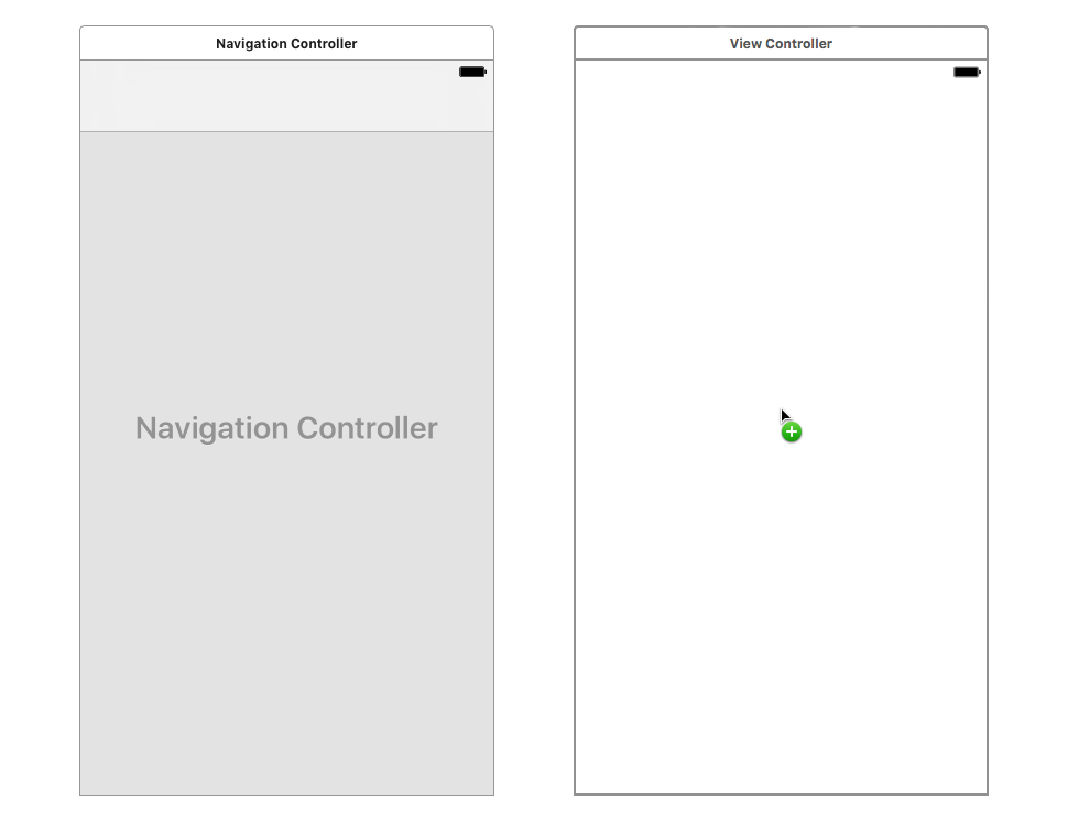
Establish the navigation relationship. Hold Control and drag from the Navigation Controller to the View Controller. A blue connection line appears during the drag. Upon release, select root view controller from the Relationship Segue section of the popup menu.
Note: Both Control-drag and right-click drag create these connections, depending on your mouse configuration.
Verify the connection appears between controllers, displayed as
 . This visual representation confirms your navigation relationship.
Ensure the Navigation Controller displays the essential entry point arrow on its left side (scroll left if necessary to verify).
Without this Storyboard entry point, your app cannot launch—iOS wouldn't know which screen to display first, resulting in a blank app.
Restore the entry point by selecting the Navigation Controller.
Access the Attributes inspector
 in the right panel.
Under View Controller, check Is Initial View Controller.
The gray arrow returns, confirming that iOS now recognizes this as your app's launch point.
The gray arrow indicates the Storyboard entry point. Without setting 'Is Initial View Controller' on your Navigation Controller, your app will not display any content when launched.
Navigation Controller Setup
Clear Default Interface
Remove the default View Controller from Main.storyboard to prepare for custom navigation
Add Navigation Controller
Drag Navigation Controller from Objects library to establish navigation framework
Replace Root View Controller
Delete prefabricated controller and add custom View Controller with Control-drag connection
Set Entry Point
Enable 'Is Initial View Controller' in Attributes inspector to restore gray arrow indicator
Adding UI Elements to the First View Controller
The master view controller requires three essential components: a navigation title for user orientation, input controls for creating new lists, and a table view for displaying existing lists. This interface pattern appears throughout iOS applications and represents best practices for list management interfaces. While waiting for final design assets—a common scenario in professional development—we'll implement a functional interface that can be styled later.
Identify the pale gray Navigation Item area at the top of the View Controller—this space houses navigation titles and bar button items.
Select the Navigation Item by clicking near the bottom edge of the pale gray area, or choose it from the Document Outline for precision.
In the Attributes inspector, set Title to Lists and press Return. The title updates both in the interface and the Document Outline.
Implement the input section, starting with the text field. Type text field in the Objects search field to filter available components.
Drag the Text Field to the upper left area of the View Controller, positioning it below the navigation area but within the main content space.
Enhance user experience with placeholder text. In the Attributes inspector's Placeholder field, enter Add new list and press Return. This provides clear guidance about the field's purpose.
Add the action button by searching for button in the Objects library.
Drag the Button to the upper right area of the interface, anticipating that we'll expand the text field width with constraints later.
Configure the button for optimal user recognition. In the Attributes inspector:
- Clear the default "Button" text from the Title field
- Set Type to Add Contact to display the universally recognized plus (+) symbol
- Improve visibility by changing Tint from Default to Black Color for better contrast against the background
Create the list display area by searching for table in the Objects filter.
Drag a Table View (avoid the Table View Controller or Table View Cell options) to the center area of the View Controller.
Table Views provide the scrollable list functionality essential for displaying dynamic content, but they require table view cells to present individual data items.
Add a prototype cell by dragging a Table View Cell from the Objects library directly into the Table View area. When the table view's borders highlight in blue, release to embed the cell properly.
Implement content display within the cell. Search for label in the Objects library.
Position the Label within the table view cell's white Content View area, as demonstrated:
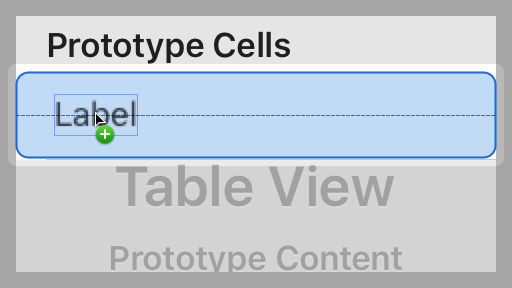
Configure the label for optimal presentation. In the Attributes inspector:
- Replace the default "Label" text with List Name and press Return
- Select the Left Align button
 next to Alignment for consistent text positioning
Adjust the label's visual boundaries by dragging the right resize handle to accommodate the full text width.
UI Element Hierarchy
When working with teams, image assets and final designs may not be ready during initial development. Building basic functional interfaces allows development to proceed while design work continues.
Constraining the UI Objects on the First View Controller
Auto Layout constraints ensure your interface adapts gracefully across different device sizes and orientations—a critical requirement for App Store approval and user satisfaction in 2026's diverse iOS device ecosystem. We'll implement constraints that maintain visual hierarchy and usability regardless of screen dimensions.
Select the Add new list text field in the upper area of the Storyboard.
Add the button to your selection by Shift-clicking it, creating a multi-selection of both input elements.
Group these related elements for easier constraint management. Go to Editor > Embed In > View. This creates a container view that simplifies positioning and maintains the relationship between the text field and button.
Focus on the text field by selecting it individually.
Access the constraint tools by clicking the Add New Constraints button
 at the bottom right of the Editor.
Optimize for precise positioning by unchecking Constrain to margins.
Establish spacing relationships by clicking all four red constraint lines at the top of the popup, ensuring these values:
- Top: 20 (provides breathing room from the container edge)
- Right: 15 (leaves space for the button)
- Bottom: 20 (balances the vertical spacing)
- Left: 20 (maintains consistent left margin)
Apply the constraints by clicking Add 4 Constraints.
Configure the button by selecting it individually.
Open the constraints popup with the Add New Constraints button
.Set these three essential constraints by selecting the corresponding red lines:
- Top: 20 (aligns with text field's top spacing)
- Right: 20 (maintains consistent right margin)
- Bottom: 20 (matches text field's bottom spacing for visual alignment)
Constraint Application Process
Embed Related Elements
Group text field and button in a container view for easier constraint management
Apply Individual Constraints
Set specific spacing values for text field (20,15,20,20) and button (20,20,20) with fixed dimensions
Configure Container View
Apply constraints to embedded view with 70-point height and light gray background for visual distinction
Position Table Elements
Set table view to fill remaining space and position label with proper margins