Exercise Preview
Exercise Overview
In this comprehensive exercise, you'll master two critical modern web development techniques. First, you'll create a smooth CSS3 animation that makes the panorama background image pan seamlessly back and forth, bringing static imagery to life. Then you'll implement responsive design principles to ensure your layout adapts flawlessly across all device sizes—from desktop monitors to mobile phones. These skills are essential for creating engaging, accessible web experiences in today's multi-device landscape.
If you completed the previous exercise, style.css should still be open in your code editor, and you can skip the following sidebar. If you closed style.css, re-open it now. We strongly recommend completing the previous exercises (1A–1B) before starting this one, as they provide essential foundation code. If you haven't finished them, follow the setup instructions in the sidebar below.
Exercise Roadmap
1Animate Panorama Background
Create CSS keyframes to make the background image pan smoothly from left to right
2Optimize for Mobile
Disable fixed backgrounds on mobile devices to prevent display issues
3Implement Responsive Design
Use CSS media queries to adapt layout and typography across different screen sizes
If You Did Not Do the Previous Exercises (1A–1B)
- Close any files you may have open in your code editor.
- On the Desktop, navigate to Class Files > Responsive CSS3 Scrolling Effects.
- Delete the Hawaii folder if it exists.
- Duplicate the Hawaii YouTube Done folder.
- Rename the duplicate to Hawaii and open it in your preferred code editor.
Animating the Panorama Background
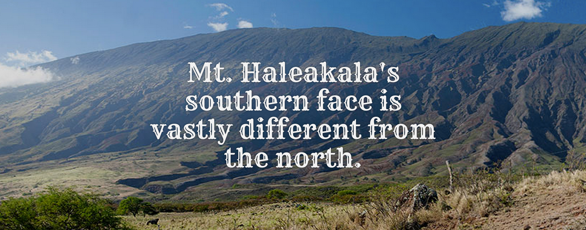
Currently, we have an exceptionally wide panoramic image in our page's panorama segment, but visitors can only see a small portion of this stunning vista. This limitation wastes the visual impact of our carefully selected imagery. We'll solve this by creating a smooth CSS animation that slowly scrolls the background from left to right, revealing the full breadth of the panoramic view.
Unlike CSS transitions, which work by changing between two distinct states (like hover effects), this animation requires a more sophisticated approach. We need CSS keyframe animation, which allows us to define multiple points along an animation timeline and create smooth, continuous motion.
Scroll to the bottom of style.css and add the following keyframe declaration at the very end of the document:
@keyframes moving-bg {

}
Define the animation's starting and ending keyframes by adding this code inside the brackets:
@keyframes moving-bg {
   0% {
      background-position: 0;
   }
   100% {
      background-position: 100% 0;
   }
}
These positions use X, Y coordinate syntax to control background positioning. The 0% keyframe sets our starting position at the image's left edge (X-position: 0). The 100% keyframe moves to the far right (X-position: 100%), while maintaining the same vertical position (Y-position: 0). This creates a smooth horizontal panning effect that showcases the entire width of our panoramic background image without any vertical movement that might disorient users.
Locate the .feature-wrap.panorama class (around line 98) and apply the animation by adding this property:
.feature-wrap.panorama {
   padding: 10% 0;
   background-image: url(../img/panorama.jpg);
   animation: moving-bg 20s linear infinite alternate;
}
Let's break down each component of this animation declaration to understand how it creates the desired effect:
moving-bgreferences the keyframe animation we just defined.20ssets a 20-second duration—long enough to feel smooth and natural, not jarring or rushed.linearapplies linear easing, ensuring consistent movement speed throughout the animation (no acceleration or deceleration).infinitemakes the animation repeat continuously, creating an endless loop that keeps the page dynamic.alternatereverses the animation direction on each iteration (left-to-right, then right-to-left), preventing jarring jumps back to the start position.
- Save the file and preview index.html in your browser. The panoramic photo behind the Mt. Haleakala text should now be smoothly panning back and forth, creating an immersive visual experience.
- Return to your code editor to add browser compatibility improvements.
Modern web development requires supporting a range of browsers, including older versions that need vendor prefixes. Copy the
animationproperty and paste it directly above the original:.feature-wrap.panorama { padding: 10% 0; background-image: url(../img/panorama.jpg); animation: moving-bg 20s linear infinite alternate; animation: moving-bg 20s linear infinite alternate; }Add the -webkit vendor prefix to the first declaration:
-webkit-animation: moving-bg 20s linear infinite alternate;
animation: moving-bg 20s linear infinite alternate;
NOTE: The -webkit prefix ensures compatibility with older versions of Safari, Chrome, and other WebKit-based browsers. While browser support for unprefixed animations is excellent in 2026, including prefixes is still considered a best practice for enterprise applications that may need to support legacy systems. For current browser support data, always consult caniuse.com/#feat=css-animation
- The keyframes we created work with the standard animation property, but we also need vendor-prefixed keyframes for the -webkit-animation property. Scroll to the bottom of style.css.
- Copy the entire
@keyframesblock of code. Paste it directly below the original. You should now have two identical copies of this code block:
@keyframes moving-bg {
   0% {
      background-position: 0;
   }
   100% {
      background-position: 100% 0;
   }
}
Add the -webkit- prefix to the first keyframes declaration:
@-webkit-keyframes moving-bg {Code Omitted To Save Space
}
@keyframes moving-bg {
Code Omitted To Save Space
}Save the file and reload your browser. Take a moment to appreciate the smooth, professional animation you've created entirely with CSS3. This technique demonstrates the power of modern CSS for creating engaging user experiences without JavaScript dependencies.
CSS Animation Properties
Duration: 20s
The animation completes one full cycle in 20 seconds, providing smooth, subtle movement that isn't distracting.
Timing: Linear
Linear easing ensures consistent speed throughout the animation without acceleration or deceleration effects.
Direction: Alternate
The alternate direction creates seamless back-and-forth panning without jarring resets.
Always include -webkit vendor prefixes for animations to support older browsers. Check caniuse.com for current browser support statistics.
Disabling the Fixed Background Images on Mobile Devices
In the previous exercise, we implemented fixed background positioning to create an elegant parallax scrolling effect on desktop browsers. However, this technique presents significant challenges on mobile devices. iOS Safari, in particular, handles fixed backgrounds poorly—often sizing them incorrectly, causing performance issues, or disabling the effect entirely. Rather than leaving mobile users with a broken experience, we'll implement a responsive solution that detects mobile devices and provides an optimized alternative.
- Return to style.css in your code editor.
We'll use CSS media queries to create device-specific styling. Above the first set of keyframes, add this media query:
@media (max-width: 600px) {

}
@-webkit-keyframes moving-bg {
NOTE: This CSS media query creates a conditional rule set that only applies when the viewport width is 600 pixels or less. This covers the vast majority of mobile phones in portrait orientation. Any styles inside these brackets will override previous declarations when the condition is met, giving us precise control over the mobile experience.
Add the background override rule inside the media query:
@media (max-width: 600px) {
   .feature-wrap.photo {
      background-attachment: scroll;
   }
}
NOTE: CSS follows the cascade principle—when multiple rules have equal specificity, the last one wins. Since this rule appears later in our stylesheet than the original background-attachment: fixed; declaration, it successfully overrides the fixed positioning on smaller screens, replacing it with standard scrolling behavior that works reliably across all mobile browsers.
- Save the file and open it in Chrome (we'll use Chrome's developer tools for testing).
- Resize the browser window to be wide (more than 600 pixels) and scroll to verify that the photo backgrounds remain fixed to the viewport—this is the desktop experience we want to preserve.
- Now resize the browser to be narrower than 600 pixels and scroll again. Notice how the backgrounds now scroll naturally with the page content—this mimics the mobile experience and eliminates the problematic fixed positioning.
- Maximize the window to return to desktop view.
- To access Chrome's device emulation tools, Ctrl+click (Mac) or Right-click (Windows) on the page and select Inspect from the context menu.
In the DevTools panel, locate and click the Toggle device toolbar button
 at the top-left:
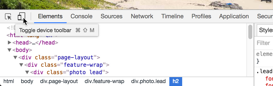
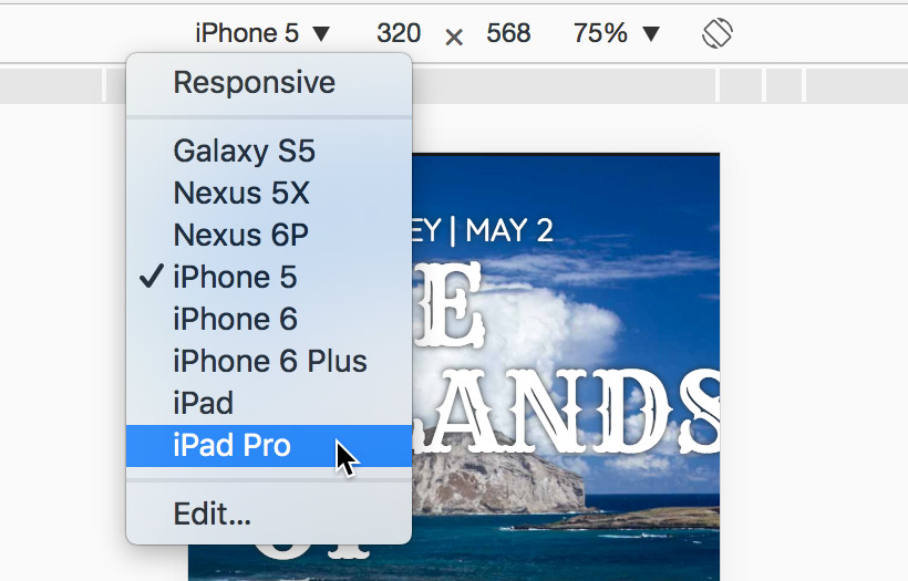
In the device emulation toolbar, select iPad Pro from the device dropdown menu:
- Reload the page to ensure proper rendering in the emulated environment.
Scroll through the page and observe that the background images still appear fixed. This reveals a limitation of our width-based media query approach. While Chrome's emulator shows the effect working, real iOS Safari would render these backgrounds incorrectly, creating a poor user experience.
The iPad Pro's resolution (1366px in landscape mode) exceeds our 600px media query threshold, so it doesn't receive the mobile-optimized styling. We could increase the media query breakpoint, but that would disable the parallax effect for many desktop users who can properly view it—clearly not an ideal solution.
This highlights a fundamental limitation of CSS: it can detect screen size but cannot distinguish between device types. A 1366px desktop monitor and a 1366px iPad Pro look identical to CSS, despite having vastly different rendering capabilities. To solve this, we need JavaScript-based device detection.
- Keep the emulated view open for testing our upcoming changes.
- Switch back to your code editor and open Hawaii > snippets > mobile-detection.html
- Select and copy all the JavaScript code from this file.
- Close mobile-detection.html and return to index.html.
- Locate the
<body>tag (around line 14). Paste the JavaScript code immediately after the opening body tag:
<body>
<script>
   var isMobile = navigator.userAgent.match(/(iPhone|iPod|iPad|Android)/);
   if( isMobile!= null ) {
      document.body.className += ' ' + 'mobile';
   }
</script>
This script performs user agent detection by examining the browser's identification string for mobile device keywords. When it detects iPhone, iPod, iPad, or Android devices, it dynamically adds a mobile class to the document body, giving us a reliable CSS hook for mobile-specific styling.
Technical Deep Dive: Every browser sends a user agent string to websites, identifying itself and the device it's running on. Our JavaScript searches this string for specific mobile device identifiers. If found, the script modifies the DOM by adding a CSS class, which we can then target with our stylesheets. This approach provides more reliable device detection than viewport width alone, though it requires JavaScript to be enabled.
- Save index.html and return to style.css.
Find the .feature-wrap.photo rule (around line 88) and add this mobile-specific override below it:
.feature-wrap.photo {
   background-repeat: no-repeat;
   background-position: center;
   background-size: cover;
   background-attachment: fixed;
}
.mobile .feature-wrap.photo {
   background-attachment: scroll;
}
NOTE: This selector targets elements with the feature-wrap photo classes, but only when they're inside an element with the mobile class (which JavaScript adds to the body tag on mobile devices). This creates a failsafe system: JavaScript handles tablets and devices that CSS can't properly detect, while the media query handles devices with JavaScript disabled.
Return to Chrome and reload the page in iPad Pro emulation.
NOTE: While Chrome doesn't use the actual iOS Safari rendering engine, the device emulator does spoof the user agent string, allowing our JavaScript to properly detect the "iPad Pro" and apply mobile-optimized styling.
- Scroll through the page and verify that background images now scroll with the content, eliminating the problematic fixed positioning on this tablet device.
- Close DevTools by clicking the X in the top-right corner of the panel.
- Reload the page at full desktop size to ensure normal functionality is preserved.
Test the responsive behavior by scrolling in desktop view—if the window exceeds 600px width, the parallax effect should work perfectly. We've successfully created a robust solution that delivers the best possible experience on every device type.
Fixed Background Attachment on Mobile
CSS vs JavaScript Detection Methods
| Feature | CSS Media Queries | JavaScript Detection |
|---|---|---|
| Detection Method | Screen width only | User agent string |
| Device Accuracy | Limited | Precise device detection |
| Tablet Handling | iPad Pro too large at 1366px | Detects all iOS devices |
| Fallback Support | Always works | Requires JavaScript enabled |
Creating Responsive Layouts with CSS Media Queries
While our page functions well across devices, the typography needs refinement for optimal mobile viewing. Large headlines that look impressive on desktop monitors can overwhelm small screens, covering too much of our carefully chosen imagery and creating poor visual hierarchy. We'll implement a comprehensive responsive typography system using CSS media queries, ensuring readable, proportionate text at every screen size.
- Return to style.css in your code editor.
Above the existing (max-width: 600px) media query, add this new breakpoint for tablet-sized screens:
@media (max-width: 1024px) {

}
@media (max-width: 600px) {
Add responsive typography rules for the medium breakpoint:
@media (max-width: 1024px) { .feature-wrap .text { font-size: 2em; } }- Save the file and test the changes by resizing your browser. Notice how the text in photo highlight sections scales down appropriately on screens narrower than 1024 pixels, while maintaining full size on larger displays.
- While testing at the smaller size, observe the panorama animation. The reduced viewport size limits the panning distance, making the animation less dramatic. Let's optimize the panorama display for this breakpoint.
Add panorama-specific styling to the 1024px media query:
@media (max-width: 1024px) { .feature-wrap .text { font-size: 2em; } .feature-wrap.panorama { padding: 15% 0; } }- Save and test the improved panorama sizing at medium screen widths.
- The zooming YouTube video effect, while impressive on large screens, becomes problematic at smaller sizes. When the video starts at 40% width on a narrow viewport, it appears uncomfortably small and the zoom transition feels jarring. Let's disable the zoom effect for medium and small screens.
Add video optimization rules to the media query:
.feature-wrap.panorama { padding: 15% 0; } .zoom { width: 100%; } }- Test the changes by resizing your browser below 1024px width. The video should now display at full width without the zoom effect. However, you'll notice spacing issues that need correction.
Add proper margins to the video container:
.zoom {
   width: 100%;
   margin: 0 25px 0;
}
Ensure consistent spacing during hover states by targeting both normal and hover states (note the comma after the first selector):
.zoom, .zoom:hover { width: 100%; margin: 0 25px 0; }- Save and test the video behavior at narrow widths. The spacing should remain consistent whether hovering or not.
- Now we'll create an intermediate breakpoint for refined control over the responsive design. Add a new media query before the 600px breakpoint:
Insert this media query between the existing ones:
@media (max-width: 850px) {

}
@media (max-width: 600px) {
NOTE: We're using a desktop-first approach for this project because desktop users experience the full range of effects (animations, parallax scrolling, etc.). This methodology starts with full desktop styling and progressively adapts downward using max-width media queries. While mobile-first approaches are common and valid, desktop-first makes sense here given our effect-heavy design that's optimized for larger screens.
Add typography and spacing optimizations for the 850px breakpoint:
@media (max-width: 850px) { .feature-wrap .text { font-size: 1.5em; margin: 0 5%; } }- Save and test the subtle improvements at this breakpoint—notice the refined text sizing and improved margins that better utilize the available space.
The panorama needs further optimization at this screen size. Add increased padding to make the image more prominent:
@media (max-width: 850px) {
   .feature-wrap .text {
      font-size: 1.5em;
      margin: 0 5%;
   }
   .feature-wrap.panorama {
      padding: 20% 0;
   }
}
The photo stack layout also needs refinement at this size. Add centered, optimized styling for the stacked photo sections:
.feature-wrap.panorama { padding: 20% 0; } .feature-wrap.stack .text { width: auto; margin: 0 5%; font-size: 3.5em; text-align: center; } }- Save and test the changes. You may notice that the photo stack text isn't behaving as expected—this is a CSS specificity issue that we need to resolve.
Fix the specificity problem by targeting all the specific text positioning classes that were defined earlier in the stylesheet:
.feature-wrap.stack .text, .feature-wrap.stack .text.right, .feature-wrap.stack .text.left { width: auto; margin: 0 5%; font-size: 3.5em; text-align: center; }- Save and test the complete responsive behavior by resizing your browser through all the breakpoints. Notice how the layout gracefully adapts from desktop (1024px+) to tablet (850px-1024px) to mobile (600px-850px) to small mobile (under 600px), with each providing an optimized experience for its screen size.
Media Query Breakpoints
Responsive Design Implementation
Desktop-First Approach
Start with full desktop styles, then use max-width media queries to progressively simplify for smaller screens
Typography Scaling
Reduce font sizes at each breakpoint: 2em at 1024px, 1.5em at 850px for optimal readability
Layout Adjustments
Modify padding, margins, and element positioning to optimize for touch interfaces and smaller screens