Topics Covered in This Web Development Tutorial:
Master Flex-Wrap and Sizing Flex Items (Flex-Grow & Flex-Basis) for responsive navigation design
Core Flexbox Concepts You'll Master
Flex-Wrap Property
Learn how to allow flex items to wrap onto multiple lines when they don't fit in the container. Essential for responsive design.
Flex-Grow & Flex-Basis
Master sizing flex items to fill available space and set their initial size before free space is distributed.
Responsive Navigation
Build a navigation that adapts from single-line desktop layout to multi-line mobile grid using media queries.
Exercise Preview

Exercise Overview
In this hands-on exercise, you'll master one of the most powerful aspects of Flexbox: creating responsive layouts that adapt gracefully across screen sizes. You'll learn how to make flex items wrap onto multiple lines intelligently, then size them proportionally using flex-grow and flex-basis properties. By the end, you'll have built a professional navigation component that transforms seamlessly from desktop to mobile—a critical skill for modern web development.
Getting Started
- In your code editor, close any files you may have open to start with a clean workspace.
- For this exercise we'll be working with the Flexbox Wrapping folder located in Desktop > Class Files > yourname-Flexbox Grid Class. If you're using a modern editor like Visual Studio Code, Sublime Text, or WebStorm, open the entire folder to take advantage of your editor's file tree navigation.
- Open index.html from the Flexbox Wrapping folder.
Preview index.html in Firefox (we'll be leveraging its superior DevTools for this exercise).
- This page builds upon previous exercises, but this time we're implementing a more sophisticated navigation pattern that responds dynamically to viewport changes.
Keep index.html open in Firefox as you work—you'll be refreshing frequently to see your changes take effect in real-time.
Setup Your Development Environment
Open Project Files
Navigate to Desktop > Class Files > yourname-Flexbox Grid Class > Flexbox Wrapping folder and open it in your code editor
Launch Preview
Open index.html in Firefox browser to preview your work and access DevTools for responsive testing
Prepare Workflow
Keep both your code editor and Firefox open side-by-side for efficient development and testing
Setting Display Flex & Wrapping
Now we'll transform a basic navigation into a flexible layout system. First, we'll establish the flex container, then add intelligent wrapping behavior.
- Switch back to your code editor.
- Open main.css from the css folder (in the Flexbox Wrapping folder).
In the .navbar rule add the following bold code:
.navbar {
   display: flex;
   border: 8px solid gray;
Code Omitted To Save Space
}Save the file, and reload the page in Firefox.
- Notice how the navigation items now display as a horizontal row instead of stacking vertically—this is the default flex behavior in action.
- Ctrl–click (Mac) or Right–click (Windows) anywhere on the page and choose Inspect Element.
If the DevTools are not docked to the right side of the window, click the
 button at the top right of the DevTools panel and choose Dock to Right.
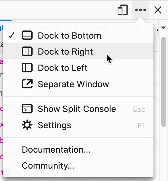
This configuration allows you to resize the webpage area more precisely than you could with DevTools closed, simulating various device widths effectively.
- Gradually resize the webpage area narrower until you observe how the navigation items stubbornly remain on one line, even when it forces horizontal scrolling—this demonstrates the default flex behavior of keeping items on a single line.
- Keep the DevTools open for the next steps.
- Return to your code editor.
In the .navbar rule add the following bold code:
.navbar {
   display: flex;
   flex-wrap: wrap;
   border: 8px solid gray;
Code Omitted To Save Space
}Save the file, and reload the page in Firefox.
- Now resize the webpage area and observe how the items intelligently wrap to new lines when space becomes constrained—this is responsive design in its purest form.
Dock DevTools to the right side of Firefox to simulate narrow screen widths more effectively. This allows you to test responsive behavior without making your entire browser window tiny.
Before vs After Adding Flex-Wrap
| Feature | Without Flex-Wrap | With Flex-Wrap |
|---|---|---|
| Overflow Behavior | Items stay on one line, causing horizontal scroll | Items wrap to new lines when space is limited |
| User Experience | Poor - requires horizontal scrolling | Good - content remains accessible |
| Responsive Design | Breaks on small screens | Adapts to screen size |
Sizing the Flex Items
With wrapping established, we'll now implement sophisticated sizing controls that create a polished, professional layout across all screen sizes.
- Return to your code editor.
Above the min-width: 571px media query, add the following new media query for smaller screens:
@media (max-width: 570px) {
   .navbar .logo {
      flex-basis: 100%;
   }
}
Save the file, and reload the page in Firefox.
- The logo now claims the full width on small screens, forcing other navigation items to wrap below—a common pattern in mobile-first design.
- Notice the remaining items don't expand to fill available space, leaving awkward white space. Let's fix this with flex-grow.
- Return to your code editor.
In the max-width: 570px media query, below the .navbar .logo rule, add the following new rule:
@media (max-width: 570px) {
   .navbar .logo {
      flex-basis: 100%;
   }
   .navbar li {
      flex-grow: 1;
   }
}
Save the file, and reload the page in Firefox.
- The navigation items now expand proportionally to fill available space. Next, we'll center the text for better visual balance.
- Return to your code editor.
In the .navbar li rule add the following bold code:
@media (max-width: 570px) {
   .navbar .logo {
      flex-basis: 100%;
   }
   .navbar li {
      flex-grow: 1;
      text-align: center;
   }
}
Save the file, and reload the page in Firefox.
- The centered text creates better visual hierarchy and balance.
- Resize the viewport until the 4 navigation links form a 2 × 2 grid. Notice how the widths don't quite align across rows—we'll fix this with explicit sizing.
- Return to your code editor.
In the max-width: 570px media query's .navbar li rule, add the following bold code:
.navbar li {
   flex-grow: 1;
   flex-basis: 50%;
   text-align: center;
}
Save the file, and reload the page in Firefox.
- Perfect! The 2 × 2 grid now has consistent widths across both rows, creating visual harmony.
- Close the DevTools and expand the browser window to full width.
- On larger screens, notice all the extra space clusters on the right side. For better UX, we want the logo anchored left and navigation items grouped right.
- Return to your code editor.
Before adjusting spacing, let's optimize our code using the flex shorthand property—a best practice for maintainable CSS.
In the max-width: 570px media query's .navbar li rule, replace the two flex properties with the shorthand version as shown below in bold:
.navbar li {
   flex: 1 0 50%;
   text-align: center;
}
NOTE: Remember the syntax is flex: flex-grow flex-shrink flex-basis; — this single property combines three flex behaviors into one concise declaration.
Progressive Enhancement Steps
Logo Full Width
Set flex-basis: 100% on logo for screens under 570px wide
Items Grow to Fill Space
Add flex-grow: 1 to navigation items to eliminate white space
Center Text Content
Apply text-align: center for better visual balance
Create Even Grid
Set flex-basis: 50% for consistent 2x2 grid layout
The flex shorthand property combines flex-grow, flex-shrink, and flex-basis into one declaration: flex: 1 0 50% means grow factor 1, shrink factor 0, and basis 50%.
Adjusting the Layout on Larger Screens
Now we'll implement the finishing touch: creating that classic logo-left, navigation-right layout that's standard in professional web design.
In the min-width: 571px media query, above the footer rule add the following new rule:
.navbar .logo {
   margin-right: auto;
}
Save the file, and reload the page in Firefox.
- Excellent! The navigation now displays the professional standard: logo anchored to the left, navigation items grouped to the right, with flex automatically handling the spacing distribution.
margin-right: autoOptional Bonus: Refining the Layout at Another Screen Size
The 2 × 2 grid works well on very small screens, but there's an intermediate screen size where all four navigation items could fit comfortably on a single row below the logo. Let's add this refinement for a truly polished responsive experience.
Above the min-width: 571px media query, add the following media query and rule:
@media (min-width: 415px) and (max-width: 570px) {
   .navbar li {
      flex-basis: 25%;
   }
}
Save the file, and reload the page in Firefox.
- Test your responsive navigation by slowly resizing the browser from narrow to wide. You should see three distinct layouts: a 2 × 2 grid on small screens, transitioning to a single row of navigation items below the logo, and finally the professional logo-left/navigation-right layout on desktop. This progressive enhancement creates an optimal user experience across all device categories.
Navigation Layout Breakpoints
Final Layout Verification
Navigation items should form an even grid below the full-width logo
All nav links should fit on one line below the logo at mid-range widths
Logo should be left-aligned with nav links pushed to the right side
Layout changes should be smooth when resizing the browser window