Part 2: Using parameters with actions in Tableau.
Dynamic parameter control represents one of the most powerful features in modern data visualization, enabling users to create truly interactive analytical experiences. In this comprehensive guide, we'll explore how to harness parameter actions to build dashboards that respond intelligently to user interactions. This article builds directly on the foundations established in "Part 1: Using Parameters in Tableau Visualizations" and demonstrates advanced techniques that separate professional-grade dashboards from basic static reports.
Parameter actions in Tableau transform static visualizations into dynamic analytical tools by allowing users to modify parameter values through direct dashboard interaction—whether clicking on data points, selecting marks, or hovering over elements. This interactivity extends beyond simple visual appeal; it enables sophisticated analytical workflows where users can dynamically adjust reference lines, modify complex calculations, control filtering logic, and even customize SQL query parameters in real-time. The result is a more engaging and insightful user experience that encourages deeper data exploration.
As established in Part 1, parameters function as global variables within your Tableau workbook, operating independently of your underlying data structure. This global nature makes them exceptionally powerful for coordinating behavior across multiple sheets and dashboards, creating cohesive analytical experiences that maintain consistency throughout your entire workbook.
The following comprehensive example demonstrates how to implement dynamic parameter manipulation using actions, showcasing techniques that professional analysts use to create compelling interactive dashboards.
To successfully implement parameters with actions, you'll need to follow this systematic three-step approach:
- Create the parameter that will be controlled using actions
- Apply the parameter to calculations, filters, or reference lines
- Define the parameter action with appropriate triggers and behaviors
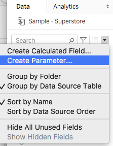
Begin by accessing the parameter creation interface: click the dropdown arrow in the data panel of your worksheet and select "Create Parameter" from the menu (fig.1). This foundational step establishes the variable that your actions will control.
For this practical demonstration, we'll use Tableau's sample superstore dataset, which provides a rich foundation for exploring parameter actions. Our objective is to create an interactive system that updates reference lines dynamically based on user selections, eliminating the need for complex calculated fields while maintaining analytical sophistication.
Let's establish the parameters that will power our interactive visualization. The first parameter will demonstrate traditional parameter control, while the second will showcase action-driven parameter manipulation.
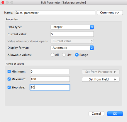
Create your initial parameter named "Sales-parameter" using the configuration shown below. This parameter will serve as a growth rate controller, accepting values between 0 and 100 to represent percentage growth scenarios.
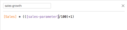
The Sales-parameter enables dynamic growth modeling by accepting percentage values that can be applied to sales calculations. Implement this parameter in a calculated field using the formula structure shown below, which multiplies your base sales figure by the parameter-driven growth rate.
Now we'll construct a comprehensive visualization that demonstrates both traditional parameter control and action-driven parameter manipulation. The following steps create a stacked bar chart that effectively displays both actual sales data and projected growth scenarios.
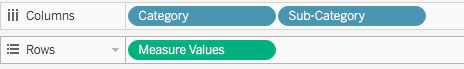
Begin by dragging the Category and Sub-Category fields to the Columns shelf, and the Measure Values field to the Rows shelf. This configuration creates the foundation for our comparative analysis visualization.
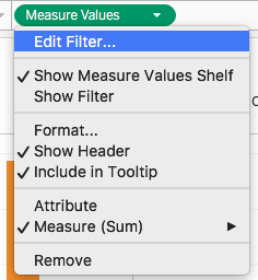
Refine your visualization focus by clicking the Measure Values pill in the Rows shelf and selecting "Edit Filter" from the dropdown menu (fig. 3). This step allows you to control which measures appear in your analysis, ensuring clean and purposeful data presentation.
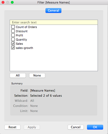
In the filter dialog, deselect all measures except sales-growth and Sales, which will form the core comparison elements in your stacked bar chart (fig. 4). This focused approach prevents visual clutter and maintains analytical clarity.
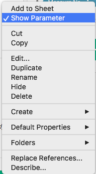
Make your parameter accessible to users by clicking the dropdown arrow next to "Sales-parameter" in the Parameters pane and selecting "Show Parameter" (fig. 5). This action creates the user interface element that enables interactive parameter control.
The parameter control now appears alongside your visualization (fig. 6), providing users with an intuitive slider interface for adjusting growth scenarios in real-time. This immediate feedback loop enables rapid what-if analysis and scenario modeling.
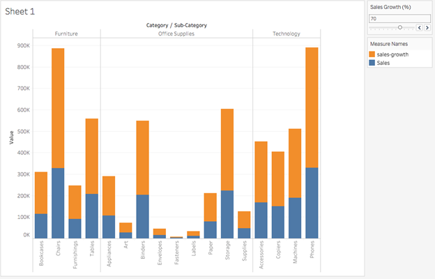
Users can now dynamically adjust sales-growth projections using the slider control, immediately observing how different growth rates affect the overall data presentation. This interactivity transforms static analysis into dynamic exploration.
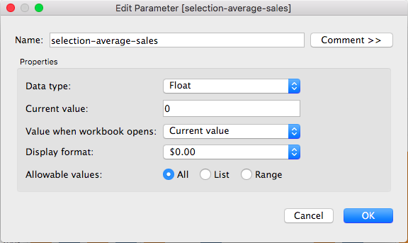
The next phase introduces action-controlled parameters, demonstrating more sophisticated interactivity. Create a second parameter named "selection-average-sales" that will automatically calculate and display the average sales value of user-selected marks. This technique enables contextual analysis where the dashboard responds intelligently to user selections.
Configure your new parameter as shown in (fig. 7), setting the data type to Float to accommodate aggregated numerical values. The Float data type ensures precise calculation of averaged sales figures across selected elements.
The next critical step involves creating the parameter action that will control your parameter value based on user interactions. Effective parameter actions require careful configuration of three essential components:
- The source sheet or sheets where the action applies, determining the scope of interactivity
- The user behavior that triggers the action (hover for immediate feedback, select for deliberate analysis, or menu for controlled access)
- The target parameter, source field, and appropriate aggregation method that defines how selected data translates into parameter values
Access the Actions configuration by selecting "Actions" from the Worksheet dropdown menu (fig. 8). This opens the comprehensive action management interface where you'll define the behavior of your parameter action.
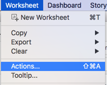
Configure your parameter action with the following professional-grade settings:
- Set "Run action on" to "Select" to ensure deliberate user interaction drives the parameter changes
- Configure "Target Parameter" as "selection-average-sales" to direct calculated values to your newly created parameter
- Set the "Source Field" to "Measure Values" and "Aggregation" to "Average" to calculate meaningful statistical summaries
This configuration creates a sophisticated analytical tool where user selections automatically generate contextual reference points for comparative analysis.
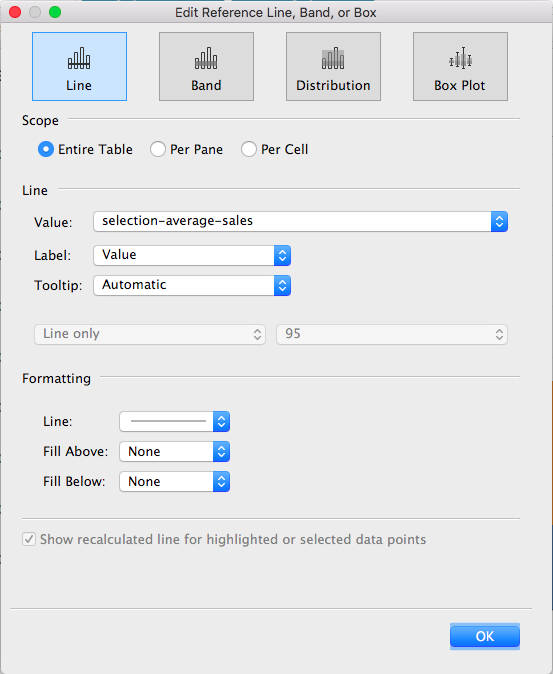
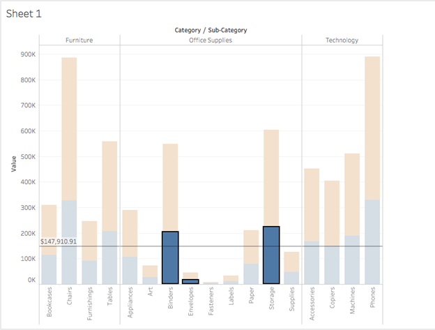
Complete your interactive system by adding a reference line that visualizes the calculated average from your selections. This visual element transforms abstract parameter values into meaningful analytical context.
From the Analytics panel, drag "Reference Line" to the Table level of your visualization. In the reference line configuration dialog, set the "Value" to your "selection-average-sales" parameter and configure the "Label" to display "Value," providing users with precise numerical context alongside the visual reference (fig. 10).
Test your sophisticated parameter action system using the following interaction method:
Hold Alt (Mac) or Ctrl (PC) while clicking multiple bars in your visualization. Tableau will immediately calculate and display a reference line showing the average sales value for your selected sub-categories (fig. 11). This dynamic reference system enables rapid comparative analysis, allowing users to establish context and identify performance patterns across different product segments with unprecedented ease.
Conclusion
This comprehensive exploration represents just the beginning of what's achievable with parameter actions in modern Tableau development. The techniques demonstrated here can be extended to create sophisticated analytical experiences: enabling users to control dynamic filtering across multiple dashboard elements, facilitating temporal comparisons in time-series analysis, or building complex drill-down hierarchies that respond to user intent. As data visualization continues evolving in 2026, parameter actions remain essential tools for creating the kind of interactive, user-driven analytical experiences that transform data exploration from passive consumption into active discovery. Master these techniques, and you'll be equipped to design flexible, professional-grade dashboards that genuinely serve your users' analytical needs while providing the insights that drive informed business decisions.