Topics Covered in This Sketch Tutorial:
Using the Tidy Button, Adjusting Symbol Spacing, Reordering Content, Using Smart Layout for Symbols
Exercise Preview

This tutorial uses pre-made Sketch files located in Desktop > Class Files > Sketch Class > Pulse. Make sure you have access to these practice files before starting.
Exercise Overview
In this exercise, you'll master Sketch's smart layout features to create truly flexible symbols that automatically adapt to content changes. These techniques are essential for modern design systems and will significantly improve your workflow efficiency when building responsive interfaces.
Tidying up & Reordering Content
Before diving into smart layouts, we'll address a common design challenge: aligning and spacing multiple elements consistently. Sketch's Tidy feature provides both automatic and manual control over element positioning.
- In Sketch, go to File > Open Local Document.
- Navigate into Desktop > Class Files > Sketch Class > Pulse and double–click on Search Results.sketch to open it.
- Notice the product grid's inconsistent alignment and uneven spacing—a typical issue in early design phases. Select all 6 products by dragging a selection over them to begin the cleanup process.
- Choose View > Zoom To > Selection to focus on your work area.
- With all products selected, click the Tidy button at the top right of the Inspector. This instantly creates uniform alignment and spacing.
- The automatic spacing is a good start, but precision matters in professional design work. With the products still selected, hover over any product to reveal the white spacing indicator lines—these provide visual feedback for manual adjustments.
- Locate the vertical line between the two columns (vertically centered in the 2nd row). Drag it left and right to dynamically adjust column spacing. This visual approach is ideal for quick iterations during client presentations.
- The horizontal lines between rows work similarly—drag any of them up or down to modify row spacing. This real-time feedback helps you achieve the perfect visual balance.
- While visual adjustments are powerful, production work often requires exact measurements for consistency across your design system.
- In the Inspector's top right section, locate the horizontal and vertical spacing controls below the W and H fields (positioned left of the Tidy button).
- Set both spacing values to 15 pixels—a common increment in modern design systems that ensures consistent rhythm across your interface.
Product ordering often changes based on business requirements or user testing feedback. Let's practice reordering without disrupting the grid layout. With all products selected:
- Hover over the Garter Stitch Sweater (2nd row, left column) until a white dot appears in its center—this indicates the element is ready for repositioning.
- Drag the white dot down to the Black Stripe Sweater below it. The products will seamlessly swap positions while maintaining perfect alignment.
Product Grid Organization Process
Select All Elements
Drag a selection over all 6 products to select them simultaneously
Apply Tidy Function
Click the Tidy button in the Inspector to automatically align and space elements
Adjust Visual Spacing
Hover over products to reveal white spacing lines, then drag to adjust column and row spacing
Set Precise Values
Use the horizontal and vertical spacing controls in the Inspector to set both values to 15
To swap product positions, hover over an element to reveal a white dot in the center, then drag that dot to another element's position to swap their places.
Creating a Smart Layout Using Symbols
Now we'll explore Sketch's most powerful feature for scalable design systems: smart layouts with nested symbols. This approach allows individual components to intelligently adjust their spacing and visibility, creating interfaces that respond naturally to content changes—a crucial skill for designing at scale in 2026's dynamic digital landscape.
- Click on the Symbols page at the top of the Sidebar to access your symbol library.
- Scroll right to locate the navbar area and zoom in on the Tag and Checkmark symbols for detailed work.
- We'll create a sophisticated tag component that can optionally display a checkmark. The key is using symbol nesting for maximum flexibility. In the Toolbar, click the Insert button
 and navigate to Symbols > This Document > Checkmark.
 - Click once in the empty space left of the TAG text to place the checkmark symbol precisely.
Position matters for consistent alignment across instances. With the Checkmark selected, set its coordinates in the Inspector to 6 X and 8 Y for pixel-perfect placement.
- The magic happens when we make this layout intelligent. Click on the Tag artboard name at the top left to select the entire symbol's artboard—this enables layout controls for the whole component.
In the Inspector's Layout section, configure the smart behavior:
- Select Horizontal layout mode.
- Ensure the Left to Right button is selected as shown below—this determines how elements flow when content changes:

- Your symbol is now equipped with intelligent layout behavior. Return to Page 1 by clicking it at the top of the Sidebar.
- Scroll up to view the top section of the Search artboard where you'll implement the tag system.
- Insert your smart symbol by clicking the Insert button and selecting Symbols > This Document > Tag.
Position the tag in the content hierarchy by clicking once below the Results found for "women" text, as shown below:

Here's where smart layouts shine: we can toggle element visibility without manual spacing adjustments. With the tag selected, locate the Overrides section in the Inspector, click the Checkmark dropdown, and select No Symbol.
Watch as the checkmark disappears and the layout automatically reflows—no awkward gaps or misalignment. This intelligent behavior is essential for dynamic interfaces that adapt to user states and content variations.
- Search interfaces typically display multiple filter tags simultaneously. Select the tag to prepare for duplication.
- Access Arrange > Make Grid to create multiple instances efficiently.
Configure the grid parameters in the Inspector:
- Cells: 4 columns and 1 row
- Spacing: 15 horizontal pixels and 0 vertical pixels for proper tag spacing
Click Finish to generate your tag row.
- Proper naming conventions are crucial for team collaboration and override management. Select the leftmost tag to begin the renaming process.
- Press Cmd–R and rename it to Tag1. Keep the text field active for efficient batch renaming.
- Press Tab to advance to the next layer and type Tag2—this workflow accelerates the naming process.
- Continue with Tab and type Tag3 for the third instance.
- Complete the sequence with Tab and Tag4 for the final tag.
- When tag text changes, individual tags will expand or contract. To maintain proper spacing across the entire group, we'll create a parent symbol with its own smart layout. Select all 4 tags.
- Click the Create Symbol button
 in the Toolbar (or use Layer > Create Symbol).
 Configure the symbol properties in the dialog:
- Name: tag group
- Layout: Left to Right Layout for horizontal flow
- Check Send Symbol to "Symbols" Page to maintain your symbol library organization
- Click Create to finalize the component
Now populate the tags with realistic content to demonstrate the smart layout in action. With the tag group selected, use the Inspector's Overrides section:
- Tag1 > Tag: Enter SHIRT (uppercase maintains design consistency)
- Tag2 > Tag: Enter SWEATER
- Tag3 > Tag: Enter JACKET
- Tag4: Set the dropdown to No Symbol to hide this unused tag—notice how the layout automatically adjusts
To demonstrate state changes, activate the checkmark for the sweater filter. Under Tag2, change the Checkmark dropdown from No Symbol to This Document > Checkmark.
This workflow simulates real-world user interactions where filter states change dynamically. The symbol override system provides this flexibility without requiring separate symbol variants for each state combination.
- Deselect all elements by clicking an empty canvas area to see the final result clearly.
Save your progress with Cmd–S and close the file to preserve your work.
Tag Symbol Creation Workflow
Insert Checkmark Symbol
Navigate to Symbols page and insert the Checkmark symbol into the Tag symbol's empty space
Position Elements
Set the Checkmark's X/Y position to 6 X and 8 Y for proper alignment
Configure Layout
Select the Tag artboard and set Layout to Horizontal with Left to Right orientation
Create Tag Grid
Use Make Grid to create 4 tags with 1 row, 15 horizontal spacing, and 0 vertical spacing
Tag Configuration Settings
Tag Symbol Setup Checklist
Enables toggle functionality for filtering states
Ensures consistent alignment across all tag instances
Allows smart spacing when checkmark is hidden/shown
Makes override management easier in complex designs
Enables layout flexibility across different tag quantities
Optional Bonus: Creating Another Smart Layout
This advanced exercise demonstrates how smart layouts handle more complex scenarios involving multiple button groups with different alignment behaviors—essential skills for building comprehensive design systems.
- Open a new practice file by going to File > Open Local Document.
- Navigate to Desktop > Class Files > Sketch Class > Pulse and double–click Product Group.sketch.
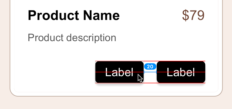
- Select the button's black background by clicking on it directly.
- Hold Shift and click the button's Label text to select both elements—this multi-selection approach ensures you capture all necessary components.
- Create your first smart button symbol using the Create Symbol button in the Toolbar.
Configure the button symbol's intelligent behavior:
- Name: button
- Layout: Horizontally Center Layout—this ensures text remains centered as button width adjusts to content
- Check Send Symbol to "Symbols" Page
- Click Create
- Descriptive naming improves team workflow and component identification. With the button selected, press Cmd–R and rename the layer to primary button, then press Return.
Create the secondary button through duplication. Drag the primary button left, then hold Option and Shift while dragging to create a precisely aligned copy:
- Rename the duplicate button for clarity: press Cmd–R, type secondary button, and press Return.
- Button groups often require different alignment behaviors than individual buttons. Select both buttons (click one, then Shift-click the other) to prepare for group symbol creation.
- Create the button group symbol using the Create Symbol button .
Configure the group's layout behavior—this demonstrates how nested smart layouts can have different alignment rules:
- Name: button group
- Layout: Right to Left Layout—this ensures the primary button stays right-aligned while the secondary button adjusts leftward as content changes
- Check Send Symbol to "Symbols" Page
- Click Create
Test the smart layout with realistic button labels. In the Inspector's Overrides section:
- secondary button > Label: More Info
- primary button > Label: Add to Bag
Observe how the buttons intelligently resize and the secondary button repositions itself as the primary button expands—this behavior is crucial for responsive design systems.
Demonstrate style flexibility within smart layouts. Many design systems require light and dark button variants. In the Inspector's Overrides:
- secondary button > button bg: Select light
- secondary button > button text: Change to dark for proper contrast
- Clear your selection by clicking empty canvas space to review the button styling changes.
For maximum layout flexibility, especially when dealing with variable text length that might cause line breaks, we'll create a master product symbol. In the Sidebar, click the product folder to select the entire group.
- Transform the product group into a comprehensive symbol using the Create Symbol button .
Configure the master product symbol for vertical content flow:
- Name: product
- Layout: Top to Bottom Layout—essential for product cards where content stacks vertically
- Check Send Symbol to "Symbols" Page
- Click Create
Replace placeholder content with realistic product information to test layout flexibility. Start with the product name by clicking on Distressed Blue Denim Jacket on the right side of the artboard:
- Press Return to select all text in the layer
- Copy with Cmd–C
- Double-click Product Name on the main artboard
- Select all existing text with Cmd–A
- Paste the new content with Cmd–V
Click in empty space to deselect and observe the intelligent layout response—text below automatically repositions and the container expands to accommodate the longer product name.
Complete the content update with the product description. Click the Subtly acid washed and… text on the right:
- Select all text with Return
- Copy with Cmd–C
- Double-click Product description on the artboard
- Select all with Cmd–A
- Paste with Cmd–V
- The final layout adjustment demonstrates the full power of nested smart layouts: buttons reposition vertically, the container resizes dynamically, and all elements maintain perfect spacing relationships regardless of content length variations.
Save your advanced smart layout work with Cmd–S and close the file.
Layout Direction Comparison
| Feature | Left to Right | Right to Left |
|---|---|---|
| Best for | Primary content flow | Button groups |
| Expansion behavior | Grows rightward | Grows leftward |
| Use case | Tag sequences | Action buttons |
| Alignment | Left-aligned | Right-aligned |
Button Group Smart Layout Process
Create Base Button Symbol
Select button background and label, then create symbol with Horizontally Center Layout
Duplicate and Rename
Create copies for primary and secondary buttons with descriptive layer names
Group into Smart Layout
Select both buttons and create symbol with Right to Left Layout for proper alignment
Apply Style Overrides
Use Inspector overrides to set different text and apply light/dark button styles
Notice how the secondary button automatically repositions left when the primary button expands. This responsive behavior eliminates manual adjustments when content changes.