Topics Covered in This Sketch Tutorial:
Mastering Bootstrap's Grid System, Strategic Design Adaptation for Tablets, Optimizing Mobile Phone Layouts
Exercise Preview
Exercise Workflow
Compare Grid Systems
Analyze desktop, tablet, and mobile Bootstrap grids to understand column behavior across breakpoints
Adapt for Tablets
Modify column spans and adjust element positioning for 768px+ screens
Optimize for Mobile
Stack elements vertically and create single-column layouts for screens under 576px
Exercise Overview
In this comprehensive exercise, you'll master the art of responsive design by learning how to systematically adapt a desktop-sized layout for smaller screens. This skill remains fundamental to modern UI/UX design, as mobile traffic now accounts for over 60% of web usage globally. You'll understand not just the mechanics of resizing elements, but the strategic thinking behind effective multi-device experiences.
Comparing Bootstrap's Desktop, Tablet, & Mobile Grids
Building on the previous exercise where we established our desktop foundation using Bootstrap templates, we'll now examine how grid systems intelligently adapt across devices. Understanding these breakpoints and their behaviors is crucial for creating cohesive user experiences that feel native to each screen size.
- In Sketch, close any open files to start with a clean workspace.
- Navigate to File > Open Local Document in Sketch.
Browse to Desktop > Class Files > Sketch Class > NYC and double–click About Page—Ready for Tablet & Mobile.sketch to open it.
NOTE: This file mirrors your previous exercise's work exactly. We're using this standardized version to ensure consistency as we explore responsive principles together.
- Compare the Desktop and Tablet artboards side by side. Use Spacebar + drag to pan smoothly between layouts if needed.
Observe how the columns become narrower in the tablet layout while maintaining consistent gutter spacing—this proportional relationship is key to Bootstrap's responsive success.
NOTE: The Tablet artboard targets screens 768px and larger, with a content container of 720px. This breakpoint captures most tablet devices in both portrait and landscape orientations.
Now examine the dramatic shift between Tablet and Phone artboards. The transition to mobile represents the most significant design challenge—multi-column layouts simply cannot function effectively on small screens. Notice we've included two-column guides for occasional use, though single-column layouts dominate mobile design.
NOTE: Bootstrap's mobile-first approach targets extra small devices under 576px. Our Phone artboard uses 320px width—the baseline established by the iPhone SE and still relevant for ensuring broad compatibility in 2026.
Bootstrap Grid Specifications
| Feature | Desktop | Tablet | Mobile |
|---|---|---|---|
| Container Width | Variable | 720px | 320px |
| Column Layout | Multi-column | Narrower columns | Single column |
| Gutter Size | Standard | Same as desktop | Minimal |
| Breakpoint | 992px+ | 768px+ | <576px |
Adapting the Design for Tablets
Responsive design isn't simply about shrinking elements—it's about rethinking proportions and hierarchy. While our sidebar spans 3 columns on desktop, we'll expand it to 4 columns on tablet. This demonstrates a core responsive principle: elements can and should claim different amounts of space across breakpoints to maintain optimal readability and visual balance.
First, we'll establish our working view to see both artboards simultaneously:
- In the left Sidebar, click Tablet to select it.
- Hold Shift and click Desktop to add it to your selection.
- Navigate to View > Zoom To > Selection for optimal viewing.
- Click any blank canvas area to deselect both artboards and prepare for element manipulation.
On the Desktop artboard, create a precise selection around the sidebar elements by dragging from outside the content area until your selection box encompasses both the background and text:
NOTE: Use Cmd–Plus(+) or Cmd–Minus(-) to adjust zoom levels throughout this exercise for precision work.
- Copy the selected elements with Cmd–C.
- Select the Tablet artboard in the Sidebar to set your paste destination.
- Paste with Cmd–V—elements will appear centered on the artboard initially.
- Switch to actual size view with Cmd–0 (View > Zoom To > Actual Size) to see true proportions.
- Ensure your guides are visible: press CTRL–R (View > Canvas > Show Rulers) if rulers aren't showing.
- Activate column guides with CTRL–L (View > Canvas > Show Layout) if they're not visible.
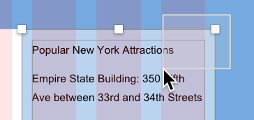
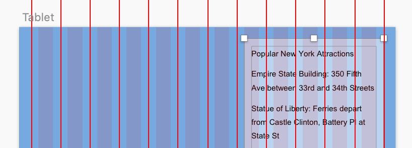
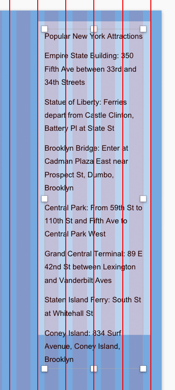
Position the sidebar precisely by aligning its right edge with the rightmost red guide. The vertical position should create visual balance—refer to the image below for guidance:
- Deselect by clicking blank canvas space.
- Select only the sidebar bg to resize the background independently.
Drag the background's left-middle resize handle inward until it snaps to the 5th red guide from right, creating our 4-column sidebar width:
- Click the sidebar text to select it.
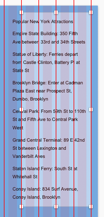
Resize the text container by dragging its bottom-left handle inward and downward until it snaps to the column boundaries within the background color, ensuring all text remains visible:
- Navigate to the Desktop artboard using Spacebar + drag or two-finger trackpad scrolling.
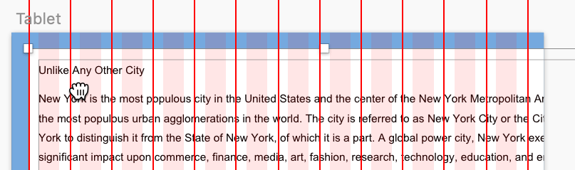
- On the Desktop artboard, select both the main content's white background and its text by dragging a selection box around both elements.
- Copy with Cmd–C.
Transfer these elements to the tablet layout:
- Scroll to the Tablet artboard.
- Ensure the tablet context is active by selecting any sidebar element or clicking Tablet in the artboard header or Sidebar.
- Paste with Cmd–V.
This juxtaposition clearly illustrates the significant size difference between desktop and tablet viewports.
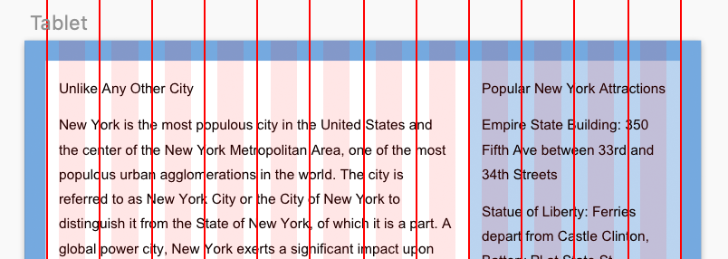
Position the main content area by aligning its left edge with the 1st red guide. Watch for the horizontal red guide that appears when you're properly aligned with the sidebar's top edge:
- Deselect elements by clicking empty canvas space.
- Select the main column's white background.
- Resize by dragging the background's right-middle handle inward until it snaps to the sidebar's left edge (the 5th red guide from right).
- Select the main column's text container.
Adjust the text box by dragging its right-middle handle inward to the 8th column boundary within the white background, achieving this layout:
- Extend the main text column by dragging its bottom-middle handle downward until all text is visible.
- Select the main column's white background on the Tablet artboard.
- Shift–click the sidebar's blue background to select both background elements.
- Extend both backgrounds by dragging their bottom handles down to create appropriate spacing below the text content. If Smart Guides interfere with your preferred positioning, temporarily disable them via View > Canvas > Show All Guides, then re-enable when finished.
Clean up your view by toggling off guides with CTRL–R and CTRL–L to appreciate your completed tablet layout.
NOTE: The tight padding you see represents Bootstrap's minimum spacing. On larger tablet screens, this content area remains constant while additional whitespace appears on the sides. While pre-built frameworks offer convenience, remember that custom grid systems provide greater control over spacing and proportions for unique design requirements.
Save your progress with File > Save (Cmd–S).
Grid systems don't require elements to span the same amount of columns across screen sizes. The sidebar spans 3 columns on desktop but 4 columns on tablet for better proportions.
Tablet Layout Process
Select Multiple Artboards
Use Shift-click to select both Desktop and Tablet artboards, then zoom to selection for easy comparison
Copy and Position Elements
Drag selection boxes around sidebar elements, copy with Cmd-C, and paste to tablet artboard with proper alignment
Resize and Align
Use red guides to align elements and resize backgrounds to fit the 4-column sidebar span
Adjust Text Areas
Resize text boxes and backgrounds to accommodate all content within the new column constraints
Adapting the Design for Mobile Phones
Mobile design represents the ultimate test of content hierarchy and user experience prioritization. With severely limited horizontal space, we must abandon multi-column layouts entirely. Our strategy places the primary content first, followed by supporting information—a approach that aligns with mobile users' task-focused behavior and limited attention spans.
- Select both Phone and Tablet artboards by clicking Phone in the Sidebar, then Shift–clicking Tablet.
- Focus on both layouts using View > Zoom To > Selection.
- Deselect artboards by clicking blank canvas space.
- Select the Phone artboard by clicking the word Phone at its top-left corner—we need to accommodate much more content vertically.
- Drag the bottom resize handle downward to add height, though visual estimation isn't precise enough for our needs.
- In the right Inspector panel, set the H (Height) field to 1,000 and press Return for adequate vertical space.
- The process for creating the mobile layout follows the same copy-paste-adjust methodology you've just mastered. Since you've demonstrated proficiency with these techniques, we'll move forward (though you're welcome to practice the mobile adaptation if desired).
- Save and close the file to complete this responsive design exercise.
Multiple text columns don't fit on small screens. The mobile layout uses a single column with the main content on top, requiring significant height adjustments to accommodate stacked elements.
Mobile Adaptation Checklist
Set height to 2000px or more to fit all elements vertically
Place main content above sidebar content for better user experience
Keep adequate padding and margins despite smaller screen size
Ensure all text and elements remain readable at mobile dimensions
Is Stacking Elements the Best Solution?
While stacking desktop columns vertically seems like the obvious mobile solution, this approach often creates problematic user experiences. Excessive vertical scrolling can bury critical information below the fold, potentially losing users before they discover key content or calls-to-action.
Consider these alternative strategies: implement collapsible sections with clear preview text for easy content scanning; convert image galleries into swipeable carousels to maintain visual impact while conserving space; use progressive disclosure to reveal detailed information on demand; prioritize content based on mobile user goals rather than desktop hierarchy. The key is understanding that mobile users often have different objectives and constraints than desktop users—your responsive strategy should reflect these behavioral differences, not simply accommodate smaller screens.
Stacking vs Alternative Solutions
Alternative Mobile Design Patterns
Collapsible Sections
Use accordion-style interfaces where sections can be collapsed for easy scanning. Users tap to reveal detailed information.
Content Carousels
Convert multiple images or content blocks into swipeable slideshows to save vertical space while maintaining access.
Priority-Based Layout
Analyze user interaction patterns to determine which content should be most prominent on mobile devices.
Think about how users will interact with your content to decide what's best for mobile, tablet, and desktop users. The goal is optimization for each platform, not just responsive scaling.