
Exploratory data analysis (EDA) represents one of the most critical yet frequently undervalued phases in any data science project. The allure of jumping straight into model training is understandable—who doesn't want to see immediate results? However, this approach often leads to flawed conclusions and unreliable models. A comprehensive EDA serves as your data's health check, revealing hidden patterns, anomalies, and quality issues that could derail your entire analysis. Python has emerged as the gold standard for data science work, largely due to its robust ecosystem of visualization libraries, particularly Matplotlib and Seaborn, which transform raw numbers into actionable insights through compelling visual narratives.
Matplotlib & Seaborn
Matplotlib stands as Python's foundational data visualization library, capable of generating everything from simple static charts to complex animated and interactive visualizations within Jupyter Notebook environments. Built on top of this robust foundation, Seaborn elevates data visualization by providing statistical plotting functions and aesthetically pleasing default themes that would otherwise require extensive customization in raw Matplotlib.
The synergy between these libraries has made them indispensable in professional data analysis workflows. While Seaborn excels at creating beautiful, publication-ready plots with minimal code, Matplotlib provides the granular control needed for custom visualizations and complex formatting requirements. This complementary relationship explains why most data scientists use both libraries in tandem during their EDA process.
To demonstrate these capabilities, we'll walk through a comprehensive EDA using the Boston Housing dataset from Kaggle. This practical example will showcase real-world techniques you can immediately apply to your own projects. Note that this analysis prioritizes exploratory breadth over hypothesis-driven investigation—a common approach when initially familiarizing yourself with unfamiliar data.
Matplotlib vs Seaborn Comparison
| Feature | Matplotlib | Seaborn |
|---|---|---|
| Customization | Highly customizable | Limited customization |
| Default Aesthetics | Basic styling | Superior color themes |
| Based On | Standalone library | Built on Matplotlib |
| Use Case | Custom plots | Quick statistical plots |
Importing Libraries
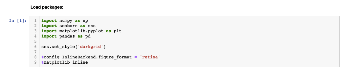
Every effective EDA begins with proper library imports and environment configuration. The following setup represents current best practices for Python data analysis in 2026:
When importing libraries, we follow widely accepted naming conventions that have become industry standards. These abbreviations (pd for pandas, np for numpy, plt for matplotlib.pyplot, and sns for seaborn) are universally recognized and expected in professional environments, ensuring your code remains readable to other data scientists.
The configuration commands deserve special attention: 'sns.set_style' establishes consistent plot aesthetics across your entire analysis, while '%config InlineBackend.figure_format = 'retina'' ensures your visualizations maintain crisp, high-resolution quality—essential when presenting findings to stakeholders or including charts in reports. The magic function '%matplotlib inline' integrates plot rendering directly into your Jupyter Notebook cells, creating a seamless analytical workflow where code and visualizations coexist.
Essential Library Setup Components
Standard Abbreviations
Industry-standard naming conventions like 'pd' for pandas and 'sns' for seaborn ensure code readability and consistency across teams.
Plot Aesthetics
The sns.set_style function configures visual styling, while retina format ensures high-resolution, professional-quality visualizations.
Inline Display
Magic functions like %matplotlib inline embed plots directly in Jupyter notebooks for immediate visualization and storage.
Loading the Data
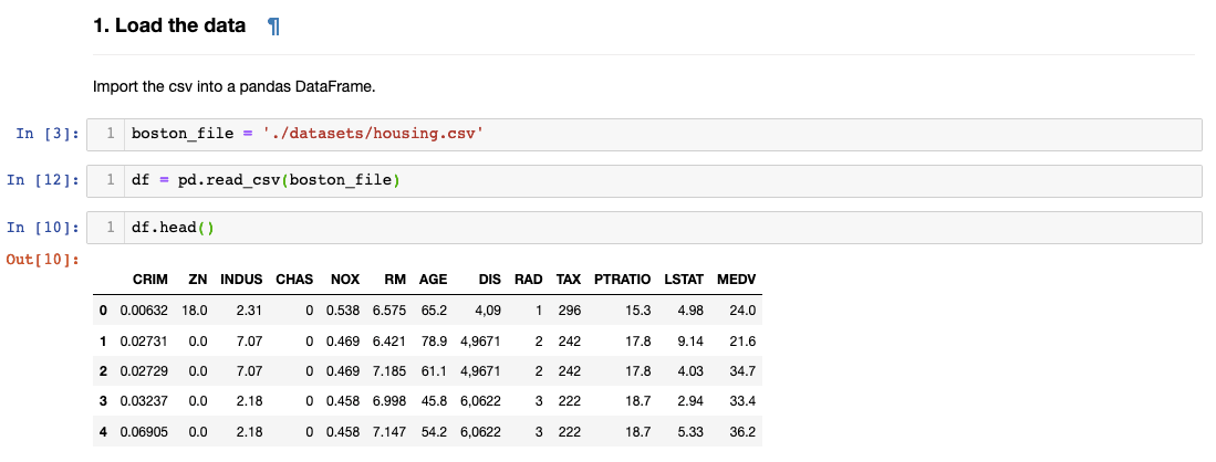
Data loading marks the transition from setup to actual analysis. Using pandas' read_csv() function, we create a DataFrame object—pandas' primary data structure that combines the familiarity of spreadsheets with the power of programmatic analysis. The variable name 'df' follows another universal convention in data science.
The df.head() method provides your first glimpse into the dataset's structure and content. While it defaults to showing five rows, you can specify any number of rows by including an integer within the parentheses (e.g., df.head(10)). This initial inspection helps you understand column names, data types, and general formatting before diving deeper into analysis. Take time during this step to mentally map the data landscape—it will inform every subsequent decision in your EDA process.
Always use df.head() to examine the first few rows of your dataset. You can specify the number of rows by adding a number in the parentheses to get the right level of detail for your initial assessment.
Checking Null Values
Data quality assessment begins with null value detection—a critical step that can save hours of debugging later in your analysis. Missing values represent one of the most common data quality issues you'll encounter in real-world datasets, and they can severely impact model performance if left unaddressed.
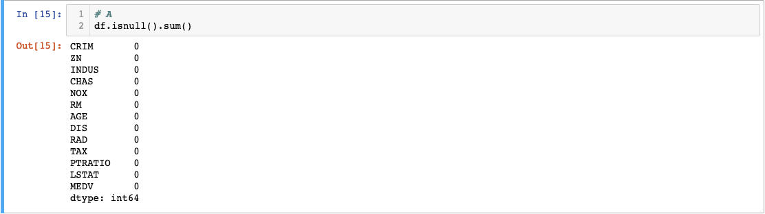
The elegant combination of .isnull().sum() provides a comprehensive null value audit in just one line of code. The .isnull() method converts each cell to a boolean value (True for null, False for populated), creating a boolean mask of your entire dataset. Chaining .sum() then counts the True values in each column, giving you exact null counts per feature.
The Boston Housing dataset's zero null values represent an idealized scenario. In practice, you'll frequently encounter missing data requiring strategic decisions about imputation methods, deletion strategies, or feature engineering approaches. These preprocessing choices can significantly influence your analysis outcomes, making null value assessment an essential early checkpoint in any data science workflow.
Null Value Detection Process
Apply isnull() Function
Converts column values into boolean True/False values, with null values returning True
Sum Boolean Results
The sum() function counts True values in each column to calculate total null values per feature
Validate Data Quality
Assess whether null values require filling, removal, or other preprocessing before model building
Renaming Column Names
Clear, descriptive variable names dramatically improve code readability and reduce cognitive overhead during analysis. While abbreviated column names are common in academic datasets and legacy systems, translating them into meaningful labels pays dividends throughout your project lifecycle.
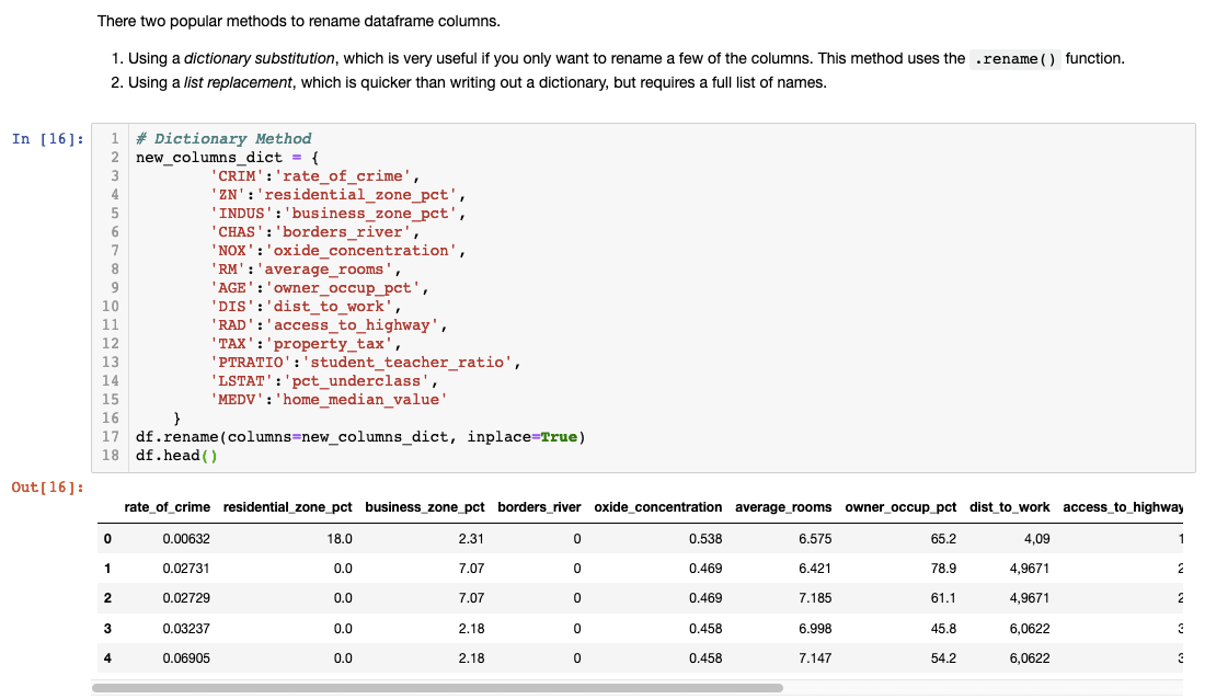
Most datasets include documentation or codebooks explaining variable abbreviations, but don't assume future readers of your analysis will have access to these references. Descriptive names like 'rate_of_crime' instead of 'CRIM' or 'average_rooms' instead of 'RM' make your analysis self-documenting and accessible to non-technical stakeholders.
Always verify your renaming operation succeeded by running df.head() immediately afterward. This simple validation step prevents downstream confusion and ensures your subsequent analysis references the correct variables. Consider this investment in clarity as technical debt prevention—your future self will thank you.
Transform abbreviated column names into descriptive ones for better readability. Always reference the dataset's codebook and verify changes with df.head() to ensure successful renaming.
Checking Summary Statistics
Statistical summaries provide the quantitative foundation for understanding your data's characteristics, distributions, and potential quality issues. The .describe() method generates comprehensive descriptive statistics for all numerical columns simultaneously, offering insights into central tendencies, variability, and range.
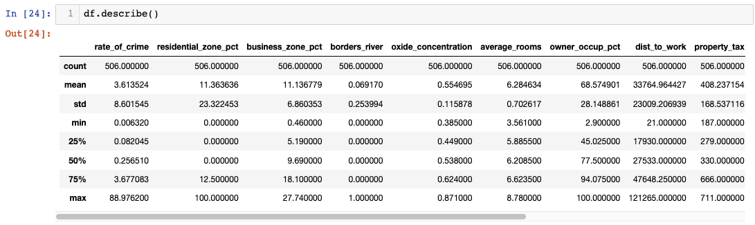
However, raw statistical tables often fail to reveal patterns that become immediately apparent through visualization. While summary statistics provide precise numerical values, they can obscure distributional characteristics, outliers, and skewness that significantly impact analytical conclusions. This limitation highlights why effective EDA combines statistical summaries with visual exploration—each approach reveals different aspects of your data's story.
The transition from tabular statistics to visual analysis represents a crucial shift in analytical perspective. Numbers tell you what happened; visualizations help you understand why and what it means for your analysis objectives.
I found it difficult to find anything meaningful when data was presented in a table format.Boxplots
Boxplots excel at revealing distributional characteristics that remain hidden in summary statistics. These compact visualizations simultaneously display median values, quartile ranges, variability measures, and outlier identification—essentially compressing an entire distribution into a single, interpretable graphic.
Understanding boxplot anatomy enhances your analytical capabilities: the box boundaries represent the first and third quartiles (Q1 and Q3), enclosing the middle 50% of your data. The internal line marks the median, while whiskers extend to the calculated maximum and minimum values. The maximum is determined by Q3 + 1.5×IQR (Interquartile Range), and the minimum by Q1 - 1.5×IQR. Any points beyond these whiskers are flagged as potential outliers deserving closer investigation.
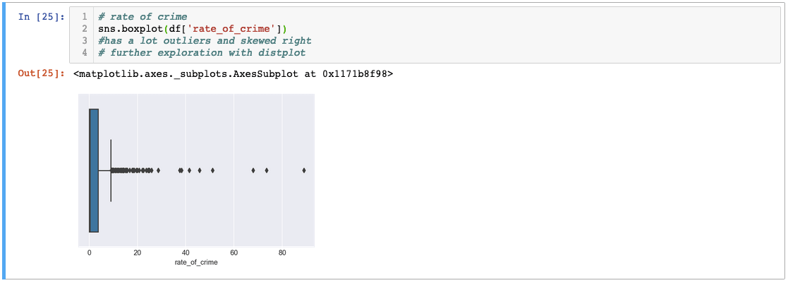
The 'rate_of_crime' variable demonstrates a classic right-skewed distribution with numerous outliers extending far beyond the typical range. This pattern suggests most areas have relatively low crime rates, but several neighborhoods exhibit exceptionally high crime levels that could significantly influence any subsequent analysis.
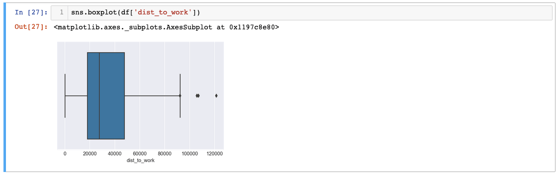
The 'dist_to_work' variable reveals even more extreme outliers—distances exceeding 120,000 units suggest possible data entry errors or measurement inconsistencies. While we'll proceed assuming data validity for this tutorial, such anomalies typically warrant investigation and potential correction in production analyses.
For comprehensive outlier assessment across multiple variables, matplotlib's subplot functionality combined with seaborn's plotting capabilities creates efficient multi-panel visualizations:
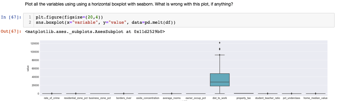
This approach reveals a common EDA challenge: variables with vastly different scales can render comparative visualization ineffective. The extreme values in 'dist_to_work' compress other variables' boxplots, obscuring meaningful patterns. Professional EDA often requires iterative visualization strategies, sometimes excluding problematic variables or applying transformations to achieve interpretable results.
Boxplot Components Explained
Box Boundaries
The upper and lower edges represent the 75th and 25th percentiles respectively, showing the interquartile range where 50% of data lies.
Central Line
The line through the box indicates the median value, providing insight into the central tendency of your data distribution.
Whiskers and Outliers
Whiskers extend to calculated maximum and minimum values. Points beyond whiskers are outliers that may require special attention.
The distance to work variable showed outliers over 120,000 miles - potentially data entry errors that should be investigated, though we proceed assuming data validity for this tutorial.
Correlation Matrices
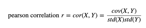
Correlation analysis reveals the linear relationships between variables, providing crucial insights for feature selection, multicollinearity detection, and hypothesis generation. The Pearson correlation coefficient quantifies these relationships on a scale from -1 to +1, where values near zero indicate weak linear relationships, and values approaching the extremes suggest strong positive or negative correlations.

Seaborn's heatmap visualization transforms correlation matrices from dense numerical tables into intuitive color-coded maps. The diagonal values of 1.0 represent each variable's perfect correlation with itself, while off-diagonal values reveal inter-variable relationships. Color intensity typically corresponds to correlation strength, making patterns immediately apparent to the human eye.
For targeted analysis of specific variables, pandas enables focused correlation examination:
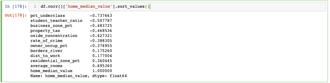
This focused approach reveals that 'average_rooms' shows the strongest correlation with 'median_value', suggesting it could serve as a powerful predictor in subsequent modeling efforts. Such insights guide feature engineering decisions and help prioritize variables for deeper investigation.
While pairplot visualizations can provide comprehensive relationship overviews, they often become cluttered and difficult to interpret with larger datasets:
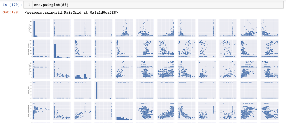
Pairplots work best with carefully selected variable subsets rather than entire datasets, highlighting the importance of strategic visualization choices in professional EDA workflows.
Correlation Analysis Workflow
Generate Pearson Correlation
Calculate correlation coefficients between all variable pairs to identify linear relationships
Create Heatmap Visualization
Use Seaborn to transform correlation matrix into an intuitive color-coded heatmap
Identify Strong Correlations
Focus on variables with high correlation coefficients for further exploration and model inclusion
The analysis revealed that average_rooms shows strong correlation with median home value, making it a valuable predictor variable for housing price models.
Recap
This comprehensive EDA tutorial demonstrates the powerful synergy between Matplotlib and Seaborn for transforming raw data into actionable insights. Through systematic application of boxplots for distribution analysis and correlation matrices for relationship exploration, we've uncovered patterns and anomalies that would remain hidden in purely numerical analyses.
Remember that effective EDA adapts to your data's unique characteristics. Different datasets may require histograms for frequency distributions, scatter plots for relationship exploration, or time series visualizations for temporal patterns. The techniques demonstrated here provide a solid foundation, but professional data analysis demands flexibility and creativity in your visualization approach.
The investment in thorough exploratory analysis pays dividends throughout your project lifecycle—from informing preprocessing decisions to guiding feature selection and validating model assumptions. As data science continues evolving in 2026, these fundamental EDA skills remain as relevant as ever, forming the bedrock of reliable, insightful analysis.
Visualization Techniques Used