Topics Covered in This Photoshop Tutorial:
Matching Colors Using Curves
Core Tutorial Components
Curves Adjustment Mastery
Learn to manipulate RGB composite curves and individual color channels. Master the precise adjustments needed for professional color matching.
Layer Mask Techniques
Apply selective editing using brush tools and layer masks. Protect specific areas while adjusting others for natural results.
Color Theory Application
Understand how different lighting affects liquid appearance. Match colors across different surfaces and materials in product shots.
Exercise Preview
Curves Adjustment Layer Benefits
Always work with Adobe RGB color space for product photography to ensure maximum color accuracy and professional print compatibility.
Exercise Overview
In this exercise, you'll tackle one of the most common challenges in product photography: color inconsistency across reflective surfaces. Notice how the whiskey appears distinctly different in the bottle compared to the glass—this discrepancy occurs frequently when lighting conditions vary across a composition. Using a targeted Curves adjustment layer, you'll learn to harmonize these color variations while maintaining the natural characteristics of each surface.
This technique is essential for e-commerce photography, advertising campaigns, and any scenario where color accuracy directly impacts brand perception and consumer trust.
Color Matching Workflow
Path Selection Setup
Load the tumbler glass path as an active selection using Cmd-click or Ctrl-click on the path thumbnail in the Paths panel.
Curves Layer Creation
Create a new Curves adjustment layer and name it appropriately for organized workflow and easy identification.
Color Analysis
Compare the bottle and glass liquor colors to identify the specific adjustments needed for accurate color matching.
Curve Adjustments
Modify RGB composite and individual color channels systematically to achieve the desired color match.
Matching the Color of the Liquor in the Glass to That in the Bottle
If it's not still open, re-open yourname-product-Adobe RGB.psd.
In the Paths panel, Cmd–click (Mac) or CTRL–click (Windows) on the tumbler glass path thumbnail to load it as a selection.
This pre-made path ensures precise selection boundaries around the glass, which is crucial for maintaining clean edges when applying color adjustments to reflective surfaces.
Navigate to the Layers panel and create a new Curves adjustment layer.
Curves remain the gold standard for color matching because they provide granular control over tonal relationships while preserving the natural luminosity variations that give liquids their realistic appearance.
Name this adjustment layer fix tumbler color.
Your objective is to match the liquor's color in the glass to the reference color in the bottle. During the adjustment process, don't be concerned if other areas of the glass temporarily shift to undesirable colors—we'll selectively mask those areas in the final step. Focus exclusively on achieving color harmony between the two liquid surfaces.
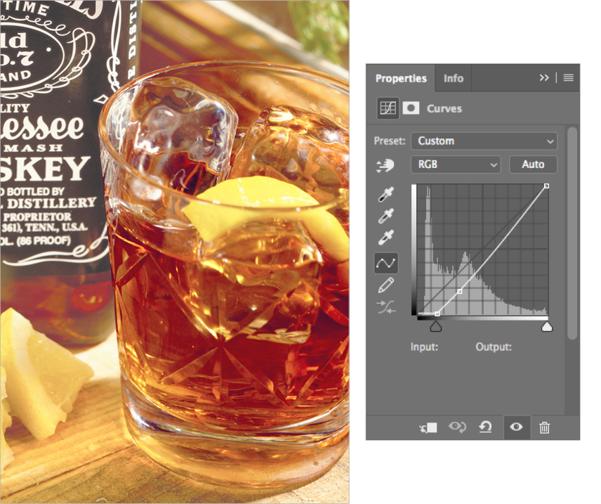
In the Properties panel, darken the RGB composite curve and add a subtle amount of Red. Use the curves shown below as your baseline reference for matching the color temperature and saturation.

The RGB composite adjustment controls overall luminosity, while the Red channel fine-tunes the warmth to match the bottle's amber characteristics.
Enhance the Green channel contrast and introduce Blue adjustments as demonstrated below:

These complementary adjustments refine the color balance, ensuring the glass liquid achieves the same rich, complex hue as the bottle reference while maintaining natural depth and translucency.
You'll notice that certain areas of the glass now appear overcorrected or unnatural. Select the curves layer mask and use the Brush
 set to black to selectively remove the color adjustment from problematic areas. Focus on masking the upper rim of the glass, the lemon garnish, and any reflective highlights where the correction creates unwanted color shifts.
This selective masking technique allows you to maintain the color correction only where it enhances realism while preserving the natural appearance of glass surfaces and garnish elements.
Save your file and keep it open—you'll build upon this color-matching foundation in the next exercise.
RGB Channel Adjustment Strategy
| Feature | Adjustment Type | Purpose |
|---|---|---|
| RGB Composite Darkening | Reduce overall brightness | Match bottle liquor darkness |
| Red Channel Addition | Add touch of warmth | Enhance whiskey tone |
| Green Channel Contrast | Increase contrast | Improve color definition |
| Blue Channel Addition | Add subtle blue tones | Balance overall color cast |
Quality Control Checklist
These areas should not be affected by color adjustments
Use black brush on layer mask to protect garnish areas
Mask out reflection areas that look unnatural after adjustment
Colors should match closely under same lighting conditions
Proper organization essential for professional workflow
Don't worry if some glass areas look wrong initially. The key is focusing on the liquor color match first, then using layer masks to refine the affected areas.