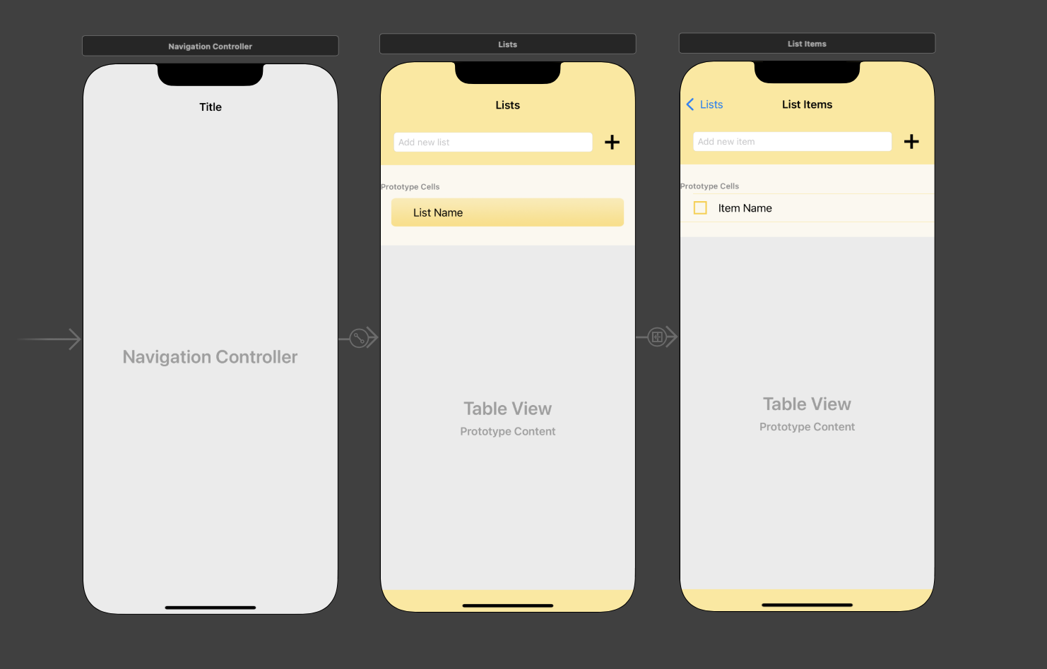
Topics Covered in This iOS Development Tutorial:
Integrating designer assets into your Xcode project, implementing sophisticated UI design patterns across storyboard screens, creating visual differentiation between view controllers for enhanced user experience, and establishing proper view controller and table view cell class relationships
Exercise Preview
Exercise Overview
Professional iOS development requires seamless collaboration between designers and developers. In this exercise, we'll implement the final design assets created by our design team, transforming a functional but visually basic app into a polished, user-friendly experience. You'll learn how to integrate custom imagery, establish visual hierarchy through color and layout, and create meaningful differentiation between screens that enhances the overall user journey. We'll add sophisticated background treatments to the first screen and interactive elements to the second, demonstrating how thoughtful UI decisions impact user engagement.
This exercise demonstrates real-world collaboration between developers and designers, showing how to implement final design assets and differentiate screens for better user experience.
Getting Started
Launch Xcode if it isn't already open. Ensure you're working with the latest stable version for optimal compatibility with current iOS deployment targets.
If you completed the previous exercise, Lists.xcodeproj should still be open. If you closed it, re-open it now to continue your development workflow.
We strongly recommend completing the previous exercise (5B) before proceeding, as this tutorial builds directly on those foundations. If you did not complete the previous exercise, follow these steps:
- Go to File > Open
- Navigate to Desktop > Class Files > yourname-iOS App Dev 2 Class > Lists Ready for Refining the UI and double–click on Lists.xcodeproj
Adding Images from the Designer
Modern iOS apps rely heavily on carefully crafted visual assets. The integration process we'll follow here represents industry-standard practice for incorporating designer deliverables into production applications.
The Project navigator on the left is likely still hidden. To reveal it, go to the top right and click the Hide or show the Navigator icon
 . This navigator is essential for project file management.
Let's incorporate the carefully designed image assets into our project to elevate the UI's visual appeal and user engagement. In the Project navigator
 , click on Assets to access the asset catalog.
Switch to the Desktop and navigate to Class Files > yourname-iOS App Dev 2 Class > Lists Images. These assets have been optimized for iOS display characteristics and performance requirements.
Press Cmd–A to select all image files efficiently.
With Xcode still visible, drag the selected images to either column in the Editor. Xcode will automatically process these assets and make them available throughout your project.
Adding Images to Xcode Assets
Show Project Navigator
Click the Navigator icon in the top right to reveal the Project navigator panel on the left side of Xcode.
Access Assets Catalog
In the Project navigator, click on Assets to open the Assets.xcassets folder where all image resources are stored.
Import Designer Images
Navigate to the designer's image folder, select all images with Cmd+A, then drag them directly into the Xcode Editor.
Adding New Images When Your Project Already Has Images
In professional development environments, design iteration is constant. You'll frequently need to update visual assets as your design team refines the user experience. This workflow ensures smooth asset updates without breaking existing references:
In Xcode, click on Assets and select all images requiring replacement. This approach maintains project organization and prevents asset bloat.
CTRL–click or Right–click on the selected images and choose Remove Selected Items. The images will be cleanly removed from your project's Assets.xcassets folder, ensuring no orphaned references remain.
Switch to the Finder, select all replacement images and drag them into Xcode, dropping them into your Assets catalog. The drag-and-drop workflow streamlines the update process.
If the new images maintain identical names to their predecessors (which is standard practice in design handoffs), existing references will automatically update—no additional code changes required! For renamed assets, select the affected UI elements and update the Image or Background properties in the Attributes inspector.
- Review and adjust constraints for affected elements to ensure the new assets display optimally across all target device sizes.
When designers refine assets multiple times, use consistent naming conventions. Images with identical names will automatically update references throughout your project, saving significant development time.
Image Update Process
Select unwanted images, right-click, and choose Remove Selected Items
Use same names as old images to preserve existing references
Change Image and Background properties in Attributes inspector if names differ
New images may require constraint modifications for proper layout
Improving the UI Design on Our Storyboard Screens
The final design employs a cohesive visual language featuring warm yellow tones and bold interactive elements that create an engaging, motivational user experience. Let's transform our basic gray interface into something that users will genuinely enjoy interacting with.
If Main.storyboard isn't visible in the Editor area, navigate there now. If the Document Outline is hidden, click its toggle button
 to reveal the structural hierarchy.
Now that we've imported our assets, hide the Project navigator by clicking the Hide or show the Navigator button
to maximize our design workspace.In the Document Outline, expand both the Lists Scene and List Item Scene by clicking anywhere on each controller in the Editor, or by clicking the down arrows in the outline. This reveals the complete view hierarchy.
Notice that each Scene contains a main View with multiple child objects. Let's establish clear naming conventions to prevent confusion during development:
- Under Lists Scene > Lists, select the View and press Return to enable renaming
- Name it superView and press Return to confirm
- Select the View under List Items Scene > List Items and rename it to superView for consistency
The default gray background lacks visual appeal and fails to communicate the app's purpose. In the Document Outline under Lists (the first View Controller
 ), click on the superView.
For efficiency, we'll update both View Controllers simultaneously. Under List Items, Cmd–click on its superView so both superViews are selected while maintaining precise selection control.
At the top right, ensure you're in the Attributes inspector tab
 where we'll modify visual properties.
In the Attributes inspector next to Background, click once on the color bar (avoid clicking the "Light Gray Color" text).
Our design team has specified exact color values for brand consistency. In the Colors panel, click the second button to display Color Sliders. Ensure the palette menu shows RGB Sliders for precise color matching.
In the Hex Color field, enter FCE586 (a carefully chosen sunny yellow that evokes positivity and energy). Press Return and close the panel to see the transformation.
Let's replace the standard system button with our custom-designed Plus button that better aligns with the app's visual identity. In the Document Outline, select the following:
- Under Lists > superView, click on the Button. This deselects the superViews, focusing on button modification
- Under List Items > superView, Cmd–click on its Button to include it in the selection
In the Attributes inspector
next to Image, type AddButton and press Return to apply our custom asset.To create the visual metaphor of a yellow memo pad with clear item separation, we'll style our table views with coordinated yellow tones. Under each superView, select both Table View objects (remember to Cmd–click the second one).
In the Attributes inspector, configure the cell separators that create visual organization between list items:
- Click once on the color bar next to Separator (not the "Default" text)
- In the color dialog, ensure the RGB Sliders interface is active
- Enter FCD75B in the Hex Color field (a darker yellow shade that provides subtle but clear separation). Press Return and close the panel
- To achieve full-width separators that look more polished, access the Separator Inset menu and change from Default to Custom
- Set the Left value to 0 to match the right inset, creating consistent edge-to-edge separation lines. Press Return
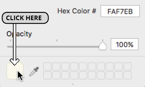
Scroll down to locate the View section in the Attributes inspector. Find the Background menu (positioned between Alpha and Tint) and click the color bar.
In the color dialog, enter FAF7EB in the Hex Color field (a subtle pale yellow that creates gentle visual cohesion). Press Return and close the panel. You'll notice refined yellow accents appearing under labels and in the prototype cells area.
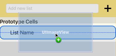
To eliminate white backgrounds that break our color scheme, apply the same background color to each Table View Cell. Select the first Table View Cell in the Document Outline, then Cmd–click the second one.
In the Attributes inspector next to Background, click the color bar to access color options.
Apply the previously used FAF7EB color by clicking the color square in the bottom left, as shown below:
Close the panel and review your work. The interface now demonstrates professional visual cohesion, but we need to create functional differentiation between the two screens to guide user understanding.
Using hex color values like FCE586 ensures consistent branding across your app and matches designer specifications exactly, rather than relying on system default colors.
Differentiating the First View Controller
User experience design relies on clear visual cues to communicate functionality. Our first View Controller displays list categories and requires a distinctive treatment that signals its role in the information hierarchy. We'll implement a subtle gradient background that adds depth without overwhelming the content.
We'll add an image view to house our designer's gradient background asset. In the Objects search field, type image to filter available UI elements efficiently.
Drag an Image View into the first View Controller's Content View. When the area surrounding the List Name label highlights with a blue outline (indicating proper containment), release the mouse.
In the Attributes inspector next to Image, type CellDeselectedBackground. Accept the autocomplete suggestion and press Return to apply this carefully designed gradient asset.
The image may be obscuring text due to default stacking order. In the Document Outline, drag CellDeselectedBackground above the List Name label while ensuring it remains nested within the Content View. This creates proper layering with the background behind text elements.
Still in the Document Outline, establish precise positioning by Control–dragging from CellDeselectedBackground to its containing Content View and creating these four constraints:
- Center Horizontally in Container
- Center Vertically in Container
- Equal Widths
- Equal Heights
Click the Update Frames button
 in the bottom right of the Editor to apply constraint changes immediately.
To achieve optimal visual balance within the cell container, switch to the Size inspector tab
 in the top right panel.
In the Size inspector, fine-tune the background image proportions by clicking Edit next to each constraint and adjusting the Multiplier values as shown (press Esc after each change):
Constraint Multiplier Equal Width 0.92 Equal Height 0.8 The proportions are improved, but the cells need additional breathing room for better readability and visual comfort. Let's optimize the cell dimensions:
- In the Document Outline, select the Lists View Controller's Table View Cell
- At the top of the Size inspector, change the Row Height to 56 and press Return
- Select the parent Table View in the Document Outline
- In the Size inspector, set the Row Height to 56 for consistency
Examining the storyboard, you'll notice the gradient background sits very close to the yellow separator line, creating visual tension rather than harmony.
Return to the Attributes inspector tab
to make our final adjustment.With the Table View still selected, access the Separator menu and change from Default to None. This creates a cleaner, more sophisticated appearance that lets the gradient backgrounds provide visual separation.
Adding Background Image with Constraints
Add Image View Component
Search for 'image' in Objects library and drag Image View into the first View Controller's Content View area.
Set Background Image Asset
In Attributes inspector, set Image to CellDeselectedBackground to display the designer's gradient background.
Configure Auto Layout Constraints
Create Center Horizontally, Center Vertically, Equal Widths, and Equal Heights constraints to Content View.
Adjust Size Multipliers
Set Equal Width multiplier to 0.92 and Equal Height to 0.8 for proper proportions and visual breathing room.
Adding a Check Button to the Second View Controller
Task completion is a core user motivation in productivity apps. By adding an interactive check button, we're implementing a fundamental UX pattern that provides immediate feedback and satisfaction when users complete items. This interaction will be powered by code in later exercises, but establishing the visual foundation is crucial for user interface planning.
In the Document Outline under the bottom scene (List Items Scene), select the Content View (expand the Table View Cell if necessary to reveal the hierarchy). If the second View Controller isn't visible in the Editor, select List Items
to bring it into focus.In the Objects search field, type button to filter available elements and locate the button component.
Carefully drag the Button to the compact space left of the Item Name label. When the label area highlights in blue, indicating proper parent-child relationship, release the mouse.
In the Attributes inspector, locate the Title field and delete the default Button text to create a clean, image-only button.
In subsequent exercises, we'll implement dynamic image switching when users tap this button. For now, establish the default state by typing Unchecked next to Image and pressing Return.
To maintain visual consistency across different device sizes, Control–drag from the new Button item to itself in the Document Outline and select Aspect Ratio from the popup menu.
Continue in the Document Outline by Control–dragging from the Button to its containing Content View and creating these essential constraints:
- Center Horizontally in Container
- Center Vertically in Container
- Equal Heights
Apply the constraint changes by clicking the Update Frames button
in the bottom right of the Editor.Switch to the Size inspector tab
to fine-tune the button's position and proportions.In the Size inspector, modify the constraint multipliers to achieve optimal button placement and sizing:
Constraint Multiplier Align Center X 0.16 10:11 Ratio 1:1 Equal Height 0.8 While the check button is now properly positioned, maintaining organized code structure requires logical ordering in our Document Outline hierarchy.
In the Document Outline, drag the Button object to become the first child under Content View. This creates a logical top-to-bottom, left-to-right organization that aids in code maintenance.
Select the Item Name label in the Document Outline to adjust its positioning relative to our new check button.
In the Size inspector
, observe that the Leading Space constraint currently references the Superview (the Content View). For proper layout relationships, we need to establish a constraint relative to our check button instead.Select the current Leading Space constraint and press the
The check button is designed for future functionality where users can mark items as completed. Setting up the UI structure now enables easy code integration later.
Check Button Configuration
Add Button Component
Drag Button from Objects library to the left side of the Item Name label in the second View Controller.
Configure Button Properties
Remove default button text and set Image to Unchecked for the default state appearance.
Set Aspect Ratio Constraint
Control-drag button to itself and select Aspect Ratio to maintain square proportions.
Apply Positioning Constraints
Add Center Horizontally, Center Vertically, and Equal Heights constraints with specific multipliers for precise placement.