Topics Covered in This HTML Email Tutorial:
Adding a Preheader to Entice Mobile Users, Inlining the Styles with Mailchimp's Inliner
Exercise Preview
Exercise Overview
In this exercise, you'll implement a preheader—the preview text that appears beneath the subject line in most modern email clients. This strategic addition serves as a compelling teaser for your email content and can significantly boost open rates by giving recipients a compelling reason to engage with your message.
We'll also address one of the most critical aspects of HTML email development: CSS inlining. While embedded CSS streamlines the coding process during development, inline styles remain the gold standard for email compatibility across diverse clients. Writing inline styles manually would be prohibitively time-consuming for complex emails, which is why we developed our layout using embedded CSS rules first. However, many email clients—particularly older versions of Gmail and Outlook—either strip out or ignore embedded styles entirely, potentially breaking your carefully crafted design.
Fortunately, automated inlining tools have evolved to handle this conversion intelligently, preserving essential media queries (which cannot be inlined) while moving all other CSS properties to inline style attributes. Most email marketing platforms now provide robust inlining capabilities as part of their sending infrastructure. For this tutorial, we'll leverage Mailchimp's proven free inliner tool, which has become an industry standard for its reliability and smart handling of responsive email code.
If you completed the previous exercise, date-night-exclusive-picks.html should still be open, and you can skip the following sidebar. If you closed date-night-exclusive-picks.html, re-open it now. We recommend you finish the previous exercises (1C–2C) before starting this one. If you haven't finished them, do the following sidebar.
Exercise PrerequisitesThis tutorial assumes completion of previous exercises 1C-2C. If you haven't completed them, follow the setup instructions in the next section to prepare your files.
If You Did Not Do the Previous Exercises (1C–2C)
- Close any files you may have open.
- On the Desktop, go to Class Files > yourname-HTML Email Class.
- Delete the 2-Column Layout folder if it exists.
- Duplicate the 2-Column Layout Mobile Optimized Done folder.
- Rename the folder to 2-Column Layout.
Setup Process for New Participants
Close Open Files
Close any files currently open in your code editor to start with a clean workspace.
Navigate to Class Files
On Desktop, go to Class Files > yourname-HTML Email Class directory.
Prepare Project Folder
Delete existing 2-Column Layout folder if present, then duplicate the 2-Column Layout Mobile Optimized Done folder and rename it to 2-Column Layout.
Adding a Preheader to Entice Mobile Users
The preheader represents one of the most underutilized opportunities in email marketing. This snippet of preview text appears after or below the subject line when recipients view your email in their inbox, providing crucial additional context that can make or break their decision to open your message. While desktop clients like Gmail and Apple Mail have long supported preheaders, mobile email apps have made them absolutely essential—the limited screen real estate means this preview text often determines whether your email gets opened or ignored.
Without a custom preheader, email clients automatically extract the first available text from your email—often mundane content like "View this email in your browser" or ALT text from header images. This default behavior wastes valuable marketing real estate and can actually discourage opens. Let's implement a strategic preheader that works hand-in-hand with your subject line to create an irresistible opening proposition.
In your code editor open date-night-exclusive-picks.html from the 2-Column Layout folder if it isn't already open. (Open the entire folder if your code editor allows.)
The preheader must be positioned as the very first text element in your HTML to ensure email clients capture it correctly. Around line 118, locate the table cell with the class of mobileBanner. Add the following compelling preheader text:
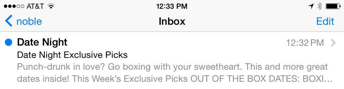
<td class="mobileBanner" align="center" width="100%">
   <p>Punch-drunk in love? Go boxing with your sweetheart. This and more great dates inside!</p>
   <a href="https://www.example.com" target="_blank"><img class="resImage" src="http://www.nobledesktop.com/nl-date-night/img/header.png" width="680" ALT="Date Night"></a>
Save the file.
Preview date-night-exclusive-picks.html in a browser. We'll keep reloading this file throughout the process, so leave it open.
Notice the preheader text currently displays prominently above the Date Night header image (or overlays it in the mobile layout), styled by our existing paragraph CSS rules. This visibility is exactly what we need to eliminate while preserving the text for inbox preview purposes.
Now we'll implement the CSS technique to hide this text from email recipients while keeping it accessible to email clients. Return to your code editor.
Add a specific class identifier to target this paragraph for styling. Update the paragraph with a class of preheader as shown in bold below:
<p class="preheader">Punch-drunk in love? Go boxing with your sweetheart. This and more great dates inside!</p>In the desktop CSS styles section (outside of any media query), locate the p rule and add the following new rule immediately after it (around line 37):
.preheader {
   font-size: 2px;
}
Save the file and reload the browser to observe the initial effect.
In the desktop layout, the preheader now appears as barely visible text—essentially a thin line at the top of your email. This ultra-small font size makes the text nearly imperceptible to recipients while maintaining its presence in the HTML structure for inbox preview functionality.
Test the mobile responsiveness by resizing your browser window until it switches to the 1-column mobile layout. The microscopic text displays above the mobile-optimized banner image but remains practically invisible. This represents a acceptable fallback scenario—even if our complete hiding technique fails, the impact on design is minimal.
Now we'll implement the complete invisibility solution. Return to your code editor.
Enhance the preheader rule with additional hiding properties as shown in bold:
.preheader {
   display: none;
   color: #ffffff;
   font-size: 2px;
}
This multi-layered approach provides comprehensive hiding: display: none should completely hide the text in most clients, while the white color serves as a backup camouflage method. The microscopic font size acts as a final failsafe, ensuring your email design remains professional even in worst-case scenarios.
Save the file and reload the browser. Test all three layout breakpoints by resizing your browser window to confirm the preheader is completely invisible across all responsive designs.
Perfect! The preheader text is now completely hidden within the email content but remains fully functional for inbox preview purposes. Email clients will still extract and display this text in recipient inboxes, giving you complete control over that crucial first impression.
While desktop clients like Gmail and Apple Mail may display preheader content, all mobile clients utilize preheaders due to screen space constraints. This makes preheaders essential for mobile engagement.
Preheader Implementation Benefits vs Challenges
Implementing Custom Preheader Text
Add Preheader Content
Insert compelling preview text as the first text element in your email, before the main banner image around line 118.
Style the Preheader
Apply CSS class and set font-size to 2px to make the text nearly invisible in the email body while preserving it for inbox preview.
Hide Completely
Use display: none and white color (#ffffff) to ensure the preheader is completely hidden from the email content while remaining functional.
Inlining the CSS with Mailchimp's Inliner
With our preheader implementation complete, it's time to prepare our email for deployment across the diverse landscape of email clients. This means converting our embedded CSS to inline styles—a critical step that ensures consistent rendering, particularly in Gmail and other clients known for aggressive style stripping. Mailchimp's inliner tool has proven itself as a reliable, industry-standard solution that handles complex responsive email code with intelligence and precision.
First, we need to capture all of our carefully crafted HTML and CSS code for the inlining process. Return to your code editor.
Select and copy the entire contents of date-night-exclusive-picks.html—from the opening doctype declaration to the closing HTML tag.
Open a new browser tab and navigate to Mailchimp's free inliner tool at: templates.Mailchimp.com/resources/inline-css
Paste your complete HTML code into the large text field labeled Paste your HTML here to convert.
Click the Convert button at the bottom of the form. The tool will intelligently process your code, inlining appropriate styles while preserving essential media queries that must remain in the document head.
Within seconds, Mailchimp processes your code and displays the fully inlined version below. The tool's sophistication shows in its ability to distinguish between styles that should be inlined and responsive media queries that must remain embedded.
Select and copy all of the inlined code from the results section.
Switch back to your code editor.
Create a new file using your editor's standard process (typically File > New or File > New File).
Paste the inlined code into this new document.
Save the file as inlined-date-night-exclusive-picks.html in your yourname-Responsive Email Class > 2-Column Layout folder.
- Navigate to the
<body>section, which should now start around line 128. Scroll through the document to examine the inlining results. Notice how our preheader paragraph now looks like this:
<p class="preheader" style="color: #ffffff;font-family: sans-serif;font-size: 2px;line-height: 140%;margin-bottom: 0;margin-top: 0;display: none;">Punch-drunk in love? Go boxing with your sweetheart. This and more great dates inside!</p>This demonstrates the inliner's intelligence: it correctly applied our general p rule properties, then appropriately overrode specific properties with our more targeted .preheader rule. The cascade hierarchy is perfectly preserved in the inline format.
Now we need to clean up the CSS section. Since our styles are now inline, we can remove the desktop CSS rules while preserving the essential media queries. Locate and delete everything from the body rule (around line 8) through the end of the .followCell p rule (around line 54). Your style section should now begin cleanly with:
<style>
   @media only screen and (max-width: 680px) {.wrapper {
Save the file.
Preview inlined-date-night-exclusive-picks.html in your browser. The email should render identically to your previous version, but now with the added assurance that inline styles will display correctly across the full spectrum of email clients, including notorious style-strippers like Gmail.
Congratulations! You now have a production-ready, fully responsive HTML email that leverages both modern CSS techniques and time-tested inline styling for maximum compatibility. Once you replace the placeholder URLs with actual links, this email is ready for deployment to your audience.
Keep in mind that email client support continues to evolve rapidly in 2026. While media query support has improved significantly across most major clients, some older or more restrictive email environments may still strip these advanced CSS features. In these cases, recipients will receive the desktop version of your email, scaled to fit their device—still a professional and readable experience. For the most current compatibility matrix, consult resources like Litmus or Can I Email, but remember that client capabilities change frequently with updates and new releases.
With your email optimized and ready for deployment, you can now close all files in your code editor and browser. You've successfully created a sophisticated, cross-client compatible HTML email that demonstrates industry best practices for both user engagement and technical reliability.
Gmail strips out embedded CSS styles, making inline CSS essential for proper email rendering. Most email marketing services provide automated inlining tools to solve this problem.
CSS Inlining Process with Mailchimp
Copy Email Code
Select and copy all HTML code from your date-night-exclusive-picks.html file in your code editor.
Use Mailchimp Inliner
Navigate to templates.Mailchimp.com/resources/inline-css and paste your code into the conversion field.
Process and Save
Click Convert button, copy the inlined results, and save as a new file named inlined-date-night-exclusive-picks.html.
Clean Up Styles
Remove desktop CSS rules from embedded styles while preserving media queries, since inline styles now handle desktop formatting.
Mailchimp's inliner tool intelligently preserves media queries in the embedded CSS while converting desktop styles to inline format. This ensures responsive functionality remains intact.
We have a nicely styled, working responsive email that is ready to send once the placeholder hrefs are replaced with real URLs.