Topics Covered in This HTML & CSS Tutorial:
What is the Box Model?, Setting Div Width, Setting a Default Font for the Page, Margin & Padding Spacing
Exercise Preview
Exercise Overview
The CSS Box Model is one of the most fundamental concepts in web development—understanding it is essential for creating professional layouts. Every HTML element that holds content exists as a rectangular box with distinct layers: content, padding, border, and margin. In this exercise, we'll master these core concepts by exploring how width, padding, and margin properties work together to control page layout. You'll learn to think like a professional front-end developer, visualizing elements as boxes and manipulating their spatial relationships with precision.
If you completed the previous exercise, sanfran.html should still be open, and you can skip the following sidebar. If you closed sanfran.html, re-open it now. We strongly recommend completing the previous exercise (3B) before starting this one, as the concepts build upon each other. If you haven't finished it, follow the sidebar instructions below.
Box Model FoundationHTML elements that hold content can have space both inside and outside of them. Consider them as boxes when styling with CSS for better layout control.
If You Did Not Do the Previous Exercise (3A)
- Close any files you may have open.
- On the Desktop, navigate to Class Files > Web Dev Class.
- Delete the Revolution Travel folder if it exists.
- Duplicate the Revolution Travel Ready for Box Model folder.
- Rename the duplicated folder to Revolution Travel.
Getting Started
We'll begin by setting up internal CSS styles, which is perfect for learning and prototyping. In production environments, you'll typically use external stylesheets for better maintainability and performance.
In sanfran.html, add a
<style>tag to the head of the document as follows:<!DOCTYPE html> <html lang="en"> <head> <meta charset="UTF-8"> <title>Travel Info for San Francisco, CA—Revolution Travel</title> <style> </style> </head>Save the file and keep it accessible—you'll be making frequent edits.
Setting Up Your CSS Structure
Add Style Tag
Insert a style tag in the head section of your HTML document to begin writing CSS rules.
Save and Preview
Save your file and keep it open in both code editor and browser for real-time testing.
Setting Width & Display Properties
Professional web layouts require careful consideration of content width. While full-width elements can work for navigation and headers, main content benefits from constraints that enhance readability and visual hierarchy. We'll implement a responsive approach that works across different screen sizes.
Add the following code (highlighted in bold) inside the style tag:
<style>
   main {
      width: 90%;
   }
</style>
NOTE: We avoid setting height in most cases because content is dynamic. Text reflows as browser windows resize, and specifying height can create layout problems when content changes or users adjust their font size preferences.
Let's ensure visual consistency by making the footer match the main content width. Add the following new rule (highlighted in bold) below the main rule:
main { width: 90%; } footer { width: 90%; } </style>- Save the file.
Preview the file in a browser. Notice how the main content is now narrower, creating whitespace on the right. This improved constraint enhances readability, though we'll center the content in a later exercise for better visual balance.
TIP: Keep this file open in the browser and use keyboard shortcuts (Cmd+R or Ctrl+R) to quickly reload as you test changes. This workflow mimics professional development practices.
Width Settings Applied
Height Best PracticeHeight is usually not specified because content may be edited later, and height will change as browser width changes.
The Box Model
Understanding the Box Model is crucial for professional front-end development. When you specify an element's width, you're defining just the content area—the innermost layer of a four-part system. Every element consists of: content (your text or images), padding (space inside the element), border (the element's edge), and margin (space between elements).
This applies to all elements—paragraphs, divs, sections, even inline elements when you change their display property. Modern CSS provides box-sizing properties that let you control how these measurements interact, giving you precise control over layout behavior. Mastering this concept is essential for creating predictable, maintainable layouts.
Limiting Content with Max-Width
Responsive design isn't just about mobile devices—it's about creating comfortable reading experiences across all screen sizes. Research shows that lines longer than 75-80 characters become difficult to read, as the eye struggles to track from the end of one line to the beginning of the next.
- Return to the browser and reload the page. Maximize the browser window and notice how the long lines of text become challenging to read. This demonstrates why professional websites implement max-width constraints.
- Return to your code editor.
Add the following new property declaration to the main rule:
main {
   width: 90%;
   max-width: 800px;
}
The footer content should follow the same constraint for consistency and future-proofing. Add the max-width property to the footer rule as well:
footer { width: 90%; max-width: 800px; }- Save the file.
Return to the browser and reload the page. Resize the browser window to observe the fluid layout behavior: the content adapts to narrow windows but maintains a maximum 800px width on larger screens. This combination of percentage and pixel values creates truly responsive layouts that work across devices.
Width vs Max-Width Behavior
| Feature | Width Only | Width + Max-Width |
|---|---|---|
| Narrow Windows | 90% of window | 90% of window |
| Wide Windows | 90% of window | Fixed 800px |
| Readability | Poor on wide screens | Optimal line length |
Styling the Text
Typography forms the foundation of web design, and CSS inheritance allows us to establish consistent text styling efficiently. By setting properties on parent elements, we can control the appearance of all child elements while maintaining the flexibility to override specific elements when needed.
Back in your code editor, add the following code (highlighted in bold) inside the style tag above the main rule:
body {
   font-family: sans-serif;
}
main {
   width: 90%;
   max-width: 800px;
}
NOTE: Using the generic sans-serif value provides excellent cross-platform compatibility. Modern browsers will select the system's preferred sans-serif font—typically SF Pro on macOS, Segoe UI on Windows, and Roboto on Android. This approach respects user preferences while ensuring consistent readability. For more control over brand identity, consider using a font stack like "Helvetica Neue", Arial, sans-serif.
- Save the file, return to the browser, and reload the page. All text elements now display in sans-serif fonts thanks to CSS inheritance—no need to style each element individually.
- Return to your code editor.
Let's establish a clear visual hierarchy with heading styles. Add the following new rule (in bold) below the body rule:
body { font-family: sans-serif; } h1 { font-size: 28px; color: #e45c09; }- Save the file, return to the browser, and reload the page. The main heading Featured Location: San Francisco, California now displays in orange with improved hierarchy.
- Resize the browser window so the heading wraps to multiple lines. Notice how the default line-height feels cramped—this is a common issue that professional developers address.
- Return to your code editor.
Add the following property declaration to the h1 rule to improve readability:
h1 {
   font-size: 28px;
   color: #e45c09;
   line-height: 36px;
}
Let's maintain visual consistency by styling the secondary headings. Below the h1 rule, add the following new rule for h2:
h1 { font-size: 28px; color: #e45c09; line-height: 36px; } h2 { font-size: 18px; color: #e45c09; }- Save the file, return to the browser, and reload the page. The subheadings now maintain brand consistency with the orange color while establishing clear hierarchy through size. However, you might notice the paragraph text feels dense—let's address this common readability issue.
- Return to sanfran.html in your code editor.
Below the h2 rule, add the following new rule for p:
h2 {
   font-size: 18px;
   color: #e45c09;
}
p {
   line-height: 24px;
}
NOTE: The browser default font-size of 16px works well for body text readability, so we don't need to override it. This demonstrates the principle of progressive enhancement—only adding CSS when it improves the user experience.
Save the file, return to the browser, and reload the page. The improved line-height creates more comfortable reading conditions by providing adequate space between lines.
Typography Hierarchy Applied
Body Text
Set font-family to sans-serif on body element. All child elements inherit this styling automatically.
Main Heading (H1)
28px font size, orange color (#e45c09), and 36px line-height for proper spacing when text wraps.
Subheadings (H2)
18px font size with same orange color as H1 to maintain visual consistency throughout the page.
Setting font-family on the body tag allows all text-based children to inherit the styling without individual rules for each element.
The Margin Property
Margin controls the space between elements—it's the invisible buffer that creates visual breathing room in your layouts. Think of margin as the "personal space" around each element. Unlike padding (which we'll explore shortly), margin exists outside the element's boundaries and doesn't affect background colors or borders. Understanding when to use margin versus padding is a hallmark of experienced CSS developers.
- Return to sanfran.html in your code editor.
Add the margin-bottom property (shown in bold) to the p rule:
p { line-height: 24px; margin-bottom: 22px; }- Save the file, return to the browser, and reload the page. Notice the subtle but important improvement in paragraph separation—this enhanced spacing makes the content easier to scan and read.
- Return to sanfran.html in your code editor.
Let's create better section separation throughout the page. We'll start by adding breathing room between the header logo and navigation. Above the main rule, add the following new rule:
header { margin-bottom: 30px; } main { width: 90%; max-width: 800px; }- Save the file, return to the browser, and reload the page. The increased space below the header creates better visual separation. Professional layouts require this kind of deliberate spacing to guide the user's eye through the content hierarchy.
- Return to your code editor.
Continue improving the page structure by adding space between navigation and main content. Above the main rule, add the following new rule:
nav {
   margin-bottom: 30px;
}
main {
   width: 90%;
   max-width: 800px;
}
Also add bottom margin to the main rule to separate it from the footer:
main {
   width: 90%;
   max-width: 800px;
   margin-bottom: 30px;
}
Save the file, return to the browser, and reload the page. The improved spacing creates a more professional, organized appearance that guides users naturally through the content.
Applying Margin Spacing
Paragraph Spacing
Add 22px margin-bottom to paragraphs for improved readability between text blocks.
Section Separation
Apply 30px margin-bottom to header, nav, and main elements for clear visual hierarchy.
Margin is space outside an element's box. For text, this is similar to space after or before a paragraph in design apps like Photoshop or InDesign.The Padding & Border Properties
While margin creates space between elements, padding creates space within elements, and borders define the visual edge between them. These three properties work together to form the complete Box Model. Understanding their interaction is crucial for precise layout control—padding expands an element's clickable area and background, while borders provide visual definition without affecting spacing.
- Return to your code editor.
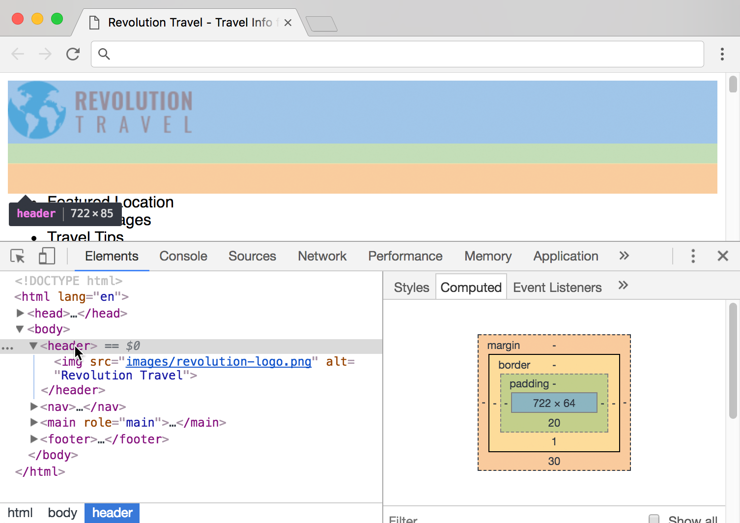
Let's create elegant visual separation between the header and navigation using a border. Add the following property to the header rule:
header { border-bottom: 1px solid #ccc; margin-bottom: 30px; }- Save the file, return to the browser, and reload the page. The subtle gray border provides visual definition, but notice how it sits too close to the logo. This demonstrates why borders often need padding for proper spacing.
- Return to your code editor.
Add padding to create appropriate space between the logo and border:
header {
   padding-bottom: 20px;
   border-bottom: 1px solid #ccc;
   margin-bottom: 30px;
}
NOTE: Property order doesn't affect functionality, but organizing them logically (padding, border, margin—from inside out) improves code maintainability and reflects professional development practices.
- Save the file, return to the browser, and reload the page. The balanced spacing between logo, border, and navigation creates a polished, professional appearance.
You can keep sanfran.html open in both the browser and code editor—you'll continue building on this foundation in the next exercise.
Adding Visual Separation
Create Border
Add 1px solid gray border-bottom to header for visual separation from navigation.
Add Padding
Include 20px padding-bottom to create space between logo and border line.
Maintain Margin
Keep 30px margin-bottom for space below the border to next section.
Margin Vs. Padding: A Professional Perspective
The distinction between margin and padding is fundamental to professional CSS development. Padding exists inside the element's box and affects the element's total size, background color coverage, and clickable area. When you add padding, you're expanding the element itself—making it visually larger while pushing content away from its edges.
Margin, conversely, exists outside the element's box. It creates transparent space between elements without affecting the element's background or total size. Margin is purely about relationships between elements, not the elements themselves.
Professional developers use this distinction strategically: padding for internal spacing and visual comfort, margin for layout relationships and component separation. Understanding this difference prevents common layout issues and enables precise control over design implementation.
For detailed visual diagrams and additional technical specifications, consult the Box Model reference at the back of this workbook.
Margin vs Padding Differences
| Feature | Margin | Padding |
|---|---|---|
| Location | Outside element box | Inside element box |
| Background Effect | Transparent space | Extends background |
| Border Relationship | Outside border | Inside border |
| Element Size | No size change | Increases element size |
For a complete visual guide illustrating the relationship between margin, border, padding, and content, refer to the Box Model reference section.