Topics Covered in This HTML & CSS Tutorial:
Defining & Using CSS Variables, the Power of Inheritance
Exercise Preview
Exercise Overview
CSS variables (officially called custom properties) represent one of the most significant additions to CSS in the past decade. Like variables in programming languages such as JavaScript, CSS variables allow you to store and reuse values throughout your stylesheets with unprecedented flexibility.
Consider the maintenance nightmare of updating a brand color used across dozens of CSS declarations, or adjusting spacing values throughout a complex design system. Variables eliminate this tedium by letting you define values once and reference them by name throughout your code. When you update the variable's value, every reference updates automatically—a game-changer for maintainable, scalable CSS architecture.
Unlike preprocessor variables (Sass, Less), CSS custom properties are live values that can be manipulated with JavaScript and inherit through the DOM, opening possibilities for dynamic theming and responsive design patterns that were previously impossible or overly complex.
This tutorial uses a practical product card layout to demonstrate CSS variables in action. You'll work with fonts, spacing, and colors to see how variables make maintenance easier.
Getting Started
- Open the file variables.html which is located in Desktop > Class Files > Advanced HTML CSS Class.
Preview variables.html in Chrome (we'll be using its DevTools for real-time experimentation).
We're working with a simplified page structure to keep focus on the variable implementation techniques rather than complex layout concerns.
Keep the page open in Chrome for live reloading as you make changes—you'll see the power of variables in real-time.
Setup Process
Open File
Navigate to variables.html in Desktop > Class Files > Advanced HTML CSS Class
Preview in Chrome
Open the file in Chrome browser to use DevTools for testing
Keep Editor Open
Have both code editor and browser open for live testing as you make changes
Defining a CSS Variable
The foundation of CSS variables lies in proper declaration and scope management. Let's start by creating your first custom property.
Switch back to variables.html in your code editor.
While we've embedded CSS in this HTML file for simplicity, these techniques work identically in external stylesheets—and that's where they truly shine in production environments.
Let's create a variable for the primary font (Google's Coiny font, already linked to the page). This establishes a single source of truth for typography decisions. Add the following code at the start of the style tag:
<style>
   :root {
      --primary-font: Coiny, sans-serif;
   }
   body {
The :root pseudo-class is your global variable container. According to Mozilla's MDN documentation, it "matches the root element of a tree representing the document"—essentially the <html> element, but with higher specificity. More importantly for our purposes, :root makes variables available to all descendant elements through CSS inheritance.
You have complete control over variable naming (following CSS identifier rules). The primary-font name is descriptive and semantic—a best practice for maintainable code. Always use meaningful names that describe the variable's purpose rather than its current value.
The :root CSS pseudo-class matches the root element of a tree representing the document. In HTML, :root represents the <html> element and is identical to the selector html, except that its specificity is higher.CSS variables must start with two dashes (--). The name after that is entirely your choice - 'primary-font' is a custom name, not a CSS keyword.
Using the Variable
Now we'll implement our variable using the var() function, which retrieves custom property values at runtime.
In the h1, h2 rule, replace the hardcoded font name with our variable reference:
h1, h2 {
   font-family: var(--primary-font);
   font-weight: normal;
Apply the same pattern to the .product-name rule:
.product-name {
   font-family: var(--primary-font);
   font-size: 18px;
}
Save the file and reload in Chrome. The visual output remains identical, but you've just implemented a powerful abstraction layer. One variable now controls typography across multiple selectors—let's test that power.
Implementation Steps
Use the var() function to reference your variable in CSS rules
Page appearance shouldn't change but code is now more maintainable
All references will update automatically when you change the root value
Updating the Variable
Here's where CSS variables demonstrate their true value: centralized control over distributed properties.
- Return to your code editor.
Change the font from Coiny to Bungee (another loaded Google font):
:root {
   --primary-font: Bungee, sans-serif;
}
Save and reload the page in Chrome. Every element using var(--primary-font) now displays in Bungee.
This single change updated multiple selectors instantly. In enterprise-scale applications with hundreds of font references, this approach saves hours of manual updates and eliminates the risk of inconsistent implementations.
Before vs After Variables
| Feature | Without Variables | With Variables |
|---|---|---|
| Font Updates | Change in multiple places | Change once in :root |
| Consistency | Risk of missing instances | Guaranteed consistency |
| Maintenance | Time-consuming | Instant updates |
Doing More with Variables
Typography is just the beginning. Let's explore how variables excel at managing spatial relationships and enable mathematical operations within your CSS.
- Return to your code editor.
Consistent spacing is fundamental to professional design systems. Create a spacing variable that can serve as your design token:
:root {
   --primary-font: Coiny, sans-serif;
   --standard-spacing: 15px;
}
Replace the hardcoded margin in the .card rule:
.card {Code Omitted To Save Space
margin: var(--standard-spacing);Code Omitted To Save Space
}CSS variables integrate seamlessly with the calc() function, enabling dynamic mathematical relationships. For h2 elements, we want double the standard spacing:
h2 {
   margin-top: calc(var(--standard-spacing) * 2);
}
Note the spaces around the multiplication operator—they're required for proper calc() parsing.
Save and reload to verify the changes. The visual result remains consistent, but your code now expresses spatial relationships mathematically rather than through magic numbers.
Let's tackle a common design challenge: compensating for text line-height in padding calculations. Currently, our cards use 10px vertical padding and 15px horizontal padding—the difference accounts for visual spacing created by line-height.
- Return to your code editor and examine the current .card padding values.
Replace the horizontal padding with our variable:
.card {Code Omitted To Save Space
padding: 10px var(--standard-spacing);Code Omitted To Save Space
}Now express the vertical padding as a mathematical relationship to our standard spacing:
.card {Code Omitted To Save Space
padding: calc(var(--standard-spacing) - 5px) var(--standard-spacing);Code Omitted To Save Space
}This approach makes the relationship explicit: vertical padding is standard spacing minus 5px for line-height compensation.
- Save and reload to confirm visual consistency.
- Ctrl+click (Mac) or Right-click (Windows) anywhere on the page and select Inspect to open Chrome DevTools.
- In the Elements panel, select the <html lang="en"> element.
- In the Styles panel, locate the :root selector displaying your custom properties.
- Click the 15px value next to --standard-spacing to select it.
Use the Up Arrow key to increase the value and watch the page update in real-time!
This demonstrates the live nature of CSS variables—they recalculate all dependent values instantly. Try values around 30px for better visual hierarchy.
- Return to your code editor.
Update the spacing variable to your preferred value:
:root {
   --primary-font: Coiny, sans-serif;
   --standard-spacing: 30px;
}
You can use CSS variables inside calc() functions to perform mathematical operations, like doubling spacing values or subtracting fixed amounts for precise alignment.
Advanced Variable Techniques
Create Base Values
Define fundamental measurements like standard-spacing that serve as building blocks
Use Math Operations
Combine variables with calc() to create proportional relationships like var(--standard-spacing) * 2
Test with DevTools
Use Chrome DevTools to modify variable values in real-time and see instant updates
The Power of Inheritance
CSS custom properties inherit through the DOM tree, creating opportunities for contextual theming that would be impossible with traditional CSS approaches. This inheritance model allows you to redefine variable values for specific page sections while maintaining the same property names.
Add a color variable to your root declarations:
:root {
   --primary-font: Bungee, sans-serif;
   --standard-spacing: 30px;
   --card-bgcolor: #45e;
}
Apply this variable to the card background:
.card {
   background-color: var(--card-bgcolor);
Code Omitted To Save Space
}Create a complementary text color variable:
:root {
   --primary-font: Bungee, sans-serif;
   --standard-spacing: 30px;
   --card-bgcolor: #45e;
   --card-text-color: white;
}
Apply the text color variable to both color and border properties:
.card {
   background-color: var(--card-bgcolor);
   color: var(--card-text-color);
   border: 4px double var(--card-text-color);
Code Omitted To Save Space
}- Save and reload to verify the white-on-blue color scheme remains intact.
- Return to your code editor and experiment with the text color:
Change the text color variable:
:root {
   --primary-font: Bungee, sans-serif;
   --standard-spacing: 30px;
   --card-bgcolor: #45e;
   --card-text-color: #8f3;
}
Save and reload to see the coordinated color change across text and borders.
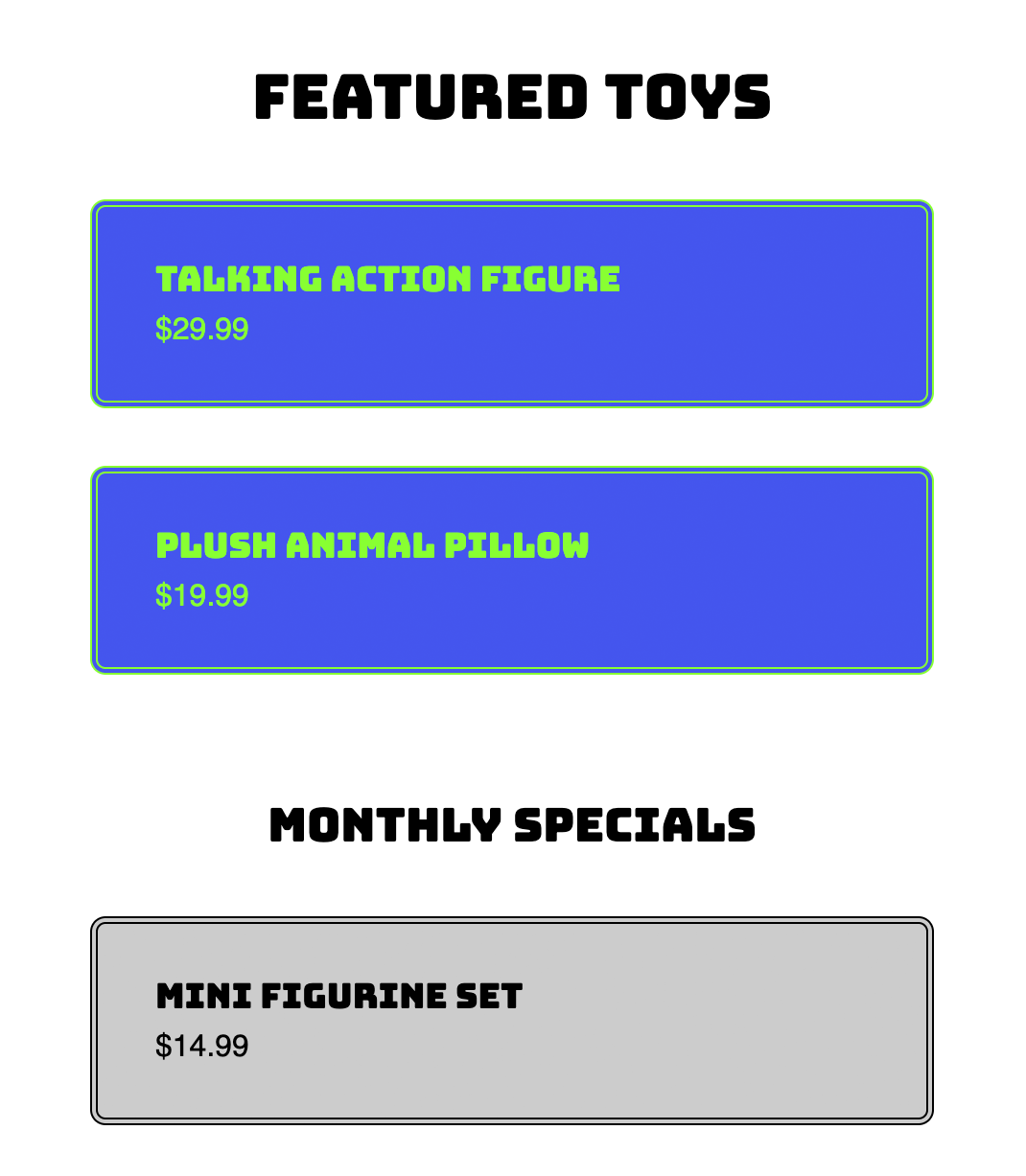
Now let's demonstrate inheritance by creating a contextual color scheme for the monthly specials section.
- Return to your code editor and examine the HTML structure:
Notice the organizational hierarchy:
- Four .card elements exist on the page
- Cards are grouped into .featured and .specials containers
- We'll target the .specials container to create a different visual theme
Add a new CSS rule that redefines our color variables for the specials section:
.specials {
   --card-bgcolor: #ccc;
   --card-text-color: black;
}
This demonstrates CSS custom properties' inheritance behavior: when no value exists on an element, it inherits from its parent. By redefining variables on .specials, all descendant .card elements will inherit these new values, overriding the :root defaults.
Save and reload the page in Chrome.
The bottom two cards now display with gray backgrounds and black text, while the top two maintain the original blue theme. You've created a contextual design system using the same CSS properties with different inherited values.
CSS Variable Inheritance Examples
Global Defaults
Variables defined in :root are available to all elements as fallback values throughout the document.
Local Overrides
Child elements can redefine variables to override parent values for specific sections like the specials div example.
Contextual Theming
Different page sections can have unique color schemes while maintaining the same variable structure.
Browser Support
CSS custom properties enjoy excellent support across all modern browsers as of 2026, with implementation dating back to 2016-2017. However, legacy browsers (notably Internet Explorer, which Microsoft discontinued support for in 2022) lack support entirely. Unlike progressive enhancement features, missing variable support often breaks layouts completely, making fallback strategies essential for legacy browser requirements.
For current browser compatibility data, consult caniuse.com/#feat=css-variables. In most contemporary web development contexts, CSS variables are considered a standard tool rather than an experimental feature.
CSS Variables Browser Support Status
CSS variables are not supported in Internet Explorer. Check your target audience before implementation, as variables may not degrade gracefully in legacy browsers.
CSS Variables, Preprocessors, & JavaScript
CSS custom properties offer a significant advantage over preprocessor variables (Sass, Less, Stylus): they're live DOM values accessible to JavaScript. This creates powerful possibilities for dynamic theming, user customization, and responsive design patterns that adapt based on runtime conditions.
Consider implementing user-controlled themes, accessibility preferences, or responsive typography that adjusts based on viewport characteristics. JavaScript can modify CSS variables instantly, and all dependent styles update automatically across your entire application.
For advanced implementation strategies, Smashing Magazine's Strategy Guide To CSS Custom Properties provides comprehensive coverage: tinyurl.com/css-var-strategy
This JavaScript-CSS bridge represents a paradigm shift in how we approach dynamic styling, moving logic from preprocessor build steps to runtime browser capabilities.
CSS Variables vs Preprocessor Variables
| Feature | CSS Variables | Sass/Less Variables |
|---|---|---|
| Runtime Changes | Yes - via JavaScript | No - compile time only |
| Browser Processing | Native CSS feature | Compiled to static values |
| Inheritance | Full CSS inheritance | No inheritance model |
| Dynamic Theming | Built-in support | Requires compilation |