Topics Covered in This HTML & CSS Tutorial:
Styling Semantically Correct Navigation, Floats for Layout, Float Insert Position, Vertical Alignment & Line-height, Simple CSS Buttons, CSS Border-radius, Reusing Class Selectors
Exercise Preview

Setup Process
Close Existing Files
Close any open files in your code editor to avoid confusion during the exercise.
Navigate to Project Folder
Open the Hipstirred Buttons and Floats folder from Desktop > Class Files > Web Dev Class.
Preview in Chrome
Open index.html in Chrome browser and keep it open for live reloading as you make changes.
Exercise Overview
This hands-on exercise demonstrates the intersection of semantic HTML and professional CSS layout techniques. You'll master semantically correct navigation markup—a foundational skill for accessibility and SEO—while learning advanced styling methods that remain relevant even in today's CSS Grid and Flexbox era. The exercise covers CSS border-radius for modern button design, strategic use of floats for precise element positioning, and reusable class patterns that scale across enterprise projects. These techniques form the backbone of professional web development, providing both historical context and practical skills you'll use throughout your career.
- We'll be using a new folder of provided files for this exercise. Close any files you may have open in your code editor to avoid confusion and maintain a clean workspace.
- For this exercise we'll be working with the Hipstirred Buttons and Floats folder located in Desktop > Class Files > Web Dev Class. If you're using a modern code editor like Visual Studio Code, open the entire folder to enable better IntelliSense and file management features.
- Open index.html from the Hipstirred Buttons and Floats folder.
Preview index.html in Chrome. We'll be leveraging Chrome's powerful DevTools throughout this exercise to inspect our work and debug layout issues.
NOTE: Keep index.html open in the browser as you work—this live preview workflow is essential for efficient front-end development. You'll reload the page to see changes as we build.
Adding Navigation to the Header
Semantic navigation markup is crucial for accessibility and SEO. Search engines and screen readers rely on proper HTML structure to understand your site's hierarchy and help users navigate effectively.
- Return to index.html in your code editor.
As shown below, add a nav tag below the img inside the header:
<header>
   <img src="images/logo.png" class="logo" height="36" width="105" ALT="Hipstirred">
   <nav>

   </nav>
</header>
Add an unordered list with two list items inside the
<nav>. Using a list for navigation is semantically correct because navigation is fundamentally a list of related links:<nav> <ul> <li>About Us</li> <li>Sign Up</li> </ul> </nav>Add links around the text in each list item, as follows:
<nav>
   <ul>
      <li><a href="about.html"> About Us</a></li>
      <li><a href="signup.html"> Sign Up</a></li>
   </ul>
</nav>
NOTE: The pages we're linking to don't exist yet, but defining the URL structure early helps establish clear site architecture. This forward-thinking approach is standard practice in professional development workflows.
Save the file, return to the browser, and reload the page. While our markup is semantically correct and accessible, the default list styling doesn't meet modern design standards. Let's transform this into professional navigation.
Return to your code editor and open up main.css.
To remove the default bullets, margin, and padding from the unordered list, we'll use a descendant selector. This surgical approach ensures we target only navigation lists, leaving other lists throughout the site unaffected—a key principle in scalable CSS architecture. Add the following new rule below the rule for .logo:
nav ul { list-style-type: none; margin: 0; padding: 0; }- Save the file.
- Return to the browser and reload index.html. The clean, minimal appearance is already more professional. Now let's arrange the list items horizontally for a modern navigation layout.
- Return to main.css in your code editor.
Add the following new rule below the nav ul rule:
nav li {
   display: inline-block;
}
NOTE: The inline-block display property is a powerful hybrid that combines the best of both worlds: block-level control over padding and margins, with inline horizontal flow. This technique remains valuable even in the era of Flexbox and CSS Grid for specific layout scenarios.
- Save the file.
- Return to the browser and reload index.html. The horizontal layout immediately feels more modern and professional. Now let's override the default link styling to match our design system.
- Return to main.css in your code editor.
We'll create another descendant selector that specifically targets navigation links. This specificity ensures that link styles elsewhere on the site remain unaffected—critical for maintaining design consistency across large projects. Add the following new rule below the nav li rule:
nav a { color: #555; text-decoration: none; }- Save the file.
Return to the browser and reload index.html. The subtle gray color feels more sophisticated than harsh blue default links. However, we want this navigation positioned at the top right of the page, alongside the logo. CSS floats provide the precise control we need for this layout.
Using nav tags with unordered lists for navigation is semantically correct and provides better accessibility for screen readers and search engines.
Building Navigation Structure
Add Nav Container
Insert nav tag below the img inside the header element to create a semantic navigation container.
Create List Structure
Add unordered list with two list items for About Us and Sign Up navigation links.
Insert Anchor Links
Wrap list item text with anchor tags linking to about.html and signup.html pages.
Floats for Layout
While modern CSS offers Flexbox and Grid for layout, understanding floats remains essential for maintaining legacy code and understanding CSS fundamentals. Floats also excel in specific scenarios where you need elements to wrap around each other naturally.
Return to main.css in your code editor and add the following new rule above the nav ul rule:
nav { float: right; }- Save the file.
Return to the browser and reload index.html. The navigation now sits on the right side, creating a balanced header layout. The vertical alignment isn't perfect yet—we'll refine that shortly using line-height techniques.
Float removes elements from normal document flow, allowing other content to wrap around them. This enables horizontal layouts and positioning elements to left or right sides.
Using display: inline-block for Navigation
Floating Social Media Links in the Footer
Social media integration is crucial for modern websites. Proper positioning of these elements affects both user experience and conversion rates, as easily accessible social links increase engagement and sharing.
- Still looking at the page in your browser, scroll down to the footer and examine the social media icons. These elements need professional styling to match our header navigation.
- Return to index.html in your code editor.
- Find the footer near the bottom and notice there is div with a social class that contains linked images. This structure allows for flexible styling and easy maintenance.
- Switch to main.css.
Below all the other rules, add the following new rule:
.social { float: right; }- Save the file.
- Return to Chrome to reload index.html. The icons moved right, but they're positioned below the copyright text rather than beside it. This behavior reveals an important aspect of how floats interact with block-level elements. Let's investigate using browser developer tools.
- CTRL–click (Mac) or Right–click (Windows) on the copyright paragraph and choose Inspect.
If the copyright paragraph is not already highlighted, hover over the
<p>tag to see how it highlights in the browser:
The copyright paragraph is a block-level element that claims the full width of the footer. The social icons float right, but since there's no horizontal space available next to the copyright text, they wrap to the next line. This differs from our header, where the logo image (an inline element) leaves room for the floated navigation. Understanding this distinction is crucial for effective layout control.
Return to your code editor and switch to index.html.
To achieve the desired layout with social icons aligned right of the copyright text, we have two approaches:
- Change the copyright paragraph's display from block to inline, creating horizontal space for the social icons.
- Reorder the HTML markup, placing social icons before the copyright paragraph. This approach makes more semantic sense, as copyright information naturally comes last in document flow.
Move the copyright paragraph so it comes after the social media icons:
<footer>
   <div class="wrapper">
      <div class="social">
Code Omitted To Save Space
</div>
      <p>© Hipstirred LLC</p>
   </div>
</footer>
Save the file, return to the browser, and reload index.html. Perfect! This demonstrates a key principle of float behavior.
When an element is floated, the browser removes it from the normal document flow. Subsequent content moves up to fill the space, then wraps around the floated element if there's sufficient room in the containing element. In our footer, the copyright paragraph now "wraps" to the left of the social icons, creating the horizontal layout we want. This behavior is what originally made floats popular for layout before Flexbox and Grid existed.
- Still in the browser, notice the small underlines between social icons (default link styling) and that the icons appear cramped together. The stark black also contrasts too harshly with our subtle gray text palette.
- Return to main.css in your code editor.
Below all the other rules, add the following new rule:
.social a { text-decoration: none; margin-left: 10px; opacity:.6; }- Save the file.
Return to Chrome to reload index.html. The icons now have better spacing and a more subtle appearance that integrates well with our overall design. However, there's excessive white space at the bottom of the footer that we need to eliminate.
Block-level elements like paragraphs take up full width, preventing floated elements from positioning correctly. Reordering markup can solve layout conflicts.
Solutions for Footer Layout Issues
| Feature | Change Display Type | Reorder Markup |
|---|---|---|
| Implementation | Change paragraph to inline | Move social icons before copyright |
| Semantic Impact | Alters content meaning | Maintains semantic structure |
| Maintainability | CSS-only solution | Requires HTML changes |
| Best Practice | Less preferred | Recommended approach |
Vertical Alignment & Line-Height
Vertical alignment is one of the most challenging aspects of CSS layout. Understanding line-height behavior is essential for creating polished, professional interfaces that feel intentionally designed rather than accidentally assembled.
- Still in Chrome, CTRL–click (Mac) or Right–click (Windows) on the copyright paragraph and choose Inspect.
- If the copyright paragraph is not already highlighted, hover over the
<p>tag to see how it highlights in the browser. - Notice how the social icons sit within the blue highlight area, but there's unwanted space below them. Since we haven't applied any margin or padding, the paragraph's line-height is determining the overall height. Our tallest social icon measures 24px, so setting the line-height to 24px will eliminate the extra space.
- Return to main.css in your code editor.
Add the following new property to the rule for footer p:
footer p { margin: 0; font-size: 14px; line-height: 24px; }- Save the file.
Return to Chrome to reload index.html. The footer now has balanced spacing above and below the social icons—exactly the professional finish we want.
Setting line-height equal to the height of the tallest element in a container centers text vertically. This technique works because text is naturally centered within its line-height.
Element Heights in Footer Layout
Simple CSS Buttons
Effective call-to-action buttons are crucial for user engagement and conversion rates. Modern CSS allows us to create compelling button designs without relying on images or JavaScript libraries, resulting in faster load times and better accessibility.
We'll transform the sign up link in our navigation into a prominent call-to-action button. Using CSS background-color, padding, and border-radius, we can create professional button styling that rivals any modern web application.
- Return to main.css in your code editor.
Add the following new rule below the .wrapper rule:
.button { background-color: #8842c2; }- Save the file.
- Switch to index.html in your code editor.
Add the button class to the sign up link, as follows:
<ul> <li><a href="about.html">About Us</a></li> <li><a href="signup.html" class="button">Sign Up</a></li> </ul>- Save the file.
- Return to the browser and reload index.html. The purple background creates visual hierarchy, but we need to improve text contrast and add proper spacing for a professional button appearance.
- Return to your code editor and switch to main.css.
Add the following new properties to the rule for .button:
.button { background-color: #8842c2; color: #fff; padding: 10px; }- Save the file.
- Return to the browser and reload index.html. The white text provides excellent contrast against the purple background, and the padding creates a proper button feel. Now let's add the rounded corners that users expect from modern interface design.
Return to your code editor and add the following to the .button rule:
.button {Code Omitted To Save Space
padding: 10px; border-radius: 4px; }- Save the file.
- Go to the browser and reload index.html. The subtle border-radius creates a modern, approachable feel without being overly stylized. Let's fine-tune the padding for optimal proportions.
Return to your code editor and update the padding for .button as follows:
.button {
   background-color: #8842c2;
   color: #fff;
   padding-top: 6px;
   padding-bottom: 6px;
   padding-right: 12px;
   padding-left: 12px;
   border-radius: 4px;
}
Save the file.
Return to the browser and reload index.html. The button now has professional proportions—more horizontal padding than vertical creates an elegant, clickable appearance that follows established UI design patterns.
Creating Professional CSS Buttons
Set Background Color
Apply purple background (#8842c2) to create visual distinction from regular links.
Add Contrast and Padding
Use white text color and padding for better readability and clickable area.
Round Corners
Apply 4px border-radius to create modern, button-like appearance.
Fine-tune Spacing
Adjust padding to 6px top/bottom and 12px left/right for optimal button proportions.
Adjusting the Nav & List Item Styles
Polished navigation requires attention to typography, spacing, and alignment details. These refinements separate professional work from amateur attempts and significantly impact user perception of your site's credibility.
- Return to your code editor.
Let's enhance the navigation typography with a smaller font size and uppercase styling for a more sophisticated appearance. Find the rule for nav and add the following properties:
nav {
   float: right;
   font-size: 15px;
   text-transform: uppercase;
}
Add appropriate spacing between navigation links using margin on the nav li:
nav li { display: inline-block; margin-left: 10px; }- Save the file.
Return to the browser and reload index.html. The typography improvements create a more professional appearance, but we need to address the vertical alignment between the logo and navigation.
Currently, the text sits below the logo because the logo image (36px tall) exceeds the default line-height of the header. Since text centers vertically within its line-height, increasing the header's line-height to match the logo height will achieve perfect vertical alignment—a subtle but important detail for professional layouts.
- Return to your code editor.
The logo image measures 36px in height, so we'll set the line-height to match. Add the following new property to the rule for header:
header { padding: 20px line-height: 36px; }- Save the file.
Return to the browser and reload index.html. The navigation now aligns perfectly with the logo, creating a balanced, professional header that demonstrates attention to design details.
Navigation Enhancement Checklist
Makes navigation less prominent than main content
Creates consistent, professional appearance
Provides proper spacing between navigation links
Matches logo height for perfect vertical alignment
Optional Bonus: Creating a Second Call to Action
Strategic placement of multiple call-to-action buttons can significantly improve conversion rates. By reusing our button class, we demonstrate the power of modular CSS architecture—write once, use everywhere.
- Return to your code editor and switch to index.html.
Near the start of the main section, add a new div tag with a link inside as shown below in bold:
<p>Fine artisanal, organic, sustainable, craft coffee delivered to your door. Hipstirred is a monthly subscription for all your cold-pressed, pour over, French press, siphon pot, and Chemex needs.</p> <div class="call-to-action"> <a href="signup.html" class="button">Get Started Now</a> </div> <h3>Amazing Coffee, Conveniently Delivered Directly to You</h3>- Save the file.
- Return to the browser and reload index.html.
- The Get Started Now link inherits our button styling but needs refinements. It should be horizontally centered, display in uppercase like our navigation, and remove the default underline that's still visible.
- Return to main.css in your code editor.
Add the following new rule below the rule for .button:
.call-to-action {
   text-align: center;
}
Now let's remove the underline and ensure consistent uppercase styling. Add the following new properties to the rule for .button:
.button {Code Omitted To Save Space
border-radius: 4px; text-transform: uppercase; text-decoration: none; }- Save the file.
- Return to the browser and reload index.html. The centered button looks much more professional and creates a clear focal point for user action. Let's add appropriate spacing below it.
Return to main.css in your code editor and add the following property to the rule for .call-to-action:
.call-to-action { text-align: center; margin-bottom: 60px; }- Save the file.
Return to the browser and reload index.html. The generous bottom margin creates proper visual separation and breathing room around our call-to-action—essential for guiding user attention effectively.
The button class demonstrates the power of reusable CSS. By creating modular styles, you can apply consistent button styling across multiple elements without duplicating code.
Call-to-Action Styling Components
Text Alignment
Center alignment draws attention and creates focal point on the page for improved user engagement.
Consistent Styling
Uppercase text and no underlines maintain visual consistency with navigation button styling.
Optional Bonus: Fixing an Edge Case
Professional web development requires considering edge cases and unusual viewing conditions. While most users won't encounter extremely narrow viewports, handling these scenarios prevents layout breakage and demonstrates thorough craftsmanship.
- To open the DevTools in Chrome, CTRL–click (Mac) or Right–click (Windows) on the page and choose Inspect.
If the DevTools are not already on the right side, at the top right of the DevTools panel click the
 button and choose Dock to right as shown below:
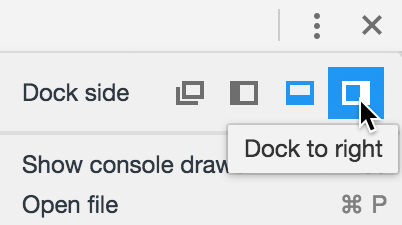
Now you can make the content area extremely narrow to test edge cases. Notice how the navigation becomes cramped and difficult to interact with at very small widths:

Return to main.css in your code editor and add the following to the body rule:
body {Code Omitted To Save Space
margin: 0;
   min-width: 320px;
}
Save the file, return to Chrome, and reload index.html. The minimum width prevents layout collapse and ensures our navigation remains functional across all scenarios. This type of defensive CSS is crucial for production websites that must perform reliably across diverse user environments.
Setting min-width: 320px prevents layout breaking on very narrow screens. This ensures navigation remains functional across different device sizes.
Mobile Viewport Considerations