Topics Covered in This Figma Tutorial:
Importing & Modifying Vector Graphics, Aligning & Distributing Layers, Layer Opacity Vs. Fill Opacity, Reusing Colors (Color Styles), Adding a Drop Shadow
Exercise Preview

File Setup Process
Access File Browser
Navigate to the homescreen using the Home tab in desktop app or Main menu in web app to access your file management interface.
Import Local Files
Use the Import file button to upload your About Page—Ready for Graphics.fig file from the designated class folder structure.
Open Design File
Double-click the uploaded file to begin working with the advanced NYC design that includes existing layout elements.
Exercise Overview
In this comprehensive exercise, you'll master the fundamental skills of importing, creating, and styling vector elements in Figma. These techniques form the backbone of professional interface design and will dramatically improve your workflow efficiency. You'll learn to work with scalable vector graphics, create reusable color systems, and apply sophisticated visual effects that make your designs stand out.
Importing & Modifying Vector Graphics
Vector graphics are essential for creating crisp, scalable designs that look perfect at any resolution. Let's start by setting up your workspace and importing professional-quality vector assets.
First, ensure you're in Figma's file browser to access your project files:
- In the Desktop app: Click the
 Home tab (Mac users can also choose File > Open File Browser).
 - In the Web app: Click the Main menu button
 and choose Back to files.
- In the Desktop app: Click the
To import your project file, click
 Import file (located near the top right of your interface).
Navigate to Desktop > Class Files > Figma Class > NYC and double-click on About Page—Ready for Graphics.fig to select it.
Once the file uploads successfully, click Done and double-click the file to open it. This design represents a partially completed NYC tourism website—we'll enhance the navigation area by adding a professional logo and creating a semi-transparent background that provides visual hierarchy and improves readability.
To maintain design integrity during our modifications, let's lock the hero image. CTRL-click (Mac) or Right-click (Windows) on the cab photo and choose Lock/Unlock.
Pro Tip: You can also use Cmd-Shift-L (Mac) or CTRL-Shift-L (Windows) to quickly lock elements, or hover over layers in the Layers panel and click the lock icon. Locking prevents accidental modifications to completed elements—a crucial habit for professional workflows.
Now we'll add a professional logo using Figma's vector import capabilities. While copying and pasting from Adobe Illustrator works well, importing vector files maintains better file organization and preserves all vector properties.
In the toolbar, click the dropdown arrow next to the Rectangle tool
 and select Place image/video
  .
.Navigate to Desktop > Class Files > Figma Class > NYC and observe the file format options:
- The NYC Logo is provided in both AI and SVG formats for maximum compatibility.
- AI (Adobe Illustrator) files appear grayed out on Mac and aren't visible on Windows—this is normal behavior.
- SVG (Scalable Vector Graphic) files are universally supported and maintain perfect scalability across all platforms.
Double-click on NYC Logo.svg to import it into your project.
Position the logo in the top-left area of the design with a single click.
For precise alignment, drag the logo so its left edge aligns with the first pink content column guide. Leave modest spacing between the logo top and frame edge—we'll refine this positioning in subsequent steps using Figma's alignment tools.
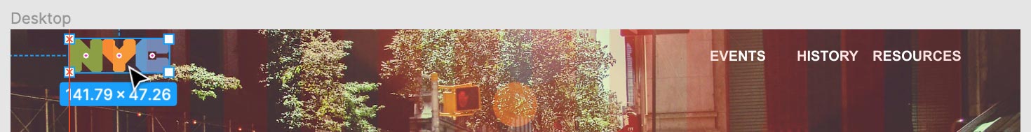
Set your view to 100% zoom by pressing Shift-0 for accurate logo assessment (scroll as needed to maintain visibility).
With the logo selected, examine the Layers panel—notice that NYC Logo displays a frame icon
 .
.To efficiently modify the logo color, we need to convert this frame structure. Frames include their own background properties, while groups provide direct access to individual vector shapes—making color modifications more intuitive.
In the Design panel header, click the Frame dropdown and change it to Group.
In the Design panel, locate Fill and click the Plus (+) button to add a new fill property.
Click the newly appeared Fill color swatch to access the color picker.
Select white for optimal contrast against the upcoming dark navigation background.
Close the color picker to apply your changes.
Let's optimize the logo size for better visual hierarchy. With the logo selected, hold Shift (to maintain proportions) and drag the bottom-right handle inward to reduce the logo size appropriately.
Clean up your workspace by hiding the layout grid. Press Control-G (Mac) or CTRL-Shift-4 (Windows) to toggle grid visibility.
If rulers and guides are visible, hide them by pressing Shift-R or clicking the Main menu
and selecting View > Rulers (Mac users choose View > Show Rulers).
Vector File Format Support
| Feature | AI Files | SVG Files |
|---|---|---|
| Mac Compatibility | Grayed out | Fully supported |
| Windows Compatibility | Not shown | Fully supported |
| Import Method | Copy/paste only | Direct import |
Use Cmd-Shift-L (Mac) or Ctrl-Shift-L (Windows) to quickly lock elements and prevent accidental movement. You can also hover over layers in the Layers panel and click the lock icon.
Creating a Navbar Background
Now we'll enhance the navigation area's visual prominence by adding a sophisticated background treatment. This technique improves text readability and creates clear content hierarchy—essential principles in modern interface design.
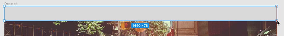
Press Shift-1 to zoom and view the entire design layout.
Select the Rectangle tool
from the toolbar.Create a navigation background by dragging a rectangle across the complete top section of the frame:
In the Layers panel, locate the selected Rectangle 1. Double-click its name and rename it to nav bg for better project organization.
Establish proper layering by dragging the nav bg layer below the EVENTS text (the final navigation item) in the layers panel.
With the rectangle selected, navigate to the Design panel and set the H (height) value to 80 for consistent navigation spacing.
Apply the brand color by locating Fill in the Design panel. Set the Hex code to 6b4656 and press Return (Mac) or Enter (Windows).
Pro Tip: Figma's intelligent color input accepts shorthand values—type a single character like B and it expands to #BBBBBB, or use three characters like 2ab to get #22AABB. This feature speeds up color workflows significantly.
Add visual definition with a bottom border. In the Design panel, find Stroke and click the Plus (+) button.
Click the stroke color swatch to open the color picker.
Choose white for crisp contrast.
Close the color picker to confirm your selection.
For precise border placement, click the Strokes per side button
 in the Design panel's Stroke section and select Bottom.
Click an empty canvas area to deselect and review your work.
You should now see a clean white stroke exclusively on the bottom edge, creating professional visual separation.
Navbar Background Creation
Draw Rectangle
Use the Rectangle tool to create a background shape that spans the entire top navigation area of your design frame.
Set Dimensions
Rename the rectangle to 'nav bg' and set the height to exactly 80 pixels in the Design panel for consistent sizing.
Apply Styling
Set the hex color to 6b4656 and add a white bottom stroke to create visual separation from the main content area.
Figma automatically expands single characters (B becomes #BBBBBB) and 3-character hex codes (2ab becomes #22AABB) to save time when entering colors.
Aligning & Distributing Layers
Professional layouts require precise alignment and consistent spacing. Figma's alignment tools ensure pixel-perfect positioning and create the visual harmony that distinguishes amateur work from professional design.
Ensure visibility of the three navigation text links in the top-right navbar area.
Click EVENTS to select it as your starting point.
Add the remaining navigation items to your selection by holding Shift and clicking HISTORY and RESOURCES.
Create professional spacing by clicking the More options button
 at the top-right of the Design panel and selecting Distribute horizontal spacing.
Before proceeding with vertical alignment, verify that the NYC logo sits completely within the navbar background boundaries. Protruding elements will interfere with proper alignment calculations.
Select all navigation elements by clicking the NYC Logo group name in the Layers panel.
Expand your selection by holding Shift and clicking the nav bg layer.
Achieve perfect vertical centering by clicking Align vertical centers
 (the third icon from the right) in the Design panel.
Maintain organization by grouping these aligned elements. Press Cmd-G (Mac) or CTRL-G (Windows) with all elements still selected.
In the Layers panel, double-click the new Group 1 name to edit it.
Type nav and press Return (Mac) or Enter (Windows) to confirm the meaningful name.
Click a blank canvas area to deselect the group and review your precisely aligned navigation.
Professional Alignment Workflow
Enables batch operations on related elements for consistent spacing
Creates equal spacing between text elements automatically
Prevents alignment conflicts when centering elements vertically
Maintains professional appearance across all navbar elements
Simplifies future edits and maintains design structure integrity
Layer Opacity Vs. Fill Opacity
Understanding opacity control is crucial for creating sophisticated visual effects. Figma mirrors CSS capabilities, allowing granular opacity control over different layer properties—a technique that separates novice designers from seasoned professionals.
Let's create visual depth with semi-transparent backgrounds. Click the navbar background to select it.
Notice in the Layers panel that the entire nav group is selected instead of the specific background element we want to modify.
Click a blank canvas area to clear the selection.
Double-click the nav background to enter the group and directly select the background element.
Confirm in the Layers panel that nav bg is now specifically selected.
When working with complex nested groups, you may need multiple double-clicks to reach deeply nested elements. However, there's a more efficient approach for direct selection.
Click a blank area to deselect, then we'll try the professional shortcut.
Hold Cmd (Mac) or CTRL (Windows) and click the navbar background.
This command-click technique penetrates group nesting and directly selects the target layer, regardless of hierarchy depth—invaluable for complex design files.
With nav bg selected, locate the Layer section in the Design panel. Change the Opacity from 100% to 50% and observe how this affects both the fill color and the white border simultaneously.
For better content definition, we want the border to remain fully opaque while only the background becomes transparent. Reset the Layer Opacity to 100%.
Under the Fill section, change the Opacity from 100% to 50% instead.
Click a blank canvas area to close any open panels and deselect the element.
Observe the sophisticated result: the background fill is now elegantly transparent while the white border maintains full opacity, creating professional visual separation.
Note: Stroke opacity can be controlled independently using the same technique, giving you complete control over each visual element.
Opacity Control Methods
| Feature | Layer Opacity | Fill Opacity |
|---|---|---|
| Affects Elements | Fill and stroke | Fill only |
| Border Visibility | Reduces transparency | Maintains opacity |
| Use Case | Overall transparency | Background only |
Hold Cmd (Mac) or Ctrl (Windows) while clicking to select elements directly through groups, regardless of nesting depth. This bypasses the need to double-click multiple times.
Reusing Colors (Color Styles)
Color styles are fundamental to scalable design systems. They enable consistent branding across projects and provide the ability to update colors globally—essential for maintaining design consistency as projects evolve and brands mature.
Select the navbar background using Cmd (Mac) or CTRL (Windows) + click for direct selection.
In the Design panel, locate the Fill section and click the Style button
 .
.In the Color Styles panel that opens, click the Plus (+) button at the top-right corner.
Name the color style primary bg and click Create style to establish this as a reusable brand asset.
Scroll to the bottom of the frame to locate the gray footer section.
Apply consistent branding by changing the footer to match our navigation color. Click the gray footer rectangle to select it.
In the Design panel, click the Style button
next to Fill.In the Color Styles panel, click the color circle for your newly created style below the Search field.
Click an empty canvas area to deselect all elements.
Notice the Color Styles list now appears in the Design panel for easy access.
To demonstrate the power of color styles, hover over the primary bg style and click the Edit Style button
 that appears.
In the Edit style panel, click the color swatch and select any different color to see the magic in action.
Watch as the color updates simultaneously across all elements using that style—this demonstrates why color styles are indispensable for professional design workflows and brand consistency.
Close the color picker to complete the demonstration.
Color Style System Setup
Create Color Style
Select an element with your desired color, click the Style button next to Fill, then create a new color style with a descriptive name like 'primary bg'.
Apply Across Design
Use the Color Styles panel to apply your saved color to other elements, ensuring consistency across your entire design system.
Global Color Updates
Edit any color style to automatically update all instances throughout your file, enabling efficient design system maintenance.
Color styles enable instant global changes across entire files. Modify one color style to update every instance simultaneously, maintaining design consistency effortlessly.
Adding a Drop Shadow to Type
Strategic use of drop shadows enhances readability and creates visual depth, particularly when text overlays complex imagery. This final technique will make your headline text stand out professionally against the dynamic background photography.
Select the prominent NEW YORK CITY heading that overlays the taxicab photograph.
In the Design panel, locate the Effects section and click the Plus (+) button (scroll down if necessary to locate Effects).
A Drop shadow effect is automatically applied to your text.
Click the Effect settings button
 positioned to the left of Drop shadow to access detailed controls.
For maximum text legibility, set the shadow transparency to 100% next to the hex color code field, creating a bold, opaque shadow.
Click in the Blur value field to position your cursor there.
Hold Shift and press the Up Arrow key twice to increase the blur value by increments of 10, creating a softer, more professional shadow effect.
To adjust the shadow's vertical positioning, click into the Y value field.
Hold Shift and use the Up or Down Arrow keys to precisely position the shadow for optimal visual impact.
Professional Tip: Shift + Arrow keys move elements 10 pixels at a time, while Arrow keys alone provide single-pixel precision—use this for fine-tuned adjustments in professional work.
For this exercise, set the final Y value to 0 to create a subtle glow effect rather than a directional shadow.
Click an empty canvas area to deselect and review your completed, professional-quality layout.
Professional Shadow Effects
Creates depth and improves text readability over complex backgrounds
Increases contrast and makes text more legible against photos
Increments of 10 pixels provide professional-quality shadow softness
Vertical offset creates realistic lighting effects and visual hierarchy
Importing Content from Sketch, XD, Photoshop, & Illustrator
In today's multi-tool design environment, seamless file interchange is crucial for maintaining workflow efficiency. Here are the current best practices for migrating content from other professional design applications into Figma as of 2026.
Sketch
- Figma provides native support for Sketch files with robust conversion capabilities. While most elements transfer successfully, always review imported files for any conversion artifacts or layout shifts.
- For selective content transfer, use Sketch's Edit > Copy > Copy SVG Code feature, then paste directly into Figma for vector-perfect results.
- Alternatively, export SVG files from Sketch and import them into Figma for maximum compatibility and editability.
Adobe XD
- While Adobe XD (.xd) files cannot be directly imported into Figma, several effective workarounds ensure smooth content migration.
- Use Adobe XD's Edit > Copy SVG Code function for individual elements, then paste into Figma to preserve vector properties.
- Export SVG files from Adobe XD and import them into Figma for batch content transfer.
- For complete file conversion, utilize online services like avocode.com/convert-xd-to-sketch to transform XD files into Sketch format, which Figma can then open directly.
Photoshop & Illustrator
- Direct import of Photoshop (.psd) or Illustrator (.ai) files isn't supported in Figma, but proven workarounds maintain design fidelity during transfer.
- Import Photoshop or Illustrator files into Adobe XD first, then use the XD-to-Figma techniques outlined above for seamless content migration.
- For Photoshop files specifically, avocode.com/convert-psd-to-sketch provides direct conversion to Sketch format, enabling immediate Figma compatibility.
- Copy and paste vector content directly from Illustrator to Figma for simple graphics and icons—this method preserves vector editability and is often the fastest approach for individual elements.
Cross-Platform Import Solutions
Sketch Integration
Direct file opening supported in Figma. Use Copy SVG Code from Sketch or export SVG files for seamless vector transfer between platforms.
Adobe XD Workflow
No direct import available. Copy SVG Code from XD to Figma, export SVG files, or use conversion tools to transform XD files into Sketch format.
Creative Suite Bridge
Import Photoshop and Illustrator files through Adobe XD as an intermediary, or use conversion services to transform files into Sketch format for Figma compatibility.