Topics Covered in This Figma Tutorial:
Master the fundamentals of interactive prototyping: linking between frames (artboards), previewing your prototype in real-time, creating sophisticated overlay interactions, and fixing element positions to prevent unwanted scrolling behaviors.
Exercise Preview

Interactive prototypes serve dual purposes: they provide clients with tangible design previews and enable user testing to validate design decisions before development begins.
Exercise Overview
Interactive prototyping transforms static designs into compelling, testable experiences. In this comprehensive exercise, you'll master the art of creating clickable, navigable prototypes that simulate real website and app functionality. These skills are essential for modern design workflows—whether you're presenting concepts to stakeholders, conducting user research, or collaborating with development teams. By the end of this tutorial, you'll have built a fully interactive mobile prototype complete with smooth transitions, overlay modals, and fixed navigation elements.
Creating a Prototype
Let's begin by setting up your workspace and establishing the foundational prototype connections that will bring your design to life.
In Figma, navigate to the home screen (file browser) using the appropriate method for your platform:
- In the Desktop app: Click the
 Home tab (Mac users can also choose File > Open File Browser).
 - In the Web app: Click the Main menu button
 and choose Back to files.
- In the Desktop app: Click the
- To access your local project files, click
 Import file (typically located in the top right corner).
 Navigate to Desktop > Class Files > Figma Class > Pulse and double-click on Pulse—Ready for Prototyping.fig to open the prepared design file.
You'll notice we've strategically added a dedicated frame for the navigation menu design. This represents a common UX pattern where tapping the menu icon reveals an overlay containing navigation options—a technique you'll implement shortly.
- In the right panel, click the Prototype tab to access Figma's prototyping tools. This is where the magic happens—transforming static designs into interactive experiences.
- Set your view to 100% zoom by pressing Shift–0 for optimal precision when creating connections.
- On the Home Page frame, locate and select the prominent Shop New Collection button near the top of the design.
- To view all frames simultaneously and understand the complete user flow, zoom to fit all by pressing Shift–1.
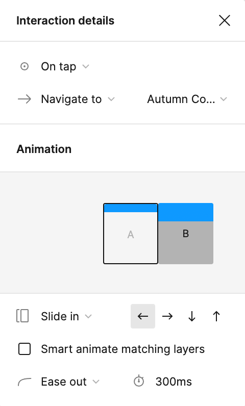
- Here's where prototyping becomes intuitive: hover over the right edge of the Shop New Collection button until a blue connection circle appears, then drag this circle directly onto the Autumn Collection frame. This creates your first interactive link.
When the Interaction details panel opens on the right, enhance the user experience by changing the animation from Instant to Slide in under the Animation settings. Your configuration should match these professional standards:
Continue building the user journey by selecting the top-left product photo (Distressed Denim Jacket) in the four-image grid on the Autumn Collection frame.
NOTE: Figma's intelligent interface positioning means the blue interaction circle can appear on any edge (top, bottom, left, or right) for optimal accessibility. The connection functions identically regardless of which side you drag from.
Create a seamless product discovery flow by dragging the photo's blue circle to the Product Page frame.
Organize your prototype professionally by renaming the flow. To the left of the Home Page frame, you'll see Flow 1 has appeared. Double-click this label and rename it Pulse Mobile Flow.
NOTE: Multiple flows enable you to document different user paths and scenarios within a single prototype—invaluable for comprehensive user testing and stakeholder presentations.
Initial Setup Process
Access File Browser
Navigate to Figma homescreen using Home tab in desktop app or Main menu in web app
Import Project File
Open the Pulse—Ready for Prototyping.fig file from the designated class files directory
Switch to Prototype Mode
Click Prototype tab in right panel and set zoom to 100% for optimal working view
Replace default 'Instant' transitions with 'Slide in' animations to create more polished, professional user interactions that feel native to mobile experiences.
Previewing the Prototype
Now that you've established the basic interactive framework, it's time to test your prototype in Figma's presentation mode—the same environment your users and stakeholders will experience.
Click on an empty area of the canvas to deselect all elements.
This ensures your preview launches from the intended starting point (Home screen). When frames are selected, Figma opens the preview to that specific frame—useful for testing specific sections but not ideal for full user journey evaluation.
Launch the interactive preview by clicking the Present button
 in the top-right corner. Browser users should note that some browsers (particularly Safari) may initially block the pop-up window—look for permission icons in the address bar.
The presentation will open in a new tab or window, displaying your Home Page in full interactive glory.
- Test your first connection: click the Shop New Collection button and observe the smooth slide animation to the collection page.
- Continue the user journey by clicking the Distressed Denim Jacket photo to navigate to the detailed product page.
- Navigate between screens using the Left Arrow key to return to the previous frame (the Right Arrow also enables frame navigation).
Experience the mobile-optimized viewport: notice how the preview maintains phone-appropriate dimensions, requiring vertical scrolling to access content below the fold. Navigation feels natural—drag up and down as you would on a touchscreen, or use your mouse wheel or trackpad.
NOTE: Device settings and visual appearance can be customized in the Prototype panel when no elements are selected—essential for testing across different screen sizes and contexts.
Close the presentation tab or window to return to your design workspace.
Preview Testing Process
Deselect All Elements
Click empty canvas area to ensure preview starts on Home screen rather than selected frame
Launch Presentation Mode
Click Present button to open interactive preview in new tab or window
Test Interactions
Click linked elements to verify smooth transitions and proper frame connections
Some browsers like Safari may block prototype pop-ups by default. Look for permission icons in the address bar to enable the presentation window.
Wiring up the Navbar
Professional prototypes require consistent navigation patterns. The navbar logo should provide reliable access to the home page from any screen—but Figma's component system requires strategic setup to achieve this functionality.
We want the navbar's logo to consistently navigate users to the home page from any location in the app. However, there's a technical constraint: you cannot link to the frame you're currently on. The solution is to move the navbar main component outside of any frame, making it available for linking throughout the entire prototype.
- Return to 100% zoom (press Shift–0) for precise component manipulation.
- Drag the navbar from the top of the Home Page frame to a position above the frame, placing it in the canvas area outside any frame boundaries.
- Select the navbar component on the Autumn Collection frame to prepare for duplication.
- Copy the selected navbar using Cmd–C (Mac) or Ctrl–C (Windows).
- Click directly on the Home Page frame title to select the entire frame as the paste destination.
- Paste the navbar into the Home Page frame using Cmd–V (Mac) or Ctrl–V (Windows).
- Select the main navbar component that now sits above the Home Page frame (the one positioned outside the frame boundaries).
- Focus on the component by pressing Shift–2 to zoom to selection.
- Double-click the PULSE logo to isolate it for interaction setup.
- When the blue connection circle appears to the right of the logo, drag it down to connect with the Home Page frame.
- Fine-tune the user experience in the Interaction details panel. The animation should default to Slide In, but for proper navigation flow, click the right-facing arrow button
 to reverse the slide direction.
Move the main navbar component outside individual frames to enable linking back to the current page, overcoming Figma's restriction on same-frame linking.
Navbar Configuration Steps
Reposition Main Component
Drag navbar above Home Page frame to create linkable master component
Copy Navigation Elements
Duplicate navbar to other frames and configure logo linking with directional slide animations
Creating a Nav Menu Overlay
Overlay interactions represent one of the most sophisticated aspects of modern app design. Unlike standard navigation that replaces entire screens, overlays provide contextual information while maintaining the user's current location—perfect for navigation menus, modals, and contextual actions.
- In the navbar positioned outside the frame, locate the hamburger menu icon (three horizontal white lines). Hover until you see the purple selection outline, then click once to select this critical navigation element.
- Expand your view to see the complete prototype structure by pressing Shift–1 to fit all frames.
- Create the overlay connection by dragging the blue circle from the menu icon to the Nav Menu frame positioned on the left side of your canvas.
Configure the overlay behavior in the Interaction details panel:
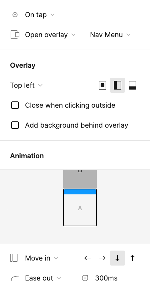
- Change the interaction type from Navigate to to Open overlay—this is crucial for maintaining the underlying page context.
- Apply these professional overlay settings:
- Deselect all elements by clicking on an empty canvas area to prepare for testing.
Launch the presentation mode by clicking the Present button
or using the keyboard shortcut Cmd–Option–Return (Mac) or Ctrl–Alt–Enter (Windows).Test the overlay interaction by clicking the menu icon in the navbar.
Observe how the Nav Menu slides down elegantly while the underlying content remains visible through the semi-transparent black background—a hallmark of professional overlay design that maintains user context while providing new functionality.
- Keep the presentation tab active but switch back to your design workspace. This allows real-time updates as you continue building the prototype functionality.
- Focus on the navbar within the Nav Menu frame by zooming in for detailed work.
- Complete the overlay experience by adding close functionality. On the Nav Menu frame, double-click the menu icon to select it for component swapping.
Access Figma's component swapping feature by switching to the Design tab in the right panel.
We've strategically created both menu and close icons as separate components with identical dimensions. This enables seamless component swapping—a professional technique that maintains consistent positioning while changing visual elements.
Above the Constraints section, click on
 menu icon and select close icon from the dropdown menu.
Notice the seamless transformation from hamburger menu to X close button—this works perfectly because both components share identical frame dimensions.
Navigation vs Overlay Interactions
Feature Navigate To Open Overlay Behavior Replaces current screen Appears over current screen Background Handling Completely new view Partial transparency shows beneath User Context Context change Context preserved Recommended: Use overlays for temporary interactions like menus to maintain user context and provide clear visual hierarchy.
Professional Component Sizing Technique
When resizing components, Figma automatically scales internal artwork, which isn't always desired behavior. Hold Cmd (Mac) or Ctrl (Windows) while resizing to adjust the component frame without altering internal artwork dimensions. This technique ensures consistent component frame sizes while maintaining artwork flexibility—exactly how we achieved identical dimensions for the menu and close icon components.
For batch operations, consider the free Frame Resizer plugin, which standardizes multiple selected component dimensions simultaneously—a significant time-saver for complex design systems.
Test the complete interaction cycle: open the menu with the hamburger icon, close it with the X button, and repeat. This represents professional-grade overlay interaction design.
Fixing the Position of Elements so They Don't Scroll
Fixed positioning is essential for creating professional mobile experiences. Navigation elements should remain accessible regardless of scroll position—just like native mobile apps. This final step transforms your prototype from a basic clickable demo into a polished, app-like experience.
- Return to your design workspace and establish a complete view by pressing Shift–1 to fit all frames.
- Select the navbar component on the Home Page frame as your starting point for batch selection.
- Use Figma's powerful selection tools: click the Main menu button and choose Edit > Select all with > Select all with same instance. This selects every navbar instance across all frames simultaneously—a massive time-saver for consistent updates.
- In the Prototype panel, locate the Scroll behavior section and change Position from the default setting to Fixed (stay in place). This ensures the navigation remains accessible during content scrolling.
- Test your professional-grade prototype by clicking the Present button or using Cmd–Option–Return (Mac) or Ctrl–Alt–Enter (Windows).
- In the presentation view, scroll vertically through the content and observe how the navbar maintains its position at the top of the viewport while page content scrolls beneath it—exactly like professional mobile applications.
- Close the presentation tab to return to your completed prototype workspace.
Fixed Positioning Implementation
Select All Navbar Instances
Use Edit > Select all with > Select all with same instance to target all navbar components simultaneously
Configure Scroll Behavior
In Prototype panel, set Position to 'Fixed (stay in place)' under Scroll behavior settings
Verify Fixed Positioning
Test in presentation mode to confirm navbar remains stationary while content scrolls underneath
Fixed positioning creates the authentic mobile app experience users expect, where navigation elements remain accessible regardless of scroll position.