Topics Covered in This Figma Tutorial:
Publishing a Team Library, Using Components in a Team Library, Using Styles in a Team Library, Swapping Team Libraries
Exercise Preview

What You'll Learn
Asset Reusability
Learn how to share colors, text styles, and components across multiple documents and team members. This enables consistent design systems.
Team Collaboration
Understand how multiple designers can work with the same design assets. Changes propagate automatically across all team files.
Library Management
Master the process of publishing, updating, and swapping design libraries. This includes handling version control for design systems.
Exercise Overview
In this comprehensive exercise, you'll master one of Figma's most powerful features for design systems: team libraries. You'll learn to create reusable assets—including colors, text styles, and components—that can be shared seamlessly across multiple documents and team members. This capability is essential for maintaining design consistency at scale, whether you're working on a small team or managing enterprise-level design systems. By the end of this tutorial, you'll understand how to establish a single source of truth for your design assets, ensuring that updates propagate automatically across your entire design ecosystem.
Creating a Team Project & Importing Files
We'll begin by setting up the proper project structure and importing the necessary design files that will serve as our foundation.
In Figma, navigate to the homescreen (file browser) if you're not already there:
- In the Desktop app: Click the
 Home tab (Mac users can also choose File > Open File Browser).
 - In the Web app: At the top left, click the Main menu button
 and choose Back to files.
- In the Desktop app: Click the
Create a new Team project to organize our library files. On the left sidebar, hover over your team name and click the Plus(+) icon.
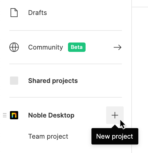
Name the new project Pulse and click Create project. Using descriptive project names helps maintain organization as your design system grows.
- Import the necessary files by clicking
 Import file (located near the top right).
 Navigate to Desktop > Class Files > Figma Class and select all three design files:
- Select all files (Women.fig, Pulse Design System.fig, and Pulse Design System Alternate.fig) by clicking the first file, then Shift-clicking the last file.
- Click Open to begin the upload process.
- Once the upload completes, click Done.
Double-click on Pulse Design System to open it. This will be our primary design system file.
File Import Process
Navigate to Home
Access the file browser through the Home tab in desktop app or Main menu in web app
Create Team Project
Hover over team name, click Plus button, name project 'Pulse' and create
Import Multiple Files
Select all 3 files using click and Shift-click method, then upload to project
Looking at the Components & Styles
Before publishing our library, let's examine the design assets we'll be sharing. Understanding the structure of your design system is crucial for effective library management.
Team libraries represent a paradigm shift in how design teams collaborate. When properly implemented, they create a shared foundation that ensures consistency while enabling rapid iteration across multiple projects and team members. Updates to the original library automatically propagate to all connected files, eliminating the manual effort of maintaining design consistency.
- Click in an empty area to ensure nothing is selected, allowing you to view the global styles.
In the Design panel on the right, observe the comprehensive style system we've established:
• Text Styles for typography hierarchy • Color Styles for brand consistency • Effect Styles for shadows and other visual effects • Grid Styles for layout standardization
- Switch to the Assets panel at the top of the left sidebar to view our component library.
Expand Local components, then Pulse Components to explore the reusable interface elements we've created. These components form the building blocks of our design system.
Available Style Types in Design Panel
Publishing a Library
Publishing transforms your local design assets into a shared team resource. This process is where individual design work becomes a collaborative system.
IMPORTANT: Figma's library publishing capabilities vary by plan tier. Publishing styles is available to free Starter teams, but publishing components requires a Professional team, Education team, or Figma Organization. If you're using the free Starter plan, you'll be able to publish styles but not components. For professional design teams, the component publishing feature is essential for maintaining design system integrity.
- Ensure nothing is selected by clicking in an empty area.
- In the toolbar, locate the dropdown arrow next to the file name and click it.
- From the dropdown menu, select Publish styles and components.
- In the publishing dialog, verify that all assets are selected (they should be by default) and click Publish. Your design system is now available as a shared team resource.
Publishing styles is available to free Starter Teams, but publishing components requires a Professional team, Education team, or Figma Organization. Free users cannot publish components.
Library Publishing Steps
Access Publishing Menu
Click down arrow next to file name in toolbar, choose 'Publish styles and components'
Select Assets
Verify all desired components and styles are selected in the publishing dialog
Publish Library
Click Publish button to make library available to team members
Loading the Team Library into a Design File
Now we'll demonstrate how other team members can access and utilize your published library in their design work.
Navigate back to the file browser to open a different file:
- In the Desktop app: Click the Home tab (Mac users can also choose File > Open File Browser).
- In the Web app: At the top left, click the Main menu button and choose Back to files.
- In the Desktop app: Click the
- In the Pulse project, double-click Women to open it. This file will serve as our design implementation example.
- Switch to the Assets panel at the top of the left sidebar.
- Click the Team library button
 at the top right of the Assets panel.
 - Activate the library by clicking the toggle switch
 next to Pulse Design System.
 Close the Libraries dialog to return to your design canvas.
Library Loading Checklist
Navigate to the file where you want to use library assets
Switch to Assets panel to view available libraries
Click Team library button and toggle on desired library
Confirm library components appear in Assets panel
Using Components in a Team Library
With library access established, let's implement shared components to see the power of centralized design assets in action.
In the Assets panel, expand Pulse Design System (our team library), then Pulse Components to reveal all available components from the shared library.
- Drag the nav component to the top of the frame. Notice how it maintains all its original properties and styling.
Drag the footer component to the bottom of the frame. These components are now connected to the master library, meaning future updates will propagate automatically.
Component Implementation Process
Expand Library
Navigate to Pulse Design System in Assets panel
Drag Navigation
Place nav component at top of frame
Add Footer
Position footer component at bottom of frame
Using Styles in a Team Library
Text and color styles from team libraries ensure typographic and brand consistency across all your design work.
Select the New Autumn Attire text element and apply our shared typography system:
- In the Design panel, click the Style button
 next to Text
 - Under Pulse Design System, select the Heading style to apply consistent typography.
- In the Design panel, click the Style button
Apply a consistent brand color by clicking the Style button
next to Fill- Under Pulse Design System, select 3. Dark (dark brown). You may need to scroll if you're in list view.
Select the subheading text cozy women's styles for the fall season and establish hierarchy:
- In the Design panel, click the Style button next to Text
- Under Pulse Design System, apply the Subheading style.
- In the Design panel, click the Style button
Complete the styling by clicking the Style button
next to Fill- Under Pulse Design System, select 2. Medium (medium brown) to create appropriate contrast hierarchy.
Text Style Applications
| Feature | Element | Style Applied | Color Applied |
|---|---|---|---|
| New Autumn Attire | Heading | 3. Dark (brown) | |
| Cozy women's styles | Subheading | 2. Medium (brown) |
Updating a Team Library
One of the most powerful aspects of team libraries is the ability to make systematic updates that propagate across all connected files. Let's demonstrate this workflow.
In the Assets panel, Ctrl-click (Mac) or right-click (Windows) on the navbar component and choose Go to main component.
This navigation feature takes you directly to the source component in the library file.
- Click in an empty area to deselect all elements.
- In the Design panel, locate the Text Styles section.
- Hover over the Heading style and click the Edit Style button
 that appears.
 In the Edit style panel, make these adjustments to improve the typography hierarchy:
- Change the font weight from Regular to Black for stronger visual presence.
- Increase the font size from 29 to 34 pixels for better readability.
Close the Edit style panel to apply your changes.
In the Pulse Components frame, double-click on the navbar's background to select it.
Update the navbar color to align with our brand palette:
- In the Design panel, click the Style button next to Fill
- Select 3. Dark (dark brown) to apply consistent brand colors.
- In the Design panel, click the Style button
- Click in an empty area to deselect, then click once on the navbar to select the entire component.
Notice the Publish changes button in the Design panel—this indicates pending updates.
- The black dot next to Assets in the left panel serves as an additional visual indicator of unpublished changes.
- Switch to the Assets panel in the left sidebar.
- Click the Team library button at the top right of the Assets panel.
- Next to Pulse Design System, click the Publish 2 changes button.
Click Publish to propagate your updates across all connected files.
Library Update Workflow
Access Main Component
Right-click component and select 'Go to main component' to edit source
Modify Styles
Edit text styles changing Regular to Black and font size from 29 to 34
Update Component Colors
Change navbar background to use Dark brown color style
Publish Changes
Click 'Publish 2 changes' button to distribute updates
Accepting Library Changes in a File
When libraries are updated, consuming files receive notifications to review and accept changes. This controlled update process ensures teams can evaluate changes before implementation.
Return to the Women file to see how library updates are handled:
- In the Desktop app: Click the Women tab at the top of the interface.
- In the Web app: Click the Women—Figma browser tab.
Look for the Component updates available notification at the bottom right of the window and click Review.
NOTE: If you dismiss this notification, you can access the same functionality through the Assets panel by clicking Team library
and selecting Updates.In the Updates window, review the proposed changes:
- While you could update changes individually, click Update all to accept all modifications simultaneously.
Observe the results of your library updates:
- The heading text now displays with black font weight and increased size for improved hierarchy.
- The navbar background has changed to the brand-consistent brown color.
When library changes are published, files using those libraries will show 'Component updates available' message at bottom right of window.
Observable Changes After Update
Typography Enhancement
Heading text becomes thicker with black font weight and increases from 29px to 34px size.
Color System Update
Navigation bar background color changes from original to brown using the updated color style.
Optional Bonus: Swapping Team Libraries
Library swapping is an advanced technique that proves invaluable when managing multiple design system versions or transitioning between different brand guidelines. This capability is particularly useful for agencies managing multiple client brand systems or organizations maintaining separate libraries for different product lines.
To demonstrate this functionality, we'll first need to establish a second published library.
Navigate back to the file browser:
- In the Desktop app: Click the Home tab (Mac users can also choose File > Open File Browser).
- In the Web app: At the top left, click the Main menu button and choose Back to files.
- In the Desktop app: Click the
- In the Pulse project, double-click Pulse Design System Alternate to open the alternative design system.
- Ensure nothing is selected by clicking in an empty area.
- Access the publishing options by clicking the dropdown arrow next to the file name in the toolbar.
- Select Publish styles and components from the menu.
Click Publish to make this alternative design system available as a team library.
Return to the Women file to perform the library swap:
- In the Desktop app: Click the Women tab at the top.
- In the Web app: Click the Main menu button and choose Back to files. Then double-click Women in the Pulse project.
- Switch to the Assets panel at the top of the left sidebar.
Click the Team library button
at the top right of the Assets panel.- Click on Pulse Design System (the currently active library) to access its options.
- Select Swap library to begin the substitution process.
- Click Choose library in the top right corner and select Pulse Design System Alternate. You may need to navigate into your team's submenu to locate it.
- Click Swap library to execute the change.
Observe the dramatic transformation of your design as it adopts the alternative design system's styling and components.
For comprehensive information about advanced library swapping techniques and best practices, visit tinyurl.com/fig-swap-lib
Library Swapping Process
Publish Alternative Library
Open Pulse Design System Alternate file and publish it as a separate library
Access Library Settings
In target file, open Team library panel and click on current library name
Execute Swap
Choose 'Swap library', select Pulse Design System Alternate, and complete swap
Review Changes
Observe how file appearance changes with new library applied
Library swapping is useful for switching between different versions of a design system or when transitioning between internal and external design agency libraries.