Topics Covered in This Figma Tutorial:
Creating Dynamic Button Hover States Using Variants and Implementing Interactive Pop-Up Overlays for Enhanced User Experience
Tutorial Learning Path
Component Setup
Create base components and establish the foundation for interactive elements using Figma's component system
Variant Creation
Build hover states using variants to create smooth transitions between different button appearances
Overlay Implementation
Configure pop-up overlays with proper positioning and interaction triggers for modal dialogs
Exercise Preview
Exercise Overview
In this comprehensive exercise, you'll master two fundamental interaction design techniques that define modern user experiences. First, you'll implement sophisticated hover effects using Figma's variant system—a critical skill for creating interfaces that provide immediate visual feedback to users. Second, you'll learn to create overlay interactions that elegantly display contextual information without disrupting the user's workflow.
These techniques form the backbone of professional interface design, enabling you to craft experiences that feel responsive and intuitive. By the end of this tutorial, you'll understand how to leverage Figma's prototyping capabilities to create production-ready interactive elements that enhance usability and delight users.
This tutorial assumes basic familiarity with Figma's interface. You'll work with the provided Hovers and Overlays.fig file located in Desktop > Class Files > Figma Class.
Opening the File
Let's begin by accessing your project files and setting up your workspace for optimal productivity.
In Figma, navigate to your file browser if you're not already there:
- In the Desktop app: Click the
 Home tab (Mac users can alternatively choose File > Open File Browser).
 - In the Web app: At the top left, click the Main menu button
 and select Back to files.
- In the Desktop app: Click the
- To import your local exercise file, click
 Import file (typically located near the top right of your interface).
 Navigate to Desktop > Class Files > Figma Class and double-click Hovers and Overlays.fig to select it.
After the file uploads successfully, click Done and double-click the file thumbnail to open your workspace.
Figma Access Methods
| Feature | Desktop App | Web App |
|---|---|---|
| Navigation | Click Home tab | Main menu > Back to files |
| File Import | Import file button | Import file button |
| Keyboard Shortcut | File > Open File Browser | Not available |
Designing the Hover State (Using Variants)
Now we'll create a sophisticated button component that transforms seamlessly when users hover over it. This technique is essential for providing immediate visual feedback and guiding user interactions.
- Set your workspace to 100% zoom by pressing Shift–0 for optimal precision while working.
In the map interface, click once on Kauai to select it.
Notice that this is a group element, which automatically selects both the text and the accompanying circle icon.
We'll implement auto layout to ensure our design remains flexible and professional. In the Design panel, locate Auto layout and click the Plus (+) button.
Auto layout is crucial for maintaining consistent spacing as content changes—a hallmark of scalable design systems.
Transform this element into a reusable component by clicking Create Component
 in the middle of the toolbar.
Components are the foundation of efficient design systems, allowing you to maintain consistency across your entire project.
You'll notice that a copy of the icon (the circle with "i") was automatically created to the right of the button. This happens because Figma follows a fundamental rule: while you can use component instances within other components, you cannot nest main components inside other main components.
We'll organize both main components (the button and icon) in the designated area off the right side of this frame—a best practice for maintaining clean, organized files.
- Select the standalone icon (the one created outside the button) by clicking on it.
- Hold Shift and click on the button to select both components simultaneously.
- Drag both elements to the right side of the canvas, positioning them in the empty space below the Kauai info card for better organization.
- Click on an empty area of the canvas to deselect all elements.
- Locate and select the Kauai button (it may appear faint, but we'll address the visibility shortly).
Create a variant for the hover state by clicking the Add variant
 button in the toolbar.
- Observe that a second button appearance has been generated in the canvas.
- In the Design panel, rename Variant2 to Hover for clarity.
- Double-click on Property 1 and change it to State, then press Return (Mac) or Enter (Windows) to confirm the change.
- Select the entire island name component set by clicking its label.
Improve visibility by adding a background fill. In the Design panel, scroll to the Fill section and click the Plus (+) button.
- Click on the newly added fill color and select Black from the color picker.
- Close the color picker to apply the changes.
The darker background significantly improves the button's visibility and professional appearance.
- Within the island name component set, select the bottom button (your hover state).
- Refine the spacing for a more polished hover effect. In the Design panel, under Auto layout, adjust Spacing between items
 to 7.
to 7. - Enhance the icon's prominence by double-clicking on it to select it individually.
- In the Design panel, under Layer, increase the Opacity from 70% to 100% for a more engaging hover state.
- Return to the Assets panel by clicking Assets at the top of the left panel.
Deploy your new component by dragging the Kauai button from the Assets panel onto the map, positioning it next to the corresponding island as shown:

Component Variant Setup Process
Apply Auto Layout
Add auto layout to ensure icon positioning adjusts automatically when text changes, maintaining consistent spacing
Create Main Component
Convert the button to a component, noting that main components cannot contain other main components
Add Variant States
Create hover variant with custom property naming (State: Default/Hover) for clear organization
Main components cannot contain other main components. When creating nested components, Figma automatically creates separate main components outside the parent.
Making the Hover State Work
With our visual design complete, we'll now implement the interactive behavior that brings your hover state to life.
- Switch to the Prototype panel in the right sidebar to access interaction controls.
- In the island name component set (located to the right of the Desktop frame), select the top button (default state).
- Create the interaction by dragging the blue circle connector to the bottom button (hover state).
Configure the interaction in the Interaction details panel:
- Change the trigger from On click to While hovering to create a proper hover effect.
- Under Animation, change Instant to Smart animate for smooth, professional transitions.
Test your work by clicking Present
 at the top right, or use the keyboard shortcut Cmd–Option–Return (Mac) or Ctrl–Alt–Enter (Windows).
- Hover over Kauai and observe the smooth animation as the icon moves closer to the text and brightens—exactly the kind of polished interaction users expect from modern interfaces.
Close the presentation to return to your workspace.
Prototype Configuration Steps
Access prototyping tools in the right panel
Drag blue connection point between default and hover states
Ensure interaction responds to mouse hover, not click
Creates smooth transitions between component states
Making a Second Button
Now we'll demonstrate the power of component-based design by quickly creating additional interactive elements.
Create another instance of your interactive button for Oahu by holding Option (Mac) or Alt (Windows) while dragging the Kauai button down and to the right, positioning it beside the next island.
- Double-click on Kauai in your new button copy to begin editing.
Once the text object is outlined, double-click again to highlight the text for editing.
- Replace the text with Oahu.
- Notice how the auto layout maintains perfect spacing as you edit—this is the efficiency of well-structured components in action.
- Press Esc once to complete text editing.
Press Esc again to deselect the component entirely.
- Launch the presentation mode by clicking the Present button .
- Test both buttons by hovering over them—both should exhibit identical hover behaviors, with only the text content differing. This consistency is what separates professional interfaces from amateur ones.
Exit the presentation to continue building your prototype.
When editing text in components with auto layout, the icon automatically maintains correct spacing distance. This demonstrates the power of Figma's responsive design features.
Opening a Pop-Up (Using an Overlay)
Next, we'll implement overlay interactions—a sophisticated technique for displaying contextual information without disrupting the user's primary workflow. This approach is essential for creating clean, uncluttered interfaces that scale well across different screen sizes.
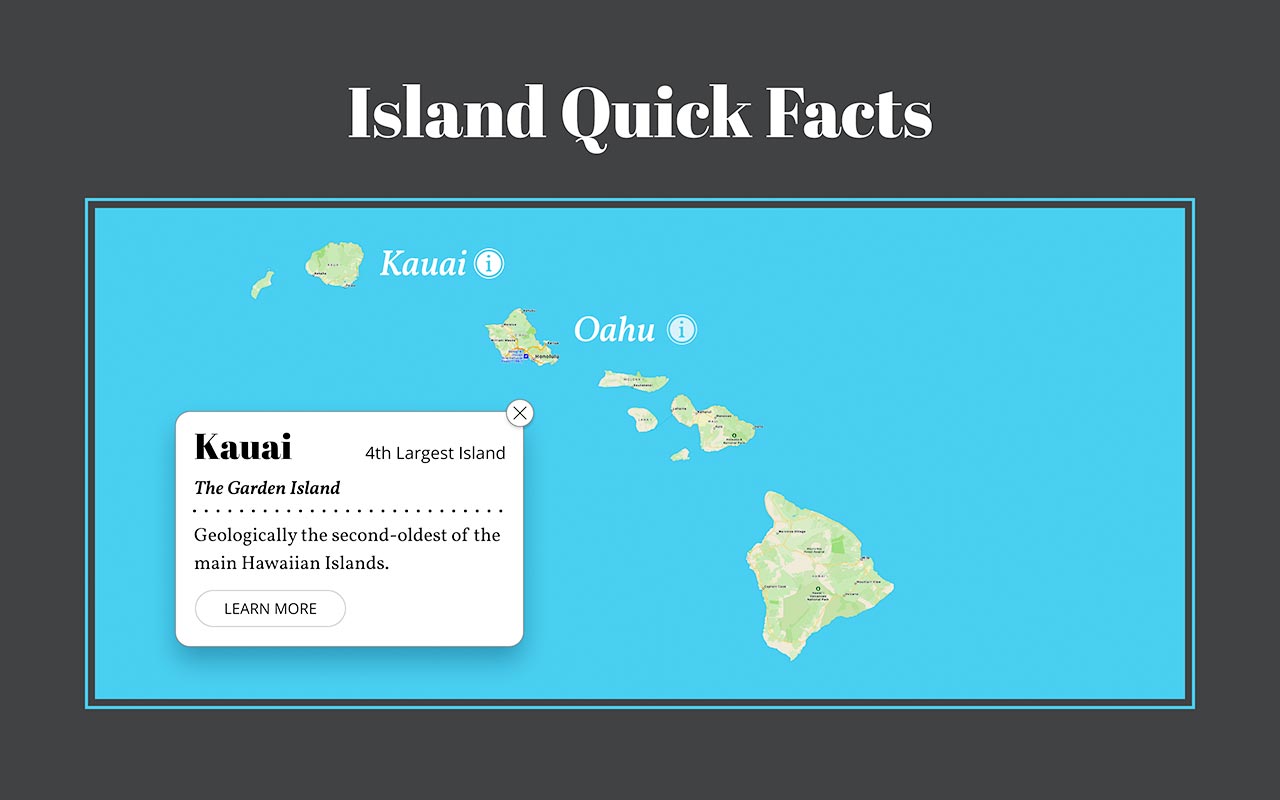
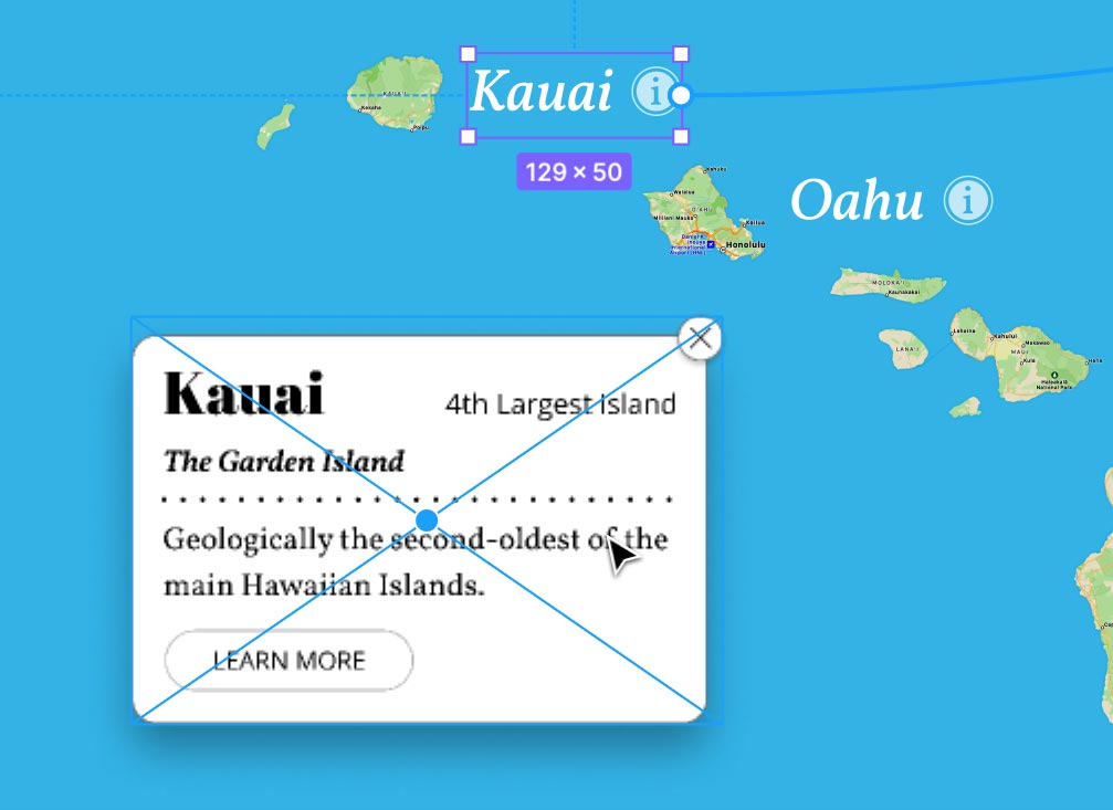
Our goal is to display the Kauai info card (currently positioned to the right of the frame) when users click the Kauai button.
- Get a complete view of your workspace by pressing Shift–1 to zoom to fit all elements.
- Ensure you're viewing the Prototype panel on the right side.
- On the Desktop frame, select the Kauai button with a single click.
Attempt to drag the Kauai button's blue connector circle to the info card—you'll notice it won't attach.
This limitation occurs because the info card is currently just a group. Figma's overlay system requires frame objects for proper functionality—another example of why understanding Figma's object hierarchy is crucial for professional work.
- Select the info card to prepare it for conversion.
- Navigate to the Design panel in the right sidebar.
At the top of the Design panel, click the dropdown menu labeled Group and select Frame to convert the object.
You'll notice the drop shadow has been clipped. In the Design panel, uncheck Clip content to restore the full shadow effect.
This restoration ensures your design maintains its intended visual polish.
- Return to the Prototype panel by clicking Prototype at the top of the right sidebar.
- Select the Kauai button on the Desktop frame once more.
Now drag the Kauai button's blue connector to the info card—this time the connection will work properly.
Configure the overlay behavior in the Interaction details panel:
- Change Navigate to to Open overlay to create a layered interaction.
- Under Overlay, change Centered to Manual to gain precise control over positioning.
Position the overlay thoughtfully by dragging it to match the layout shown below:
Close the Interaction details panel to clean up your workspace.
- Test your overlay by clicking the Present button at the top right.
Click the Kauai button to trigger the info card overlay. The smooth appearance creates an elegant, professional interaction that maintains context while providing detailed information.
However, we still need to implement a way for users to close this overlay—a critical aspect of user experience design.
Exit the presentation mode to complete the interaction.
Groups vs Frames for Prototyping
Overlay Setup Process
Convert to Frame
Change the info card from group to frame to enable prototype connections and overlay functionality
Configure Overlay Settings
Set interaction to 'Open overlay' and positioning to 'Manual' for precise placement control
Position Overlay
Drag overlay to desired screen position for optimal user experience
Making the Close Button Work
No overlay interaction is complete without an intuitive way to close it. We'll implement the close functionality to ensure users maintain full control over their interface experience.
- In the info card frame on the right, select the close button (the circled X icon).
Add a new interaction by clicking the Plus (+) button next to Interactions in the Prototype panel.
Configure the close behavior by clicking on the Click
—>None interaction that appears:- Change None to Close overlay to complete the interaction loop.
- Close the Interaction details panel when finished.
- Click on an empty area of the canvas to deselect all elements.
- Launch your final test by clicking the Present button .
- Click the Kauai button to display the info card overlay.
Click the close button on the info card to dismiss it smoothly.
Congratulations! You've successfully created a complete interactive system with hover states and overlay functionality—skills that are fundamental to modern UX design and highly valued in professional environments.
Close the presentation to return to your design workspace.
Always provide clear exit paths for overlays. The close button interaction completes the user journey by allowing users to dismiss the modal and return to the main interface.
Final Testing Checklist
Verify smooth animations and proper icon positioning
Ensure modals appear in correct positions
Confirm overlays dismiss properly when closed
Test entire interaction sequence from start to finish