Topics Covered in This Adobe XD Tutorial:
Creating a New File, Setting up Artboards, Importing Text, Creating Colored Backgrounds for Text
Exercise Preview
Exercise Overview
In this comprehensive exercise, you'll master the fundamentals of Adobe XD while learning industry-standard grid-based design principles. We'll walk through creating new files and designing with the widely-adopted Bootstrap grid system—a cornerstone of modern responsive web design. You'll build a clean 2-column desktop layout that serves as the foundation for mobile adaptation in subsequent exercises, giving you practical experience with the design-to-development workflow that defines today's digital projects.
This tutorial is tested with Adobe XD version 49.0.12.14. Most features work similarly across versions, but check tinyurl.com/axdnew for the latest updates.
Creating a Blank New File
Launch Adobe XD.
NOTE: This book has been tested with Adobe XD version 49.0.12.14. While Adobe XD is no longer receiving major updates as of 2022, it remains a powerful tool for UI/UX design. If you're using a different version, most functionality should remain consistent. For the latest information about XD's status and alternatives, visit tinyurl.com/axdnew
- You should see the welcome screen displaying preset options for phone, tablet, desktop, and custom dimensions. If the welcome screen doesn't appear, navigate to File > New or use the keyboard shortcut Cmd–N (Mac) or CTRL–N (Windows).
As shown below, click on the Web 1920 preset (or whatever your current Web size displays).
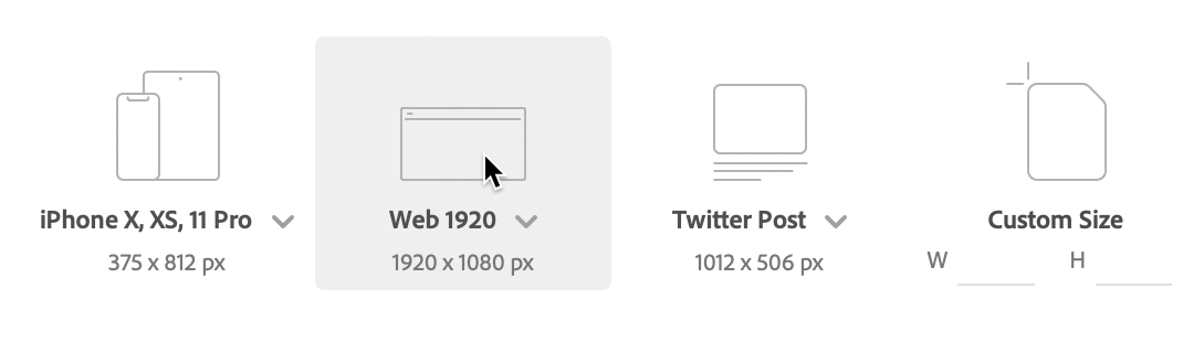
NOTE: Click on the Web 1920 dropdown menu to customize its default dimensions if needed.
- At the top left of the artboard, double-click on Web 1920 – 1 and rename it to Desktop.
- Press Return (Mac) or Enter (Windows) to confirm the name change.
- Ensure the artboard remains selected (indicated by a blue bounding box). If it's not selected, click on the artboard's name (Desktop) to select it.
In the Property Inspector panel on the right, change the width (W) to 1280 and press Return (Mac) or Enter (Windows) to apply the change.
NOTE: All measurements in XD use pixels, the standard unit for web and UI design. A 1280-pixel width accommodates smaller desktop screens and laptop displays effectively.
- Deselect the artboard by clicking on the gray canvas area outside the artboard.
- Now we'll add additional artboards for our responsive design. In the left Toolbar, select the Artboard tool
 .
. - In the Property Inspector on the right, locate the Tablet section and click on iPad, Nexus 9. A new artboard will appear to the right of your Desktop artboard.
Let's complete our responsive trio with a mobile artboard. With the iPad artboard still selected, scroll down in the Property Inspector to find the mobile presets and click on iPhone 6,7, 8, SE.
TIP: To quickly duplicate any artboard, hold Option (Mac) or ALT (Windows) while dragging the artboard's name (located at the top left of each artboard).
Return to the Select tool
 in the left Toolbar.
Setting Up Your First Artboard
Launch and Select Web Template
Open Adobe XD and select Web 1920 from the welcome screen, or use File > New (Cmd-N/Ctrl-N).
Rename and Resize Artboard
Double-click 'Web 1920 - 1' to rename it 'Desktop', then change width to 1280px in the Property Inspector.
Add Multiple Device Artboards
Use the Artboard tool to add iPad and iPhone artboards for responsive design testing.
Navigating Around a File
Before diving into design work, let's master XD's navigation tools—these will save you significant time as your projects grow in complexity.
- Ensure the Select tool is active in the left Toolbar.
- Zoom in by holding Cmd (Mac) or CTRL (Windows) and pressing the Plus(+) key several times.
- Zoom out by holding Cmd (Mac) or CTRL (Windows) and pressing the Minus(–) key several times.
- Hold the Spacebar (notice the cursor changes to a hand icon
 ) and drag anywhere on the canvas to pan around your workspace.
 - To access the Layers panel, click the
 icon in the bottom left of the window. If the Layers panel is already open, this button will close it—click again to reopen.
 - The Layers panel displays a hierarchical list of all artboards in your project, providing an organized overview of your design structure.
XD offers efficient artboard navigation through this panel. Double-click on the artboard icon
 next to iPhone 6,7, 8, SE – 1 (as shown below) to instantly navigate to that artboard and zoom it to fill your screen. Avoid double-clicking the artboard name, which would activate rename mode.
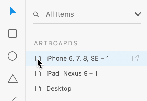
The Layers panel now shows the contents of this specific artboard. Since we haven't added any design elements yet, it appears empty. To return to the master artboard list, click the back arrow
 next to iPhone 6,7, 8, SE – 1 at the top of the Layers panel.
Essential Navigation Shortcuts
Zoom Controls
Use Cmd/Ctrl + Plus to zoom in, Cmd/Ctrl + Minus to zoom out for precise design work.
Pan Navigation
Hold Spacebar and drag to move around the canvas quickly without losing your current zoom level.
Layers Panel
Double-click artboard icons in the Layers panel to navigate between artboards and zoom to fit screen.
Designing on a Grid
Professional designers rely on grid systems to create visually cohesive, mathematically precise layouts that translate seamlessly from design to code. Web developers use these same grid systems as the structural foundation for responsive websites. While grids aren't mandatory, they're essential for creating designs that work harmoniously across phones, tablets, and desktops—streamlining both the creative process and the development handoff.
The most widely adopted grid system in web development is Bootstrap's 12-column framework, which provides standardized gutter spacing and column widths optimized for different screen sizes. When your development team uses Bootstrap (or similar frameworks), designing with matching grid specifications eliminates guesswork and ensures pixel-perfect implementation. For comprehensive documentation on Bootstrap's grid system, visit getbootstrap.com/docs/4.5/layout/grid
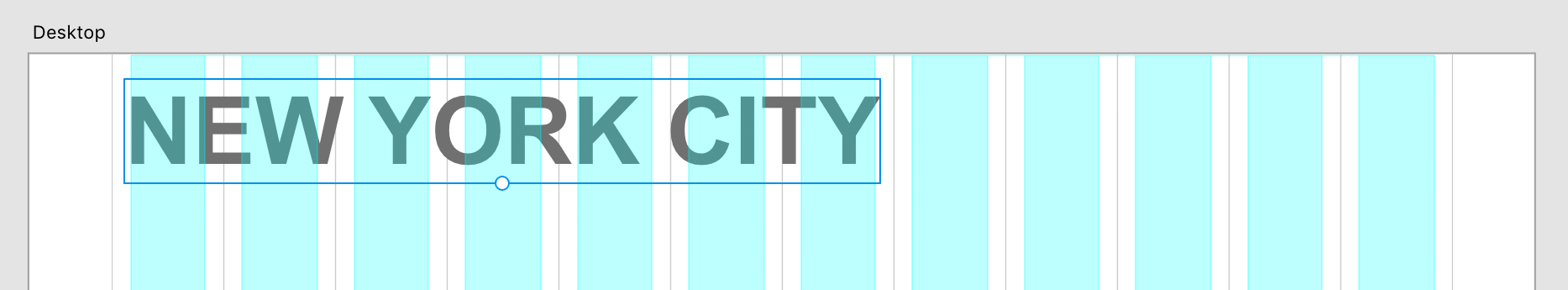
- In the Layers panel, double-click on the artboard icon next to Desktop to navigate to that artboard and zoom it to fill your screen.
- In the Property Inspector on the right, locate the Grid section, check it to enable, and ensure the dropdown menu is set to Layout.
- Verify that Columns is set to 12 (the Bootstrap standard).
- Set Gutter Width to 30 and press Return (Mac) or Enter (Windows) to apply this industry-standard spacing.
Observe how the column spacing adjusts to match professional grid specifications.
To accelerate your workflow, we've prepared a comprehensive Bootstrap grid template that includes precise measurements and additional guides that XD's standard layout grid doesn't provide—saving you valuable setup time on every project.
- Navigate to File > Open from Your Computer or use the shortcut Cmd–Shift–O (Mac) or CTRL–Shift–O (Windows).
- Browse to Desktop > Class Files > Adobe XD Class.
- Double-click on Bootstrap 4 Grid Template.xd to open the template file.
Choose File > Save As Local Document to create a working copy.
NOTE: File > Save As saves documents to Adobe Creative Cloud's online storage, while Save As Local Document keeps files on your computer for offline access.
- Since this exercise focuses on creating a NYC-themed page, navigate to Desktop > Class Files > Adobe XD Class > NYC to maintain organized project files.
Name the file About Page.xd and click Save.
If prompted with Continue saving to your computer? click Continue to proceed.
You'll now see three artboards featuring aqua blue columns that precisely match Bootstrap's specifications for phone, tablet, and desktop breakpoints.
This Bootstrap grid template was created by Dan Rodney, a Noble Desktop instructor with extensive industry experience. Access the template and future updates at danrodney.com/blog/adobe-xd-bootstrap4-grid. For detailed information about Bootstrap's responsive breakpoints, refer to the sidebar at the end of this exercise.
- The Layers panel displays all three artboards in your project hierarchy.
Double-click on the artboard icon
next to Desktop to focus on the desktop layout and fill your screen with this artboard.
Using matching grid systems between design and development streamlines the workflow, making designs easier to create and significantly easier to code for responsive websites.
Setting Up Bootstrap Grid in XD
Set to 12 columns to match Bootstrap's standard
Maintains consistency with Bootstrap specifications
Saves time with pre-configured guides and measurements
Why 12 Columns?
The 12-column grid has become the industry standard because it offers maximum layout flexibility through mathematical divisibility. Since content typically spans multiple columns, the total column count must accommodate common layout patterns. A 12-column system divides evenly into halves (6+6), thirds (4+4+4), fourths (3+3+3+3), and sixths (2+2+2+2+2+2)—covering virtually every layout scenario you'll encounter. Compare this to a 10-column grid, which works for 2-column layouts but cannot be evenly divided into thirds or fourths, limiting your design options and creating awkward proportions.
12-Column Grid Divisibility Advantage
Adding Text
Now we'll begin building our page content, starting with a prominent heading that establishes visual hierarchy and guides the user's attention.
- We'll create a primary heading for the top-left area of our page. In the Toolbar, select the Text tool
 .
. - Click anywhere on the artboard to create a text element. Don't worry about precise placement—we'll position it properly in the next steps.
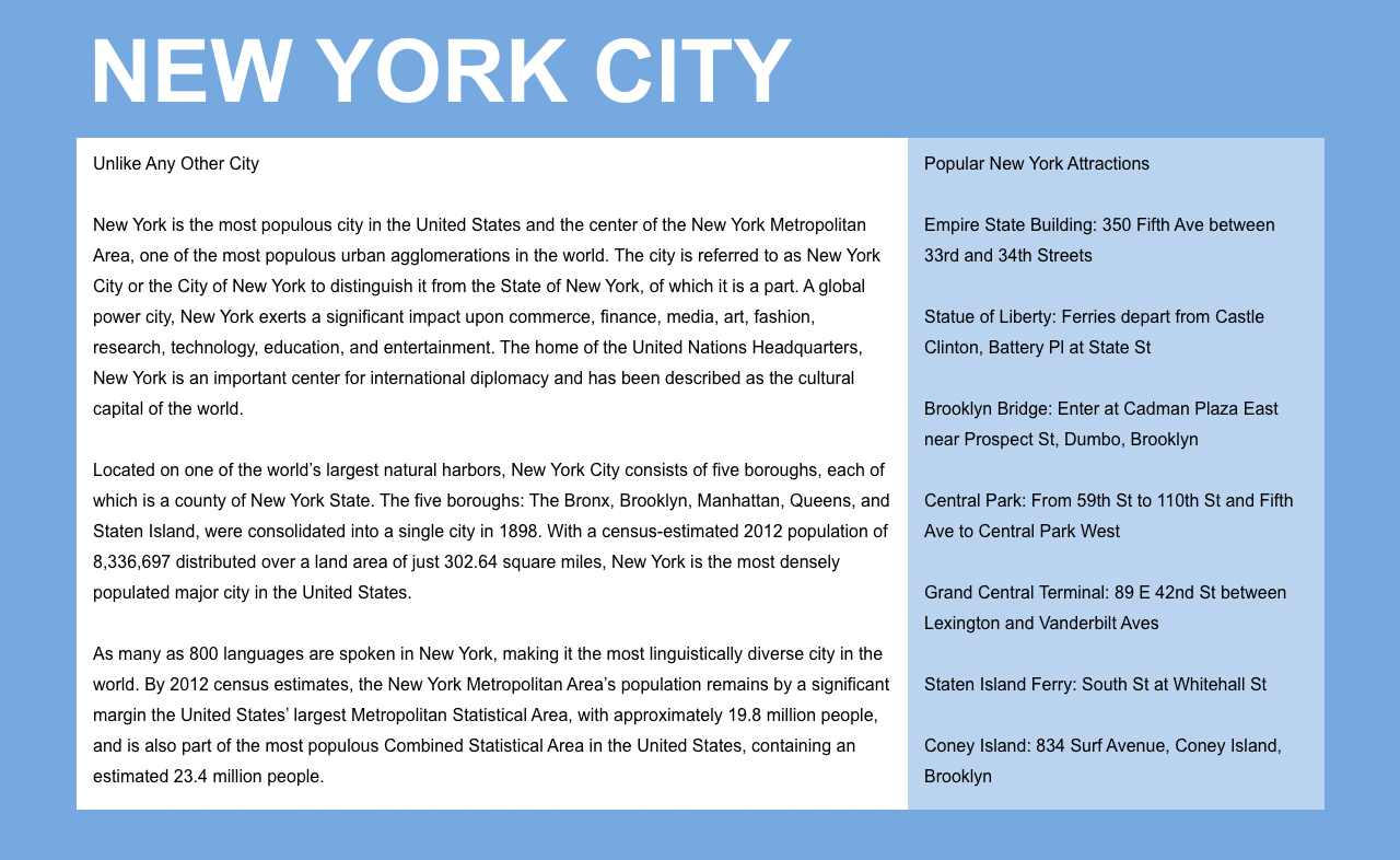
- Type New York City
- Press Esc to select the entire text box and exit text editing mode.
- Locate the circular resize handle at the bottom of the text box. Drag this handle downward to increase the text size dynamically—notice how the font size value updates in real-time within the Property Inspector.
With the text selected, configure the following settings in the Property Inspector (including the circled options shown below):

- Return to the Select tool in the Toolbar.
Position the heading by dragging it so the left edge aligns with the first solid aqua column. While XD won't automatically snap to the column, you can achieve precise visual alignment by eye.
Point Type Vs. Area Type
Adobe XD offers two distinct text creation methods, each optimized for different content types:
- Point type creates single-line text that expands horizontally as you type (unless you manually press Return/Enter for line breaks). It's perfect for headings, labels, and short phrases. The bottom resize handle allows quick size adjustments. Create point type by clicking (not dragging) with the Text tool.
- Area type creates multi-line text containers with defined boundaries. Text automatically wraps to fit the container width, forming organized columns—ideal for paragraphs and body content. Create area type by dragging out a rectangular boundary with the Text tool.
XD Text Types Comparison
| Feature | Point Type | Area Type |
|---|---|---|
| Creation Method | Single click with Text tool | Drag to create box with Text tool |
| Text Behavior | Single line unless Return/Enter pressed | Multi-line with automatic text reflow |
| Resize Method | Bottom circle handle for quick sizing | Drag box edges to define text column width |
| Best Use Case | Headlines and short text | Paragraphs and content blocks |
Importing & Styling Text
Rather than typing extensive content manually, we'll import pre-written text files to build our two-column layout efficiently. This workflow mirrors real-world projects where content often comes from copywriters, clients, or content management systems.
- Navigate to File > Import to access XD's import functionality.
- Browse to Desktop > Class Files > Adobe XD Class > NYC.
- We need to import both text files for our layout. Click once on Text—main.txt to select it.
- Hold Shift and click on Text—sidebar.txt to select both files simultaneously.
- Click Import to bring both text files into your design.
XD will create two text boxes in the center of your artboard. With both text boxes selected, apply the following typography settings in the Property Inspector (including the circled options shown below):

Click in an empty area of the canvas or artboard to deselect both text elements.
NOTE: Line Spacing
 functions identically to line-height in CSS or leading in traditional print design, controlling the vertical space between lines of text.
TIP: To reset line spacing to its default value, enter 0 in the line spacing field and press Return (Mac) or Enter (Windows).
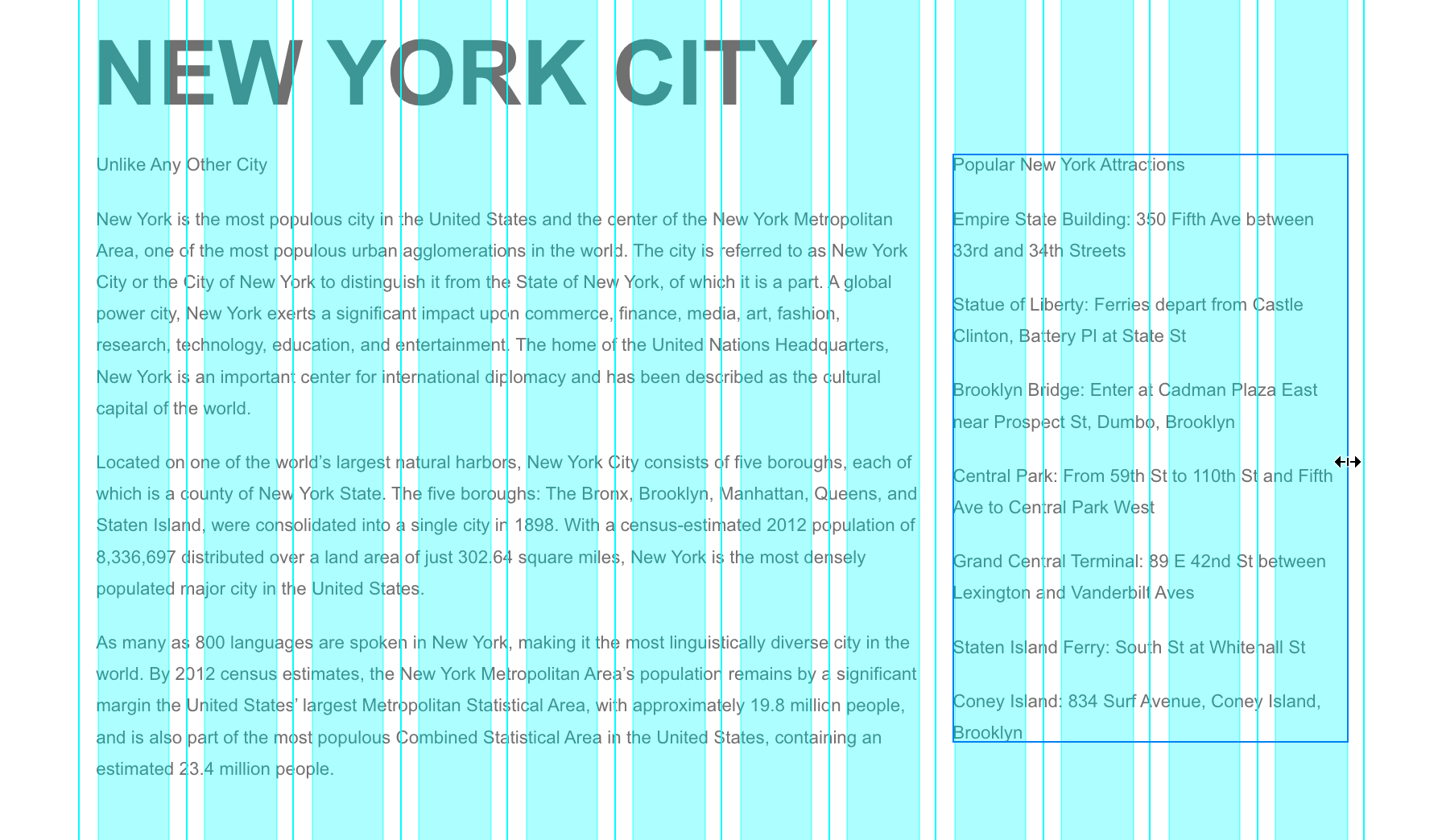
Position the main content by dragging the Unlike Any Other City text box directly beneath the New York City heading, as shown below:
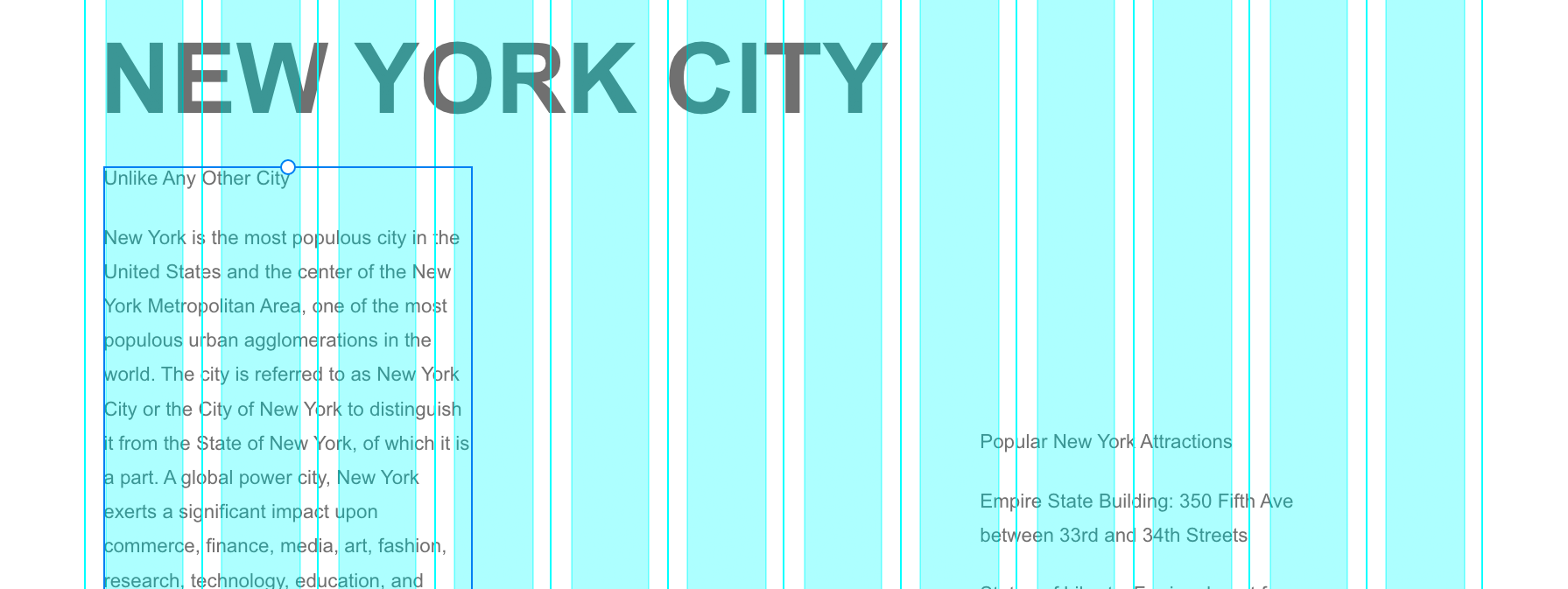
Resize the main column by dragging the text box width to span exactly 8 of the solid aqua columns, creating a spacious primary content area:

Position the sidebar by dragging the Popular New York Attractions… text box so it aligns vertically with the top of the main column text (XD's smart guides will appear to assist with precise alignment) and horizontally with the aqua column immediately to the right of the main content:

Complete the sidebar by resizing its width to span the remaining 4 aqua columns, creating a balanced two-column layout:
- Click on a blank area of the artboard (not the external canvas) to deselect all elements.
- To preview your layout without grid distractions, hide the layout grid by choosing View > Hide Layout Grid or using the shortcut Cmd–Shift–
'(Mac) or CTRL–Shift–'(Windows). - Also hide the guidelines by choosing View > Guides > Hide All Guides or pressing Cmd–; (Mac) or CTRL–; (Windows).
To see your design at actual browser size, choose View > 100% for an accurate representation of how users will experience your layout.
Text Import and Grid Alignment Process
Import Multiple Text Files
Use File > Import to select multiple .txt files simultaneously with Shift-click selection.
Position Main Content
Drag main text box to span 8 of the solid aqua columns for optimal reading width.
Create Sidebar Layout
Position sidebar text to span remaining 4 columns, maintaining visual hierarchy and balance.
Changing the Artboard Background Color
A thoughtfully chosen background color enhances readability and establishes visual cohesion across your responsive design. We'll apply a consistent background to all three artboards simultaneously.
- To view all artboards simultaneously, choose View > Zoom to Fit All.
- Click on a blank area of the canvas to ensure no elements are selected.
- In the Layers panel on the left, click once on the Phone artboard to select it.
- In the Layers panel, hold Shift and click on the Desktop artboard to select all three artboards simultaneously.
- In the Property Inspector on the right, click on Fill to open the color picker interface.
- Set the Hex value to 77aadd and press Return (Mac) or Enter (Windows) to apply this professional blue tone.
- All three artboards should now display the blue background. Close the color picker by pressing Esc or clicking anywhere outside the picker.
- If artboards remain selected, click on a blank canvas area to deselect them.
- In the Layers panel, click once on Desktop to focus on that artboard.
- To zoom in on your selection, choose View > Zoom to Selection.
- Since we'll be adding colored backgrounds behind our text columns, let's ensure the page heading remains prominent by lightening its color. Click on the NEW YORK CITY text to select it.
- In the Property Inspector, click on Fill to access the color picker.
- Choose white for optimal contrast against the blue background, then press Esc to close the color picker.
Adding Colored Backgrounds for the Columns
Professional layouts distinguish between content alignment and background element positioning. Text and images align with the column edges (aqua lines), while backgrounds extend to the gutter midpoints (marked by guides in our template). This creates appropriate padding around content while maintaining visual separation between columns. The 30-pixel gutters provide 15 pixels of breathing room on each side of the content.
- Re-enable the layout grid by pressing Cmd–Shift–
'(Mac) or CTRL–Shift–'(Windows). - Show all guides by choosing View > Guides > Show All Guides or pressing Cmd–; (Mac) or CTRL–; (Windows).
- In the Toolbar, select the Rectangle tool
 .
. Draw a rectangle over the four columns containing the sidebar text. Align it precisely with the gutter divider guides (the thin lines between columns) rather than the solid aqua column boundaries, as shown below:
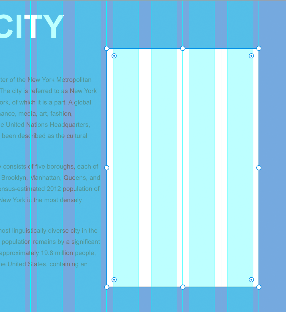
- In the Property Inspector, uncheck Border to remove the default stroke.
- In the Property Inspector, reduce Opacity
 to 50% to create a subtle background that doesn't overpower the text.
 - In the Layers panel, double-click on Rectangle 1 and rename it to sidebar bg for better project organization.
- In the Layers panel, drag the sidebar bg layer below the Popular New York Attractions… text layer to ensure proper layering hierarchy.
- Return to the Select tool in the Toolbar.
- To improve text readability, we need to adjust the sidebar text color. Click on the sidebar text on the artboard to select it.
Content aligns with aqua columns, while backgrounds align with gutter midpoint lines. This provides 15px padding around each column's content.