Topics Covered in This Adobe XD Tutorial:
Mastering component creation and editing, implementing targeted content overrides versus global component updates, detaching components when needed, and understanding the strategic differences between components and repeat grids
Exercise Preview
Exercise Overview
Efficient design systems depend on reusable components that can be updated globally across entire projects. In this exercise, you'll master Adobe XD's component system (formerly called symbols) to build scalable design elements like navigation bars and buttons that maintain consistency while allowing for strategic customization. This approach dramatically reduces maintenance overhead and ensures design coherence across complex projects.
Without components, updating elements like navigation bars requires manual changes across multiple artboards. Components solve this by creating linked, reusable elements that update globally from a single source.
Creating a Component
- In Adobe XD, navigate to File > Open from Your Computer or use the keyboard shortcut Cmd–Shift–O (Mac) or CTRL–Shift–O (Windows).
Browse to Desktop > Class Files > Adobe XD Class > Pulse and double–click Pulse—Ready for Components.xd to open the file.
You'll notice the Home Page artboard contains a nearly complete design, while the other artboards have partial content that needs finishing. The navigation bar at the top represents a perfect candidate for componentization—rather than copying and pasting it across artboards (which would require manual updates in multiple locations), we'll create a linked component system that updates universally when modified.
- Access the Libraries panel by clicking the
 icon in the bottom left corner of the interface.
 - Observe that the Libraries panel currently shows no existing components—we'll be building our component library from scratch.
- Set your view to 100% zoom using Cmd–1 (Mac) or CTRL–1 (Windows) for optimal working precision.
- Locate the black navigation bar positioned at the top of the Home Page artboard. This element will serve as our first reusable component.
- Create a selection around the entire navbar, ensuring you capture both the black background and all interactive icons within it.
- Convert the selection into a component by clicking the + button next to Components in the Libraries panel.
- Notice the new component appears in the Libraries panel with a generic identifier that we should customize for better organization.
Double–click the Component 1 name, replace it with nav, and press Return (Mac) or Enter (Windows) to confirm the change.
NOTE: When viewing components in grid mode, names only appear on hover—keep this in mind when organizing larger component libraries.
- Deploy the component by dragging it from the Libraries panel directly onto the Autumn Collection artboard.
- Position the navbar so it snaps precisely to the top-left corner of the artboard, maintaining consistent placement.
- Demonstrate an alternative deployment method by selecting either navbar instance (the source doesn't matter for this operation).
- Copy the selected component using Cmd–C (Mac) or CTRL–C (Windows).
- Click on the Product Page artboard to set it as your target.
Paste using Cmd–V (Mac) or CTRL–V (Windows). Notice how XD intelligently remembers the positioning, maintaining visual consistency across artboards.
Now that we've established our component system, let's explore how to make strategic edits that either affect all instances globally or customize individual components locally.
Component Creation Process
Select Elements
Drag a selection around all elements you want to include in the component, such as the navigation bar and its icons.
Create Component
In the Libraries panel, click the + button next to Components to convert your selection into a reusable component.
Name Component
Double-click the generic name and replace it with a descriptive name like 'nav' for better organization.
Reuse Component
Drag from Libraries panel to other artboards or copy and paste to maintain positioning across designs.
Editing Components
Understanding the distinction between global and local component editing is crucial for maintaining design system integrity while allowing necessary customizations.
- Select the navbar on the Autumn Collection artboard with a single click.
- Examine the selection handles: notice that most corners display white circular resize handles, while the top-left shows a distinctive diamond shape—this diamond indicates you're working with a component instance.
- Now select the navbar on the Home Page artboard and observe the handle differences.
This original element displays a solid green diamond in the top-left corner, identifying it as the Main Component. This is the master version—any changes made here will cascade to all component instances throughout your project.
Understanding this hierarchy is essential: the Main Component (solid green diamond) controls global updates, while instances (hollow white diamonds) can receive individual customizations that won't affect other instances.
- The search and shopping bag icons need visual adjustment—they're currently too subdued. Double–click the gray search icon outline in the Home Page navbar. If you accidentally select the background, you're now inside the component, so simply click the search icon again.
- With the search icon selected, hold Shift and click the shopping bag icon to select both elements simultaneously.
- In the Property Inspector's Appearance section, adjust the Opacity
 to 100% for better visibility.
 - Observe how this change instantly propagates across all navbar instances—this demonstrates the power of component-based design systems.
- Let's enhance the hamburger menu icon (the three-line menu indicator) on the navbar's left side. Increase your zoom to 200% using Cmd–2 (Mac) or CTRL–2 (Windows) for precise editing.
- Navigate to the hamburger menu icon in the Home Page navbar.
- If you still have other icons selected, you're already in component edit mode—simply click the menu icon once. Otherwise, double–click to enter the component.
- With the menu icon selected, drag the right-middle handle outward to increase width proportionally.
To increase height while maintaining center alignment, hold Option (Mac) or ALT (Windows) and drag the bottom-middle handle downward.
NOTE: The Option/ALT modifier key enables center-point scaling, maintaining visual balance during resize operations.
Click an empty canvas area to deselect and observe your changes across all component instances.
Component Types Comparison
| Feature | Main Component | Component Instance |
|---|---|---|
| Visual Indicator | Solid green diamond | Hollow white diamond |
| Edit Impact | Updates all instances | Local changes only |
| Typical Use | Global design changes | Content customization |
Changes made to the main component, like adjusting opacity from the original value to 100%, instantly update all navbar instances across every artboard in your design.
Editing the Main Component
Lost track of your Main Component or accidentally deleted it? Adobe XD provides robust recovery options. Simply CTRL–click (Mac) or Right–click (Windows) on any component instance in the Libraries panel or document, then select Edit Main component.
- If the Main Component still exists, XD will navigate directly to its location.
- If the Main Component was deleted, XD automatically generates a new Main Component positioned off-canvas, ready for editing.
With navigation components established, let's create a more complex component system using buttons that can adapt to different content while maintaining visual consistency.
If you delete the main component or forget which instance is the original, right-click any component instance and choose 'Edit Main Component' to either locate or recreate it automatically.
Making a Button Component: Overriding Content in One Instance Vs. Globally Updating All Components
Button components showcase the sophisticated balance between reusability and customization that makes component systems so powerful in professional design workflows.
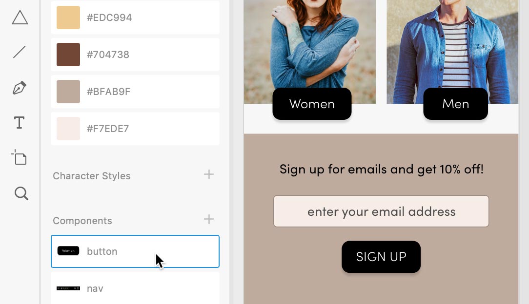
- Locate the Women button (displayed as a black square) on the Home Page artboard.
- Select the button with a single click to capture the complete group containing both the rectangle and text elements.
- Right-click the Women button (use CTRL–click on Mac) and select Make Component from the context menu.
- In the Libraries panel, double–click the automatically generated women button name, replace it with button, and press Return (Mac) or Enter (Windows) for better component organization.
- Create a companion button for men's content by holding Option (Mac) or ALT (Windows) while dragging the Women button to the right, positioning it over the men's product image.
- Customize the duplicated button by double–clicking the text until it becomes editable, then change Women to Men.
- Click outside the Men button multiple times to fully deselect and exit edit mode.
- Select the Men button with a single click to prepare it for resizing.
Adjust the width to create more balanced spacing around the text, matching the visual weight of the Women button.
Notice that XD intelligently resizes the button container without distorting the text—this smart scaling preserves typography integrity while adapting the component dimensions.
Undo the previous change using Cmd–Z (Mac) or CTRL–Z (Windows) to demonstrate a more efficient approach.
Manual spacing adjustments work but aren't optimal for maintaining consistency across multiple component instances. XD offers an automated solution through padding controls.
- Select the Women button (the Main Component) to access global settings.
- In the Property Inspector, enable the Padding checkbox to activate automatic spacing calculations.
- Observe how the Men button automatically adjusts its width to match the padding ratio established in the Main Component—this ensures visual consistency without manual intervention.
- Create a third button instance by dragging the button component from the Libraries panel to a position below the email input field, near your existing buttons.
- Edit this new button's text by double–clicking until it becomes editable, then change Women to Sign Up.
With the text still selected, apply uppercase formatting by clicking the Uppercase button
 in the Property Inspector.
This demonstrates local overrides in action—only this specific instance receives the uppercase treatment, while other button instances remain unaffected.
- Now let's implement global changes that will enhance all button instances simultaneously.
Since the Women button serves as our Main Component, modifications made here will update all instances (except where local overrides exist).
Double–click the black background of the Women button to access its shape properties.
Locate the four corner radius controls (small circles within the shape) and drag any of them inward to create rounded corners, as illustrated below.

- Watch as the corner radius change immediately applies to all three button instances (Women, Men, and SIGN UP), demonstrating the efficiency of component-based updates.
- Select the Women text within the Main Component button.
- In the Property Inspector, change the font weight from Bold to Light to create a more refined appearance.
Again, observe how this typography change cascades across all button instances, maintaining design consistency throughout your project.
Smart Button Component Creation
Create Base Component
Select your button element, right-click and choose 'Make Component', then name it appropriately in the Libraries panel.
Override Instance Content
Double-click text in component instances to change content like 'Women' to 'Men' without affecting other instances.
Enable Auto Padding
Check the Padding option in Property Inspector to automatically adjust button width based on text length while maintaining consistent spacing.
Apply Global Changes
Modify the main component to update all instances simultaneously, such as rounding corners or changing font weight.
XD components resize intelligently rather than scaling. When you adjust button width, the text remains sharp and spacing adjusts proportionally, not through simple scaling transformation.
Working with Components
Removing Local Changes (Reset to Main State)
When local customizations no longer serve your design goals, XD provides a simple reset mechanism. CTRL–click (Mac) or Right–click (Windows) on any modified component instance and select Reset to Main State to restore it to the Main Component's appearance.
Detaching from a Component
Sometimes you need complete independence from the component system for specific instances. Select any component on your artboard and choose Object > Ungroup Component to break the link—this instance will no longer receive updates when the Main Component changes.
Deleting Components
To remove a component entirely from your design system, CTRL–click (Mac) or Right–click (Windows) on the component in the Libraries panel and choose Delete. All existing instances will automatically convert to regular groups, preserving your design while removing the component relationship.
While components excel at reusable elements across different contexts, certain design patterns benefit from XD's repeat grid functionality. Understanding when to use each approach optimizes your workflow efficiency.
Component Management Options
Reset to Main State
Right-click any component instance to remove local overrides and restore original main component appearance.
Detach Component
Use Object > Ungroup Component to break the link and convert an instance into independent elements.
Delete Components
Right-click in Libraries panel and choose Delete to remove components, converting all instances to regular groups.
Component Versus Repeat Grids
Repeat grids automate content duplication within contained areas, making components unnecessary unless you plan to reuse that content elsewhere in your design system. Let's examine this distinction through practical application.
- If you're not viewing at 200% zoom, press Cmd–2 (Mac) or CTRL–2 (Windows) for optimal detail work.
- On the Autumn Collection artboard, examine the repeat grid containing four product cards (images with descriptions and pricing information).
This product grid was constructed using XD's repeat grid functionality for efficient content management. Notice that the first product, Distressed Denim Jacket, displays a white heart icon in the bottom-right corner for favoriting functionality, but the other products lack this element.
This inconsistency occurred during the import process from Illustrator—the heart wasn't properly grouped with the product content before grid creation. Let's resolve this systematically.
- Select the white heart icon on the Distressed Denim Jacket product card.
- Cut the heart using Cmd–X (Mac) or CTRL–X (Windows) to remove it temporarily.
- Double–click the Distressed Denim Jacket image to enter repeat grid edit mode.
- Paste the heart back using Cmd–V (Mac) or CTRL–V (Windows)—notice how it automatically appears on all product cards within the grid.
- Reposition the heart to the bottom-right corner of the product image where it belongs functionally.
- Since product images may have light backgrounds that could obscure the white heart, let's add definition. With the heart selected, enable Border in the Property Inspector.
Reduce the heart's visual prominence by setting Opacity
to 50% for a more subtle, professional appearance.
For our final exercise, let's explore an innovative application of repeat grids that showcases their versatility beyond traditional content layouts.
Components vs Repeat Grids
| Feature | Components | Repeat Grids |
|---|---|---|
| Best for | Cross-artboard reuse | Repeated content patterns |
| Content updates | Global from main | Individual within grid |
| Spacing control | Manual positioning | Automatic equal spacing |
| Use case | Navigation, buttons | Product lists, galleries |
Optional Bonus: an Interesting Use of Repeat Grids
Navigate to the Product Page artboard and locate the single gray star positioned below the Distressed Denim Jacket product title.
We need to create a five-star rating interface for customer reviews. While components might seem appropriate, repeat grids offer superior functionality here because we need multiple instances with consistent spacing that can be easily adjusted as a unit.
- Select the gray star element to prepare it for grid conversion.
- Click the Repeat Grid button in the Property Inspector to transform the single star into a repeatable element.
- Drag the right handle outward to create a total of five stars for the complete rating interface (don't worry if it temporarily overlaps adjacent text).
- Fine-tune the spacing by hovering between stars until you see the pink spacing indicator, then drag left to reduce gaps until the star group fits properly within the available space.
- Since this product hasn't received ratings yet, outlined stars would better indicate an interactive rating interface. Double–click any star to enter edit mode.
In the Property Inspector, disable Fill to create outlined stars that suggest user interaction capability.
All stars update simultaneously, demonstrating how repeat grids maintain consistency while allowing global modifications.
Save your work using Cmd–S (Mac) or CTRL–S (Windows) and close the file to complete the exercise.
Creating Star Ratings with Repeat Grids
Select Base Element
Choose your star element that will serve as the foundation for the rating system.
Apply Repeat Grid
Click the Repeat Grid button in Property Inspector to convert the single star into a repeatable grid system.
Adjust Quantity
Drag the right handle to create exactly 5 stars for a standard rating interface.
Fine-tune Spacing
Hover between stars to see pink spacing indicator, then drag to adjust spacing so stars fit properly within allocated space.
Style for Interaction
Double-click one star and uncheck Fill in Property Inspector to create outlined stars that suggest user interaction capability.
TIP: Swap One Component for Another
Need to replace a component throughout your entire design? Simply drag any component from the Libraries panel onto an existing component instance on your artboard—XD will automatically replace all instances of the target component with your new selection, maintaining positioning and local overrides where possible.
Drag any component from the Libraries panel directly onto an existing component instance on your artboard to instantly replace all instances of that component throughout your entire design with the new component.