Animated infographics have emerged as one of the most effective tools for transforming dense, complex data into compelling visual narratives. In an era where attention spans are measured in seconds and information overload is the norm, these dynamic visualizations cut through the noise by combining the clarity of traditional infographics with the engagement power of motion design. The result? Significantly improved comprehension rates and dramatically enhanced retention compared to static alternatives.
Master presentation basics: The foundational principles that govern successful presentations apply with even greater importance to animated infographics. Know your audience intimately—their expertise level, pain points, and decision-making criteria. Embrace radical simplicity by introducing one concept at a time, allowing viewers to process each idea fully before moving forward. Strip away jargon ruthlessly; if industry terminology is essential, define it visually. Most critically, minimize on-screen text. Your animation should tell the story, with text serving only as essential waypoints.
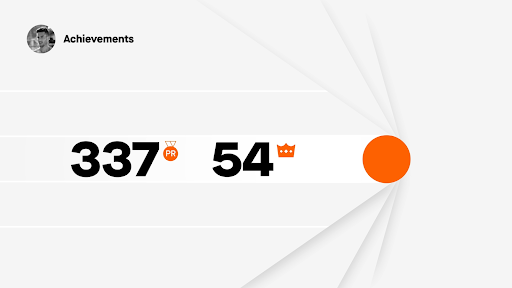
Example: Strava // Year In Sport by Giant Ant
Building on this foundation, your visual hierarchy becomes your most powerful weapon for directing attention and reinforcing key messages.
Make your point impossible to miss: Effective animated infographics don't whisper—they command attention through bold, confident design choices. Scale your most important elements dramatically larger than supporting content. Charts should dominate the frame, icons should be instantly recognizable from across a room, and critical data points should feel monumental. Strategic color application can transform a good point into an unforgettable one. Use contrast not just for aesthetics, but as a cognitive tool that guides viewers to your conclusion.

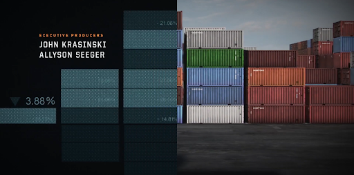
Example: Oil'd by Chris Harmon
While visual impact is crucial, the most memorable animated infographics engage multiple learning pathways simultaneously.
Leverage dual-channel processing with strategic audio: Cognitive science confirms what successful motion designers have long understood: audiences retain significantly more information when it's presented through both visual and auditory channels. Professional voice-over doesn't just explain your visuals—it creates an emotional connection and provides pacing that allows complex ideas to land properly. Lower thirds and animated text overlays serve as visual anchors, reinforcing key terms and statistics that viewers need to remember. This multi-modal approach is particularly effective for technical subjects where precision matters.

Example: NTT Data by Colin Jackson > click the Load More button > scroll to NTT Data
Beyond technical execution, the most impactful animated infographics excel at making abstract concepts feel tangible and relatable.
Harness the power of visual metaphors: Visual metaphors represent the intersection of creativity and clarity in motion design. They transform abstract business concepts—like data flow, market penetration, or organizational growth—into intuitive, memorable imagery. The most effective metaphors create "aha moments" where complex relationships suddenly become obvious. In 2026's increasingly data-driven business environment, the ability to make AI algorithms feel like flowing rivers or cybersecurity threats appear as literal shields and swords can mean the difference between stakeholder confusion and enthusiastic buy-in. These metaphors also provide narrative threads that unify disparate data points into cohesive stories.
Example: Jack Ryan Season 2 Opening Titles
Metaphors work best when paired with thoughtful pacing that respects how audiences actually process information.
Structure information in digestible phases: Modern attention spans demand content that can be consumed incrementally. Break complex processes into distinct phases, with each transition serving as a natural pause point where viewers can absorb what they've learned before moving forward. This approach transforms overwhelming datasets into manageable insights and mirrors how people naturally think through problems—step by step, building understanding progressively. Each phase should feel complete on its own while contributing to a larger narrative arc. This modular approach also makes your content more shareable, as individual segments can stand alone on social platforms or in executive summaries.

Example: Artolution Timeline by Pentagram
Ultimately, the most successful animated infographics leverage motion not as decoration, but as a fundamental communication tool.
Let animation illuminate what words cannot: The true power of animated infographics lies in their ability to make the invisible visible. Use motion to reveal hidden patterns in data, demonstrate cause-and-effect relationships in real-time, and show how systems evolve over time. Animation can compress months of market trends into seconds of revelation, or expand microsecond processes into comprehensible sequences. In an age where business decisions increasingly depend on understanding complex interconnections—whether in supply chains, customer journeys, or AI-driven processes—animation serves as a cognitive amplifier, helping stakeholders grasp relationships that would be nearly impossible to explain through static charts or text alone.

Example: Keplertek | AI & Robotics Ecosystem